README
@airship/rn-components
This is a component library created and used by Airship for quickly building out consistent and high quality React Native apps! It is made up of basic inputs and animated wrapper components. This library is included in all Airfoil templates by default.
Features
- ✨ Easy to use, configurable components
- 📱 Animations that use the UI thread for a consistent 60fps on iOS and Android
- ⏳ Saves you from building basic components from scratch every project
Getting Started
To add to your project, run the command
yarn add @airship/rn-components
Directory 📚
API Reference
AnimatedFade
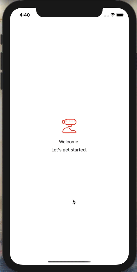
An animated View that can wrap a React Native component fade a component in or fade it out.
Example:
import { AnimatedFade } from '@airship/rn-components';

<AnimatedFade delay={1000}>
  {children}
</AnimatedFade>
| Prop | Type | Required | Default | Description |
|---|---|---|---|---|
| triggerFade | boolean | no | true |
By default, animation is triggered on mount. triggerFade allows for controlled triggering. |
| loop | boolean | no | false |
Enables looping for the animation |
| opacityStart | number | no | 0 |
Defaults to 0. Values can range from 0.0 - 1.0 |
| opacityEnd | number | no | 1 |
Defaults to 1. Values can range from 0.0 - 1.0 |
| duration | number | no | 800 |
Specify in ms how long the fade animation lasts. |
| delay | number | no | 0 |
Specify in ms how long to wait until the fade animation occurs. |
| style | ViewStyle | no | undefined |
Pass React Native View styles to AnimatedFade. |
| onEnd | () => void | no | undefined |
When the animation finishes and this function exists, the onEnd function will be called. |
AnimatedMove
An animated View that can wrap a React Native component and move its position.
Example:
import { AnimatedMove } from '@airship/rn-components';

<AnimatedMove startY={-50} delay={1000}>
  {children}
</AnimatedMove>
| Prop | Type | Required | Default | Description |
|---|---|---|---|---|
| moveOnMount | boolean | no | true |
AnimatedMove is set to start animating on render. Setting this to false in conjunction with triggerMove will allow you to control when the animation occurs. |
| triggerMove | boolean | no | false |
Setting to true will cause the move animation to start. |
| tension | number | no | 18 |
Controls the speed. Reference |
| friction | number | no | 4 |
Controls "bounciness"/overshoot. Reference |
| toX | number | no | 0 |
Move your component to a new X position. |
| toY | number | no | 0 |
Move your component to a new Y position. |
| startX | number | no | 0 |
Move your component to its X origin position (ex. setting to -10 will have the component move from the left to its position you have in your styles). |
| startY | number | no | 0 |
Move your component to its Y origin position (ex. setting to -10 will have the component move from the top to its position you have in your styles). |
| delay | number | no | 0 |
Specify in ms how long to wait until the animation occurs. |
| style | ViewStyle | no | undefined |
Pass React Native View styles to AnimatedMove. |
| onEnd | () => void | no | undefined |
When the animation finishes and this function exists, the onEnd function will be called. |
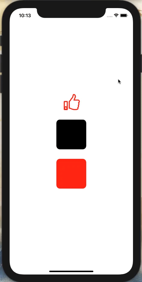
AnimatedPressable
An animated View that changes its scale on press, and returns to its original position on the press out. It can render out a component with props available to it such as color interpolation based on the pressed state.
Example:
import { AnimatedPressable } from '@airship/rn-components';

<View>
  <AnimatedPressable
    colorStart={'rgb(255, 255, 255)'}
    colorEnd={'rgb(255, 42, 19)'}
    renderComponent={(colorInterpolation) => (
      <ThumbsUpSVG
        height={54}
        width={63}
        stroke={colors.orange}
        fillColor={colorInterpolation}
      />
    )}
  />
  <AnimatedPressable
    toScaleValue={0.8}
    friction={12}
    tension={120}
    onPress={() => Alert.alert('Pressed!')}
    renderComponent={() => (
      <View
        style={{
          marginTop: 32,
          width: 100,
          height: 100,
          backgroundColor: colors.trueBlack,
          borderRadius: 12,
        }}
      />
    )}
  />
  <AnimatedPressable
    toScaleValue={1.5}
    renderComponent={() => (
      <View
        style={{
          marginTop: 32,
          width: 100,
          height: 100,
          backgroundColor: colors.orange,
          borderRadius: 12,
        }}
      />
    )}
  />
</View>
| Prop | Type | Required | Default | Description |
|---|---|---|---|---|
| toScaleValue | number | no | 0.5 |
This number controls how much the Animated.View will scale. It can be lower or higher than 1. |
| tension | number | no | 18 |
Controls the speed. Reference |
| friction | number | no | 4 |
Controls "bounciness"/overshoot. Reference |
| colorStart | string | no | null |
Initial color value, must be given as a rgb string. Color interpolation does not work with hexes. NOTE: Works off of pressed. Think of it as a "like" button. If pressed has a true value, that means the current color is colorEnd. |
| colorEnd | string | no | null |
End color value, must be given as a rgb string. Color interpolation does not work with hexes. NOTE: Works off of pressed. Think of it as a "like" button. If pressed has a true value, that means the current color is colorEnd. |
| isPressed | boolean | no | false |
The current state of AnimatedPressable. Can be passed a value such as starting with pressed set to true, which means the colorEnd is the starting color. |
| onPress | () => void | no | undefined |
When the animation finishes (press out) and this function exists, the onPress function will be called. |
| callFunctionOnPressIn | boolean | no | false |
Setting to true will cause the onPress function to call on the press in of the tap instead of the press out default. |
| renderComponent | (colorInterpolation: Animated.AnimatedInterpolation) => React.ReactElement | no | undefined |
This render function allows for a child component to be passed with access to the colorInterpolation values IF a colorStart and colorEnd have been set. Otherwise the value will not exist and will render the component without value to colorInterpolation. |
| style | ViewStyle | no | undefined |
Pass React Native View styles to AnimatedPressable. |
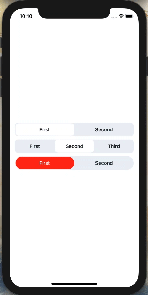
SegmentedControl
An animated tab controller for selections in an app with customizable color schemes.
Example:
import React, { useState } from 'react';
import { StyleSheet } from 'react-native';
import { SegmentedControl } from '@airship/rn-components';

export const App = () => {
  const [currIdx, setCurrIdx] = useState(0);
  const [currIdx2, setCurrIdx2] = useState(0);
  const [currIdx3, setCurrIdx3] = useState(0);

  return (
    <View>
      <SegmentedControl
        tabs={['First', 'Second']}
        onChange={(idx) => setCurrIdx(idx)}
        currentIndex={currIdx}
        activeSegmentBackgroundColor={colors.background}
        containerStyle={styles.segmentContainer}
        textStyle={styles.textStyle}
      />
      <SegmentedControl
        tabs={['First', 'Second', 'Third']}
        onChange={(idx) => setCurrIdx2(idx)}
        currentIndex={currIdx2}
        activeSegmentBackgroundColor={colors.background}
        containerStyle={styles.segmentContainer}
        textStyle={styles.textStyle}
      />
      <SegmentedControl
        tabs={['First', 'Second']}
        onChange={(idx) => setCurrIdx3(idx)}
        currentIndex={currIdx3}
        activeSegmentBackgroundColor={colors.orange}
        containerStyle={styles.segmentContainerCustom}
        textStyle={styles.textStyle}
        activeTextColor={'#FFF'}
        activeContainerStyles={styles.activeContainer}
      />
    </View>
  )

  const styles = StyleSheet.create({
    segmentContainer: {
      backgroundColor: colors.background3,
    },
    segmentContainerCustom: {
      backgroundColor: colors.background3,
      borderRadius: 50,
    },
    textStyle: {
      color: colors.text,
    },
    activeContainer: { borderRadius: 50 },
  })
}
| Prop | Type | Required | Default | Description |
|---|---|---|---|---|
| tabs | string[] | yes | [] |
An array of strings, with each one being a label for each tab. |
| onChange | (index: number) => void | yes | null |
Exposes the current index when changing tabs for state management. |
| currentIndex | number | yes | null |
This is the currently selected tab. |
| activeSegmentBackgroundColor | string | yes | '' |
Color for the currently selected tab. |
| containerStyle | ViewStyle | no | null |
Add additional/override styling to the segment container. |
| textStyle | TextStyle | no | null |
Add additional/override styling to the text components. |
| activeTextColor | string | no | #20242B |
Color of the text in the active selected tab. |
| activeContainerStyles | ViewStyle | no | null |
Add additional/override styling to the active selected tab container. |