README
Yellow
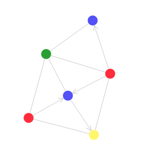
Welcome to Yellow! Yellow is a library of React components for rendering simulated graphs. Yellow has components for rendering basic graphs,
import React from 'react';
import { Graphs } from '@akud/yellow-client';

export default () => {
  return (
    <Graphs.Graph>
      <Graphs.CircleNode nodeId="red-node" color="#fc2f38" />
      <Graphs.CircleNode nodeId="blue-node" color="#5b41fc" />
      <Graphs.CircleNode nodeId="yellow-node" color="#fcf95d" />
      <Graphs.CircleNode nodeId="green-node" color="#3ba226" />
      <Graphs.Edge fromNodeId="yellow-node" toNodeId="red-node" />
      <Graphs.Edge fromNodeId="yellow-node" toNodeId="blue-node" directed={true} />
      <Graphs.Edge fromNodeId="yellow-node" toNodeId="green-node" />
      <Graphs.Edge fromNodeId="blue-node" toNodeId="green-node" />
      <Graphs.Edge fromNodeId="blue-node" toNodeId="red-node" directed={true} />
      <Graphs.Edge fromNodeId="green-node" toNodeId="red-node" />
    </Graphs.Graph>
  )
}
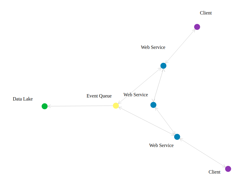
for controlling their layouts with simulated forces,
import React from 'react';

import { Elements, Simulations, Graphs } from '@akud/yellow-client';

export default ({ width=1000, height=1000 }) => (
  <Graphs.Graph width={width} height={height} border={true}>
    <Graphs.Node nodeId="event-queue">
      <Elements.Label text='Event Queue' orientation={Simulations.Orientation.TOP_LEFT} />
      <Elements.Circle color="#fcf95d" />
    </Graphs.Node>
    <Graphs.Node nodeId="service-a">
      <Elements.Label text='Web Service' orientation={Simulations.Orientation.TOP_LEFT} />
      <Elements.Circle color="#2980B9" />
    </Graphs.Node>
    <Graphs.Node nodeId="service-b">
      <Elements.Label text='Web Service' orientation={Simulations.Orientation.TOP_LEFT} />
      <Elements.Circle color="#2980B9" />
    </Graphs.Node>
    <Graphs.Node nodeId="service-c">
      <Elements.Label text='Web Service' orientation={Simulations.Orientation.TOP_LEFT} />
      <Elements.Circle color="#2980B9" />
    </Graphs.Node>
    <Graphs.Node nodeId="client-a">
      <Elements.Label text='Client' orientation={Simulations.Orientation.TOP_LEFT} />
      <Elements.Circle color="#8c28b7" />
    </Graphs.Node>
    <Graphs.Node nodeId="client-c">
      <Elements.Label text='Client' orientation={Simulations.Orientation.TOP_LEFT} />
      <Elements.Circle color="#8c28b7" />
    </Graphs.Node>
    <Graphs.Node nodeId="data-lake">
      <Elements.Label text='Data Lake' orientation={Simulations.Orientation.TOP_LEFT} />
      <Elements.Circle color="#28b92b" />
    </Graphs.Node>

    <Graphs.Edge fromNodeId="event-queue" toNodeId="service-a" bidirectional={true} />
    <Graphs.Edge fromNodeId="event-queue" toNodeId="service-c" bidirectional={true} />
    <Graphs.Edge fromNodeId="event-queue" toNodeId="data-lake" directed={true} />
    <Graphs.Edge fromNodeId="service-b" toNodeId="service-a" bidirectional={true} />
    <Graphs.Edge fromNodeId="service-b" toNodeId="service-c" bidirectional={true} />
    <Graphs.Edge fromNodeId="service-a" toNodeId="client-a" bidirectional={true} />
    <Graphs.Edge fromNodeId="service-c" toNodeId="client-c" bidirectional={true} />


    <Simulations.CenteringRule elements={{ groupId: 'event-queue' }} />
    <Simulations.DirectionalRule
      elements={{ groupIds: ['service-a'] }}
      orientation={Simulations.Orientation.TOP_RIGHT}
      strength={25.0}
    />
    <Simulations.DirectionalRule
      elements={{ groupIds: ['client-a'] }}
      orientation={Simulations.Orientation.TOP_RIGHT}
      strength={50.0}
    />
    <Simulations.DirectionalRule
      elements={{ groupIds: ['service-c'] }}
      orientation={Simulations.Orientation.BOTTOM_RIGHT}
      strength={25.0}
    />
    <Simulations.DirectionalRule
      elements={{ groupIds: ['client-c'] }}
      orientation={Simulations.Orientation.BOTTOM_RIGHT}
      strength={50.0}
    />
    <Simulations.DirectionalRule
      elements={{ groupIds: ['data-lake'] }}
      orientation={Simulations.Orientation.LEFT}
      strength={50.0}
    />
  </Graphs.Graph>
);
and more. The great thing about yellow is that any React component can be embedded inside an HtmlNode, so you can create graphical organization of any type of content.
API Reference
There are three top-level concepts in Yellow's architecture that form
the ability to render graphs -
Elements, Simulations, and Graphs. Each of these is an importable name from @akud/yellow-client, and all components can be imported directly.
Elements
import React from 'react';
import {
Elements
} from '@akud/yellow-client';
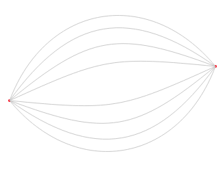
<Elements.DisplayWindow border={true}>
<Elements.Circle radius={2} color='red' position={{ x: 100, y: 250 }} />
<Elements.Circle radius={2} color='red' position={{ x: 400, y: 200 }} />
<Elements.Curve
id='4'
from={{ x: 100, y: 250 }}
to={{ x: 400, y: 200 }}
curvature={4}
/>
<Elements.Curve
id='3'
from={{ x: 100, y: 250 }}
to={{ x: 400, y: 200 }}
curvature={3}
/>
<Elements.Curve
id='2'
from={{ x: 100, y: 250 }}
to={{ x: 400, y: 200 }}
curvature={2}
/>
<Elements.Curve
id='1'
from={{ x: 100, y: 250 }}
to={{ x: 400, y: 200 }}
curvature={1}
/>
<Elements.Curve
id='-1'
from={{ x: 100, y: 250 }}
to={{ x: 400, y: 200 }}
curvature={-1}
/>
<Elements.Curve
id='-2'
from={{ x: 100, y: 250 }}
to={{ x: 400, y: 200 }}
curvature={-2}
/>
<Elements.Curve
id='-3'
from={{ x: 100, y: 250 }}
to={{ x: 400, y: 200 }}
curvature={-3}
/>
<Elements.Curve
id='-4'
from={{ x: 100, y: 250 }}
to={{ x: 400, y: 200 }}
curvature={-4}
/>
</Elements.DisplayWindow>
The Elements namespace contains basic components for rendering a
static svg. When used directly, these components need to be passed a
position inside the svg. They will normally be used inside of components
from the Simulations and Graphs namespaces to be positioned automatically.
Arrow- renders an arrow pointing at the desired positionProps:
to: #element-prop-types-position. Position the arrow points to. Requiredcolor: PropTypes.string. Color string like'#4286f4'orgreen. Optional.thickness: PropTypes.number. Thickness of the arrow. Optional.angle: PropTypes.number. Angle at which the arrow should be rendered. Optional.link: ElementPropTypes.link Optional link object describing a web page for the object to link to
Circle- renders a circle centered at the given positionProps:
id: PropTypes.string - optional id for the element. Will be set asdata-element-idon the rendered circle. This is used by the simulation to track elements.position: ElementPropTypes.position - circle centercolor: PropTypes.string - circle color. Defaults to#4286f4radius: PropTypes.number - circle radius. Defaults to 10link: ElementPropTypes.link Optional link object describing a web page for the object to link to
Curve- renders a curve between the given pointsProps:
id: PropTypes.string - optional id for the element. Will be set asdata-element-idon the rendered circle. This is used by the simulation to track elements.color: PropTypes.string - curve color. Defaults to#c7c7c7from: ElementPropTypes.position - curve starting pointto: ElementPropTypes.position - curve ending pointthickness: PropTypes.number - thickness of the curvecurvature: #element-prop-types-curvature - one of-4,-3,-2,-1,1,2,3,4denoting the curvature. Negative numbers denote convex curves, positive number concave curves.
DisplayWindow- top-level wrapper component for holding elements. Renderschildreninside an svg with the provided size.Props:
width: PropTypes.number - width of the svg. Defaults to 500height: PropTypes.number - height of the svg. Defaults to 500border: PropTypes.bool - boolean indicating if a border should be drawn around the svg. Defaults to false.zoom: PropTypes.number - multiplier determining the zoom level inside the window
ElementGroup- renderschildreninside a<g>tag. Forwards all props to the<g>tag.ElementPropTypes.link - Defines a link prop type for linking to a web page
export const link = PropTypes.oneOfType([
  PropTypes.string,
  PropTypes.exact({
    href: PropTypes.string.isRequired,
    inline: PropTypes.bool,
    className: PropTypes.string,
  }),
]);
If a string is provided, the element will link to that url. the
inlineprop determines whether the link will open in a new window (inline={false}) or in the same browser window (inline={true}).classNameis set on the wrappingatag.
Determines an element's position in svg space. For the most part this prop should be passed in automatically by
SimulationsorGraphs.export const position = PropTypes.exact({ x: PropTypes.number.isRequired, y: PropTypes.number.isRequired, });
ElementPropTypes.curvature - Determines the curvature of a line or edge, from a max concavity (
curvature=4) to a max convexity (curvature=-4)export const curvature = PropTypes.oneOf([ 4, 3, 2, 1, -1, -2, -3, -4, '4', '3', '2', '1', '-1', '-2', '-3', '-4', ]);Grid - Renders a grid cooridnate system on the current display window
Props:
color: PropTypes.string - color to use to render the grid pointsstepsPerSide: PropTypes.number - number of steps to take per side when laying out the grid
HtmlFragment- renderschildreninside an html fragment centered at the given positionProps:
id: PropTypes.string - optional id for the element. Will be set asdata-element-idon the rendered element. This is used by the simulation to track elements.position: ElementPropTypes.position - fragment centerlink: ElementPropTypes.link Optional link object describing a web page for the object to link to
Image- renders an imageProps:
id: PropTypes.string - optional id for the element. Will be set asdata-element-idon the rendered image. This is used by the simulation to track elements.position: ElementPropTypes.position - image centersrc: PropTypes.string.isRequired - image sourcewidth: PropTypes.number.isRequired - width to render the image asheight: PropTypes.number.isRequired - height to render the image aslink: ElementPropTypes.link Optional link object describing a web page for the object to link to
Label- renders svg text centered at the given positionProps:
id: PropTypes.string - optional id for the element. Will be set asdata-element-idon the rendered text element. This is used by the simulation to track elements.text: PropTypes.string.isRequired - the text to renderposition: ElementPropTypes.position - label centerlink: ElementPropTypes.link Optional link object describing a web page for the object to link to
Line- renders a line between the given pointsProps:
from: ElementPropTypes.position.isRequired - line starting pointto: ElementPropTypes.position.isRequired - line ending pointcolor: PropTypes.string - line color. Defaults to#c7c7c7thickness: PropTypes.number - line thickness
Link- renderschildrenin an<a>tag to link to a web page.Props:
href: PropTypes.string.isRequired - location to link toinline: PropTypes.bool - whether to open the link inline (in the same browser tab) or not. Defaults to false, opening links in a new windowclassName: PropTypes.string - optional class name to set on the wrappingatag
Rectangle- renders a rectangle centered at the given positionProps:
id: PropTypes.string - optional id for the element. Will be set asdata-element-idon the rendered rectangle. This is used by the simulation to track elements.position: ElementPropTypes.position - rectangle centercolor: PropTypes.string - rectangle color. Defaults to#4286f4width: PropTypes.number - rectangle width. Defaults to 10height: PropTypes.number - rectangle height. Defaults to 10
WindowContext- Context that provides basic information about the window. Will be provided by DisplayWindowconst WindowContext = React.createContext({ width: 500, height: 500, center: { x: 250, y: 250 }, });
Simulations

import React from 'react';
import {
  Elements, Simulations
} from '@akud/yellow-client';

export default () => (
  <Simulations.SimulationWindow>

    <Simulations.SimulatedElement id='centered'>
      <Elements.Label text='Center' />
    </Simulations.SimulatedElement>

    <Simulations.SimulatedElement id='rectangle-1'>
      <Elements.Rectangle color='red' />
    </Simulations.SimulatedElement>

    <Simulations.SimulatedElement id='rectangle-2'>
      <Elements.Rectangle color='red' />
    </Simulations.SimulatedElement>

    <Simulations.SimulatedElementGroup id='circle1'>
      <Elements.Circle />
      <Elements.Label text='circle1' />
    </Simulations.SimulatedElementGroup>

    <Simulations.SimulatedElementGroup id='circle2'>
      <Elements.Circle />
      <Elements.Label text='circle2' />
    </Simulations.SimulatedElementGroup>

    <Simulations.SimulatedElementGroup id='circle3'>
      <Elements.Circle />
      <Elements.Label text='circle3' orientation={Simulations.TOP_RIGHT} />
    </Simulations.SimulatedElementGroup>

    <Simulations.CenteringRule elements={{ id: 'centered' }} />

    <Simulations.DirectionalRule
      elements={{ ids: [ 'rectangle-1', 'rectangle-2' ] }}
      orientation={Simulations.TOP}
      strength={2.0}
    />

    <Simulations.DirectionalRule
      elements={{ groupIds: [ 'circle1', 'circle2' ] }}
      orientation={Simulations.BOTTOM_LEFT}
    />

    <Simulations.OrientingRule
      baseElementId={Simulations.SimulatedElementGroup.getPrimaryElementId('circle-1')}
      targetElements={{ groupIds: [ 'circle-2', 'circle-3' ] }}
      orientation={Simulations.LEFT}
    />
  </Simulations.SimulationWindow>
)
The Simulations namespace provides the backbone of yellow's layout
engine. Under the hood, Yellow runs a
d3 force simulation
to guide elements to their desired position determined by a set of
basic forces and user-defined Rules. The main components
are SimulationWindow),
SimulatedElement, and
SimulatedElementGroup. Elements and
Groups inside a Window will render with positions determined by
a force-particle simulation. Each element is simulated as a circle
with a certain radius whose motion is affected by the
ForceApplications returned by rules in the
simulation. All simulations have a basic repelling force
where elements exert a repelling force on each other, though
that can be changed with
SimulationContext#setRepellingForceStrength.
Orientation - enumeration of orientations available in a simulation.
TOP_LEFT
TOP
TOP_RIGHT
RIGHT
BOTTOM_RIGHT
BOTTOM
BOTTOM_LEFT
LEFT
UNSPECIFIED
PRIMARY
These can be used in SimulatedElementGroups, DirectionalRules and OrientingRules.
Rules - module containing embeddable
Rulecomponents to interact with the SimulationContext). EachRulecomponent is also accessible as a top level property ofSimulations.DirectionalRule - Rule that pushes elements in a direction
Props:
elements: SimulationPropTypes.elementSelector.isRequired - ElementSelector determing the elements this rule should apply toorientation: PropTypes.oneOf(Object.values(Orientation)).isRequired - direction the elements should be pushed instrength: PropTypes.number - strength multiplier for the rule
PositioningRule - Rule that pushes elements towards a position
Props:
elements: SimulationPropTypes.elementSelector.isRequired - ElementSelector determing the elements this rule should apply toposition: ElementPropTypes.position.isRequired - x, y coordinates of the position that elements should be pushed towardsstrength: PropTypes.number - strength multiplier for the rule
CenteringRule - Rule that pushes elements towards the window center
Props:
elements: SimulationPropTypes.elementSelector.isRequired - ElementSelector determing the elements this rule should apply tostrength: PropTypes.number - strength multiplier for the rule
OrientingRule - Rule that orients a group of elements relative to a base element
Props:
baseElementId: PropTypes.string.isRequired - element id of the element to use as the base. Other elements will be pushed to be oriented relative to this one.targetElements: SimulationPropTypes.elementSelector.isRequired - ElementSelector determing the elements this rule should apply toorientation: PropTypes.oneOf(Object.values(Orientation)).isRequired - orientation determining the desired positioning of the target elements relative to the base element.strength: PropTypes.number - strength multiplier for the rulestyle: PropTypes.oneOf([ 'exact', 'narrow', 'medium', 'wide', ]) - enum determining the rule's tolerance
LinkingRule - Rule that links two elements together, acting on them both to keep them a desired distance apart.
Props:
between: PropTypes.arrayOf(PropTypes.string).isRequired - two-element array of element ids to apply the rule todistance: PropTypes.number.isRequired - desired distance to keep the two elements apartstrength: PropTypes.number - strength multiplier for the rule
BindingRule - Rule that binds a set of target elements to a base element, acting only on the target elements to keep them a desired distance away from the base element.
Props:
baseElementId: PropTypes.string.isRequired - element id of the element to use as the base. Other elements will be pushed to be kept a desired distance away from this one.targetElements: SimulationPropTypes.elementSelector.isRequired - ElementSelector determing the elements this rule should apply todistance: PropTypes.number.isRequired - desired distance to keep the target elements from the base elementsstrength: PropTypes.number - strength multiplier for the rule
FunctionRule - Rule that runs a function to determine forces to apply at each simulation iteration
Props:
rule: PropTypes.func.isRequired - function with signature (simulation) => [[ForceApplication]((https://github.com/akud/yellow/blob/master/packages/client/src/simulation/force/ForceApplication.js), ...] that will be passed the simulation object (for retrieving current element data) and should return an array of ForceApplication objects determining forces to apply in the next iteration of the simulation
RepellingRule - Sets the simulation-wide repelling force strength
Props:
strength: PropTypes.number - strength multiplier for the simulation-wide repelling force
SimulatedElement Wraps a single Element and positions it based on the current SimulationContext
Props:
id: PropTypes.string.isRequired - id to use for the element in the simulation
SimulatedElementGroup - Wraps a group of Elements and binds them around a primary element. This component will read an
orientationprop off of all children to determine the primary element and how to orient the others around the primary element. The primary element is the first element with no orientation ororientation={Orientation.PRIMARY}Props:
id: PropTypes.string.isRequired - id to use for the element group. The primary element will have an element id ofid + "_primary".className: PropTypes.string - optional class name to set on thegtagbindingStrength: PropTypes.number - optional strength to set on the rules that bind elements togetherlink: ElementPropTypes.link Optional link object describing a web page to wrap the group in a link.
SimulatedLink - links two elements in the simulation together and passes their positions to a render prop. This is used to render edges between nodes in a graph
Props:
render: PropTypes.func.isRequired - function with signature(sourcePosition, targetPosition) => </>that will be passed the positions of the two elements and can return children to be renderedfromElementId: PropTypes.string.isRequired - the "source" of the link, whose position will be passed assourcePositiontoElementId: PropTypes.string.isRequired - the "target" of the link, whose position will be passed astargetPositiondistance: PropTypes.number - distance to keep the elements apart. Defaults to 100.bindingStrength: PropTypes.number - strength to use in the rule that links the two elements
SimulationContext - Context that delivers the core functionality of Yellow simulations. This will be provided by a SimulationWindow.
export default React.createContext({

  /**
   * String identifying the current simulation context
   */
  contextId: 'default-simulation-context',

  /**
   * Add an element to the underlying simulation, specifying it's id and shape
   */
  registerElement: (elementId, shape) => {},

  /**
   * Get a list of ids of all the elements in the simulation
   */
  getElementIds: () => simulation.getElementIds(),

  /**
   * Retrieve a blob of data about an element in the underlying simulation:
   *
   * {
   *   position: {
   *     x: <current x position>,
   *     y: < current y position>,
   *   },
   *   shape: elementShape
   *   }
   *
   */
  getElementData: elementId => ({
    position: {
      x: 0,
      y: 0,
    },
    velocity: {
      x: 0,
      y: 0,
    },
    shape: PointDefinition.INSTANCE,
  }),

  /**
   * Register a new rule in the simulation. A rule is a function
   * `f: f(currentSimulation) => [ForceApplication, ForceApplication...]
   *
   * thata optionally determines a set of forces to apply to the next state
   * in the simulation
   */
  registerRule: (ruleId, rule) => {},

  /**
   * Register a group of elements with the simulation, which can be retrieved with
   * getGroupElementIds
   */
  registerGroup: (groupId, elementIds) => simulation.registerGroup(groupId, elementIds),

  /**
   * Retrieve a list of a previously defined element group
   */
  getGroupElementIds: (groupId) => simulation.getGroupElementIds(groupId),

  /**
   * Set the strength of the simulation-wide force that causes elements to repel
   * or attract each other. 1.0 is the base repelling force strength, -1.0 would
   * be an equivalent attractive force.
   */
  setRepellingForceStrength: (strength) => simulation.setRepellingForceStrength(strength),
});
SimulationPropTypes.elementSelector - determines a set of elements for rules to apply to.
/**
 * Defines a prop that identifies a group of elements in a simulation.
 * There are several options:
 *
 * id: select a single element by id
 * ids: select a set of elements by their ids
 * groupId: select all elements in a group
 * groupIds: select all elements in set of groups
 * all: select all elements
 */
export const elementSelector = PropTypes.oneOfType([
  PropTypes.exact({ id: PropTypes.string.isRequired }),
  PropTypes.exact({ ids: PropTypes.arrayOf(PropTypes.string).isRequired }),
  PropTypes.exact({ groupId: PropTypes.string.isRequired }),
  PropTypes.exact({ groupIds: PropTypes.arrayOf(PropTypes.string).isRequired }),
  PropTypes.oneOf(['all']),
]);
SimulationWindow - Wrapper class to render a simulation inside a DisplayWindow. This will provide a
SimulationContextto children, render allSimulatedElements andSimulatedElementGroups with their positions from the simulation, and register allRulecomponents.Props:
width: PropTypes.number - width for the window. Defaults to 500.height: PropTypes.number - height for the window. Defaults to 500.border: PropTypes.bool - whether to render a border around the window or notzoom: PropTypes.number - Optional multiplier that determines the zoom level of the window
Graphs
import React from 'react';
import { Graphs } from '@akud/yellow-client';

export default () => {
  return (
    <Graphs.Graph>
      <Graphs.CircleNode nodeId="red-node" color="#fc2f38" />
      <Graphs.CircleNode nodeId="blue-node" color="#5b41fc" />
      <Graphs.CircleNode nodeId="yellow-node" color="#fcf95d" />
      <Graphs.CircleNode nodeId="green-node" color="#3ba226" />
      <Graphs.Edge fromNodeId="yellow-node" toNodeId="red-node" />
      <Graphs.Edge fromNodeId="yellow-node" toNodeId="blue-node" directed={true} />
      <Graphs.Edge fromNodeId="yellow-node" toNodeId="green-node" />
      <Graphs.Edge fromNodeId="blue-node" toNodeId="green-node" />
      <Graphs.Edge fromNodeId="blue-node" toNodeId="red-node" directed={true} />
      <Graphs.Edge fromNodeId="green-node" toNodeId="red-node" />
    </Graphs.Graph>
  )
}
The Graphs namespace contains high level components for rendering
graphs
driven by a physical simulation. The main component is Graph,
which will render a window with all Nodes and Edges
from its children.
CircleNode - Convenience component to render a Circle inside a Node.
Props:
nodeId: PropTypes.string.isRequired - id to use for the nodecolor: PropTypes.string - circle color. Defaults to'#4286f4'radius: PropTypes.number - circle radius. Defaults to 10link: ElementPropTypes.link Optional link object describing a web page for the circle to link to
Edge - Renders an edge in the graph
Props:
fromNodeId: PropTypes.string.isRequired - source node idtoNodeId: PropTypes.string.isRequired - target node idcolor: PropTypes.string - Optional color to render the edge. Defaults to'#c7c7c7'thickness: PropTypes.number - Edge thickness. Defaults to 1.distance: PropTypes.number - Edge distance. defaults to 100.directed: PropTypes.bool - whether to make the edge directed (render an arrow at the target element) or not.bidirectional: PropTypes.bool - whether to make the edge bidirectional (render an arrow at both the source and target nodes) or notbindingStrength: PropTypes.number - strength with which to bind elements togethercurvature: ElementPropTypes.curvature - Optional curvature with which to render the edge
Graph - Main entrypoint for rendering graphs. This renders a graph inside a SimulationWindow which is used to determine the layout
Props:
width: PropTypes.number - width of the window. Defaults to 500.height: PropTypes.number - height of the window. Defaults to 500.border: PropTypes.bool - whether to render a border around the window or notzoom: PropTypes.number - zoom to be applied to the window
HtmlNode - renders children inside an HtmlFragment inside a (Node)[#node]
Props:
nodeId: PropTypes.string.isRequired - id to use for the nodelink: ElementPropTypes.link Optional link object describing a web page for the html fragment to link to
ImageNode - renders an Image inside a [Node]
Props:
nodeId: PropTypes.string.isRequired - id to use for the nodesrc: PropTypes.string.isRequired - image src urlwidth: PropTypes.number.isRequired - image widthheight: PropTypes.number.isRequired - image heightlink: ElementPropTypes.link Optional link object describing a web page for the image to link to
Node - Basic wrapper component for rendering elements inside a graph.
childrenwill be rendered inside the graph positioned by the graph rules, and multiple elements will be oriented around a primary element inside a SimulatedElementGroup.Props:
nodeId: PropTypes.string.isRequired - id to use for the nodelink: ElementPropTypes.link Optional link object describing a web page for the node to link to
PointNode - Renders a point-sized, invisible node
Props:
nodeId: PropTypes.string.isRequired - id to use for the node