README
@maqe-vue/text-input
The Vue2 component for text-input
See demo: jsfiddle
Installation
NPM
Install the npm package.
npm install @maqe-vue/text-input --save
Register the component
import Input from '@maqe-vue/text-input'
import '@maqe-vue/text-input/dist/style.css'

Vue.component('m-input', Input)
Usage
Basic
 ```
```
Theme

 ```
```
###
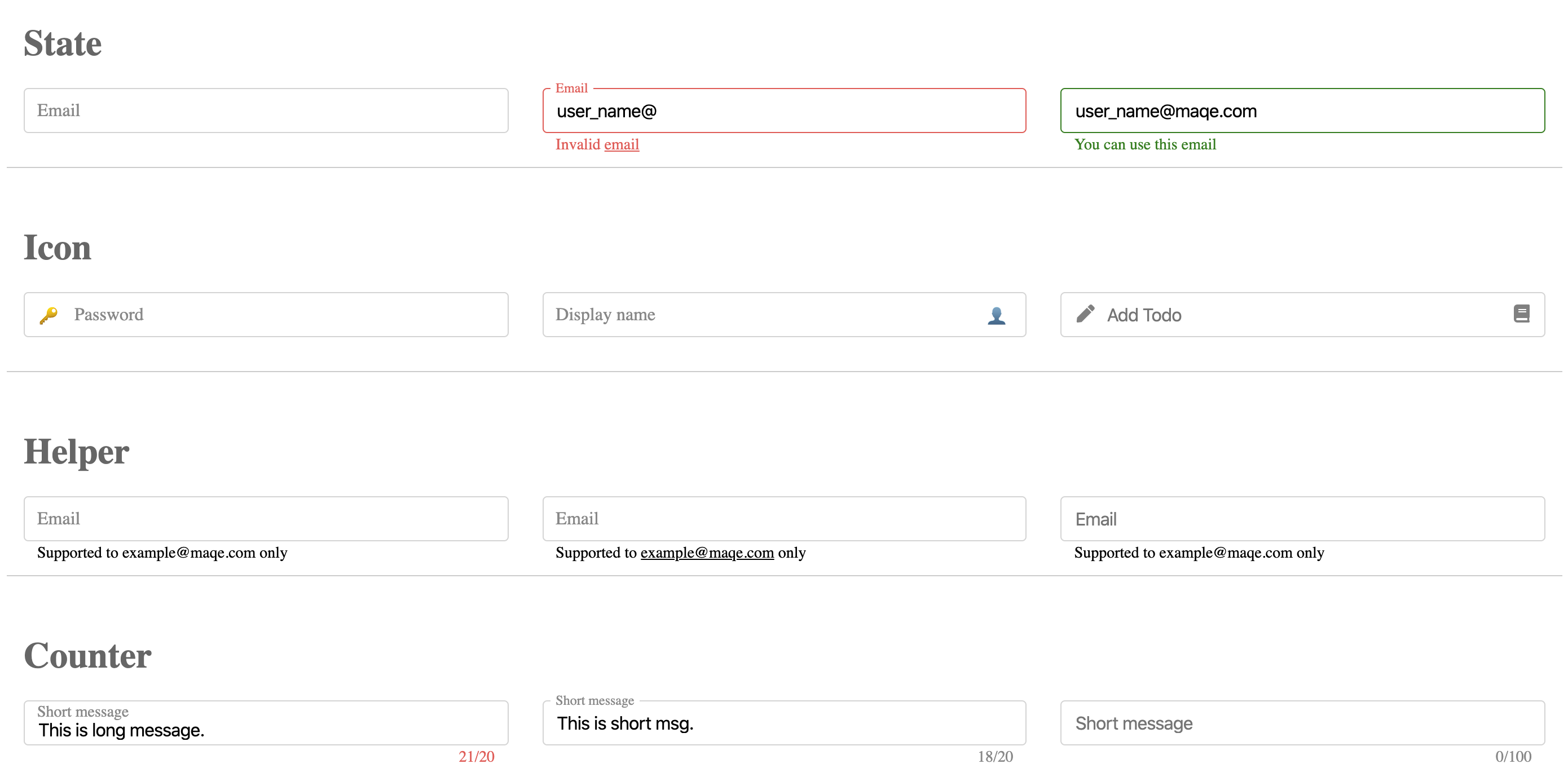
#### State
<img src="https://i.imgur.com/eDpfSbd.png" width="315" height="50">
<br/>
<img src="https://i.imgur.com/2YU4GE6.png" width="315" height="50">
<m-input v-model="email" type="text" theme="label-inside" :state="false"
<template v-slot:state-invalid-text>
    <span>
        Invalid
        <u>email</u>
    </span>
</template>
------

## API
#### Props

| Name                 | Type                | Description    | default    |
| :--------------------|:-------------------:|----------------|:-----------|
| `v-model`            | `bind`              |                |            |
| `size`               | `string`            | `sm|md|lg`     |            |
| `color`              | `string`            | `name|hex|rgb` | `#28b7c1`  |
| `theme`              | `string`            | `label-inside|label-border|label-none`
| `label`              | `string`            |                |            |
| `placeholder`        | `string`            |                |            |
| `state`              | `boolean|null`      |                | `null`     |
| `state-valid-text`   | `string`            |                |            |
| `state-invalid-text` | `string`            |                |            |
| `helper-text`        | `string`            |                |            |
| `icon`               | `string|array`      |                |            |
| `icon-after`         | `string|array`      |                |            |
| `counter-max `       | `Integer`           |                | `-1`       |
| `counter`            | `Integer`           |                |            |
| `disabled`           | `boolean`           |                | `false`    |
| `loading`            | `boolean`           |                | `false`    |
| `clearable`          | `boolean`           |                | `false`    |
| `autofocus`          | `boolean`           |                | `false`    |
| `trim`               | `boolean`           |                | `false`    |

#### Slot
| Name                 | Type                | Description    | default    |
| :--------------------|:-------------------:|----------------|:-----------|
| `state-valid-text`
| `state-invalid-text`
| `icon`               |                     | left side icon
| `icon-after`         |                     | right side icon
| `helper-text`

#### Slot Example
Event
| Name | Type | Description | default |
|---|---|---|---|
select(value, event) |
function |
Invoked when input is selected. | |
focus(value, event) |
function |
Invoked when input gains focus. | |
blur(value, event) |
function |
Invoked when input loses focus. | |
change(value, event) |
function |
Invoked when input changes. | |
keyup(value, event) |
function |
Invoked when a key is released. | |
keydown(value, event) |
function |
Invoked when the user presses a keyboard key. | |
keypress(value, event) |
function |
Invoked when the user presses a key on the keyboard. |
Event Example
<m-input
    type="text"
    theme="label-border"
    @change="handleChange"
/>

methods: {
    handleChange(value, event) {
        // code here
    }
}
Classes
.vmq-input-wrapper
.vmq-input-textfield
.vmq-input-label
.vmq-input-state
.vmq-input-icon
.vmq-input-icon-after
.vmq-input-helper
.vmq-input-counter
.vmq-input-clear
Custom Style Example
.vmq-input-textfield {
    border: solid 1px #ccc;
    border-radius: 6px;
}

.vmq-input-state, .vmq-input-helper {
    left: 0;
    color: #ccc;
}