README
react-native-view-slider
A robust simple lightweight library for sliding views/images/anything in react-native applications.
- Support -> React native => 0.59.0 -> This module will support both expo managed application and bare react native applications.

Install the library
npm i react-native-view-slider
Import
import ViewSlider from 'react-native-view-slider'
Using in application
import React from 'react';
import {
StyleSheet,
View,
Text,
Dimensions,
Image
} from 'react-native';
import ViewSlider from 'react-native-view-slider'
const { width, height } = Dimensions.get('window');
function App() {
return (
<>
<ViewSlider
renderSlides = {
<>
<View style={styles.viewBox}>
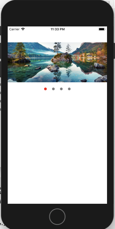
<Image source={{uri: 'https://image.shutterstock.com/image-photo/beautiful-autumn-scene-hintersee-lake-260nw-747646759.jpg'}} style={{height: 200, width}}/>
</View>
<View style={styles.viewBox}><Text>TWO</Text></View>
<View style={styles.viewBox}><Text>THREE</Text></View>
<View style={styles.viewBox}><Text>FOUR</Text></View>
</>
}
style={styles.slider} //Main slider container style
height = {200} //Height of your slider
slideCount = {4} //How many views you are adding to slide
dots = {true} // Pagination dots visibility true for visibile
dotActiveColor = 'red' //Pagination dot active color
dotInactiveColor = 'gray' // Pagination do inactive color
dotsContainerStyle={styles.dotContainer} // Container style of the pagination dots
autoSlide = {true} //The views will slide automatically
slideInterval = {1000} //In Miliseconds
/>
</>
);
};
const styles = StyleSheet.create({
viewBox: {
paddingHorizontal: 20,
justifyContent: 'center',
width: width,
padding: 10,
alignItems: 'center',
height: 150
},
slider: {
alignSelf: 'center',
justifyContent: 'center',
alignItems: 'center',
backgroundColor: 'pink'
},
dotContainer: {
backgroundColor: 'transparent',
position: 'absolute',
bottom: 15
}
});
export default App;
Props
- renderSlides : Views/sliders content
- style : slider container style[ Full customize your slider container with style prop ]
- height : Your slider height
- slideCount : Number of slides you are giving [Required]
- dots : default false [If you want the slider dots to be shown set it to true]
- dotActiveColor : active dot color
- dotInactiveColor : Inactive dot color
- dotsContainerStyle
- autoSlide : The views will slide automatically
- slideInterval : In Miliseconds