README
@denkschuldt/react-dialog
A simple to use and customizable react dialog implementation.
Installation
# NPM
$ npm install --save @denkschuldt/react-dialog
| Version | Compatibility |
|---|---|
| 1.x | React ˆ16.8+ |
Basic usage
import ReactDOM from 'react-dom';
import React, { useState } from 'react';
import Dialog from '@denkschuldt/react-dialog';
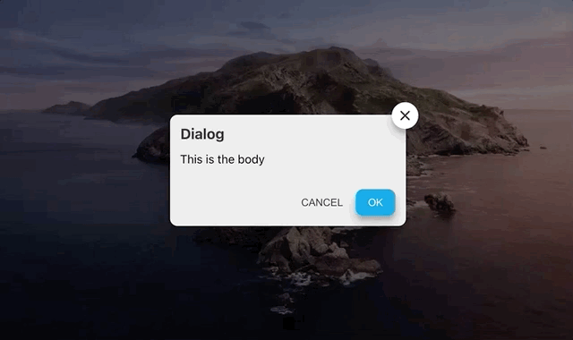
const App = () => {
const [ isVisible, setIsVisible ] = useState(false);
return (
<div>
<button
type='button'
onClick={() => setIsVisible(true)}>
Show dialog
</button>
{
isVisible &&
<Dialog
title='Dialog'
onCancelClick={() => {}}
onConfirmClick={() => {}}
onCloseClick={() => setIsVisible(false)}>
<span>
This is the body
</span>
</Dialog>
}
</div>
);
}
ReactDOM.render(<App/>, document.getElementById('root'));
See more examples at @DenkSchuldt/react-dialog
Props
| Name | Type | Required | Description | Default |
|---|---|---|---|---|
| width | Number | Dialog width | ||
| height | Number | Dialog height | ||
| title | String | Dialog title | ||
| draggable | Boolean | Allows dialog drag | true | |
| className | String | Component class to override styles | ||
| slideIn | String | Initial animation: top, bottom, left, right | ||
| cancelableOutside | Boolean | Whether the dialogs closes by clicking outside or not | false | |
| closeOnEscPress | Boolean | Whether the dialogs closes by pressing escape | false | |
| hideCloseButton | Boolean | Hides the close button | false | |
| onCloseClick | function | :white_check_mark: | Close button click function | |
| cancelText | String | Negative button text | 'CANCEL' | |
| onCancelClick | function | Negative button click function | ||
| cancelDisabled | Boolean | Negative button disabled prop | false | |
| confirmText | String | Positive button text | 'OK' | |
| onConfirmClick | function | Positive button click function | ||
| confirmDisabled | Boolean | Positive button disabled prop | false |
Styling
Use the className prop to override dialogs classes:
.your-css-class {
  .dnk-dialog-content {
    /* The dialog card */
    .dnk-dialog-close {
      /* The close button */
    }
    .dnk-dialog-body {
      .dnk-dialog-body-buttons {
        /* The buttons div container */
        button {
          /* cancel button */
          &.dnk-btn-primary {
            /* confirm button */
          }
        }
      }
    }
  }
}
Contributing
- Fork the project
- Make changes and include tests
- Update README, CHANGELOG with detailed info
- Send me a PR :bowtie:
License
MIT