README
Official N1ED React component
Create and edit HTML content with powerful visual page builder based on TinyMCE 5
Q: What can be better than TinyMCE 5?
A: TinyMCE 5 + free set of widgets, custom templates, modern UI, Flmngr file manager, ImgPen image editor and visual configuration: N1ED.
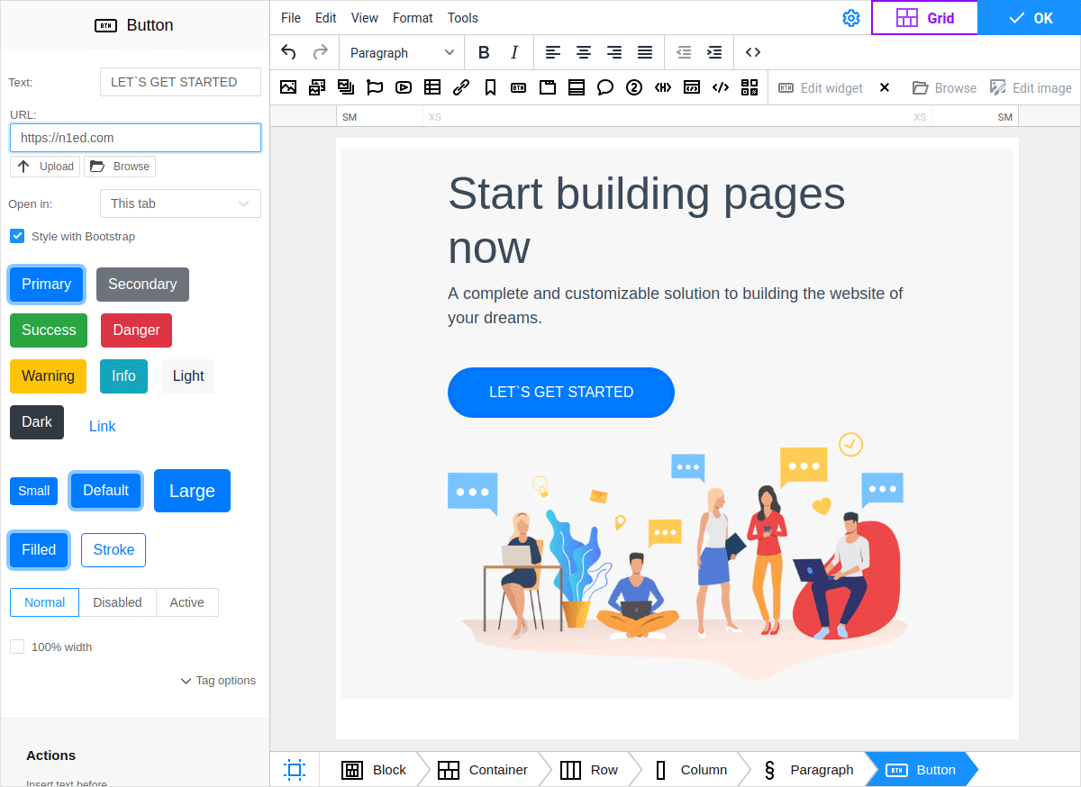
This module will help to integrate N1ED (bundled TinyMCE 5 + all required free add-ons which power up it) into your React app.
Install
With npm installed, run
$ npm install --save @edsdk/n1ed-react
Usage
Here is an example of usage of TinyMCE + N1ED in your React component. This is JS sample, see links below for TypeScript one.
You can remove init parameter in case you do not wish to pass any custom config into TinyMCE. In this example we use it to define a custom toolbar and create inside it a custom TinyMCE button in order to show how to work with basic TinyMCE features from N1ED.
import React from 'react';
import {N1ED} from '@edsdk/n1ed-react';


class YourReactComponent {

    handleEditorChange(content, editor) {
        console.log('Content was updated:', content);
    };

    render() {

        return <div>
            Edit the content:
            <N1ED
                apiKey="REACDFLT" // you will use your own key later
                initialValue="<p>N1ED react demo</p>"
                onEditorChange={this.handleEditorChange}

                init={{
                    height: 500,
                    toolbar: 'undo redo | styleselect | bold italic | alignleft aligncenter alignright alignjustify | outdent indent | myCustomToolbarButton',
                    setup: (editor) => {
                        console.log("TinyMCE initialized");
                        editor.ui.registry.addButton('myCustomToolbarButton', {
                            text: 'My Custom Button',
                            onAction: () => alert('Custom button clicked!'),
                        });
                    },
                }}
            />
        </div>;

    }

}
All the attributes of <N1ED> element are described in offical TinyMCE React docs.
The only difference is:
apiKeyattribute here is related not to TinyMCE Cloud, but to N1ED cloud and is optional until you need to visually configure it or add some other add-on from N1ED Ecosystem.N1ED has 3 own UI modes (Classic, FullScreen and Dialog).
You do not need to define
pluginsparameter withN1EDvalue: it is already defined until you specify something another.
Examples
We have two examples how to use N1ED React component:
Technical details
@edsdk/n1ed-react uses @tinymce/tinymce-react module inside and delegates all calls to TinyMCE, except some special actions it does for initialization of correct environment related to connection with dinamyc CDN (which makes possible configuring your N1ED+TinyMCE instance visually online using Dashboard).
TypeScript support
This module is written with TypeScript and can be used in both JS and TS projects. You do not need to install typings separately, they are built in the project.
License
This module is released under LGPL v3 and free to use in your projects. N1ED itself is also free product.