README
React Tag Input

A lean, easily customizable, tag input React component.
Installation
npm i @eidellev/react-tag-input

# or
yarn add @eidellev/react-tag-input
Usage
Import styles
/* In your stylesheet */
@import '@eidellev/react-tag-input/dist/index.css';
Import component
import TagInput from '@eidellev/react-tag-input';
...
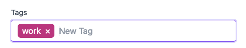
<TagInput value={tags} onChange={onChange} colorize placeholder="New Tag" options={suggestions} />
Props
value(string[]) - The current valueoptions(string[]) - A list of suggestionscolorize(boolean) - Should each tag be assigned a unique background colorplaceholder(string) - Placeholder textcompleteKeys(string[]) - A list of keys that trigger tag completion (the default areEsc,Enterand,)onChange(function) - A callback that will be called when a tag is added or removed
Customizing Styles
If you would like to apply your own design, there is no need to import the default styles. Simply add your own styles to the built-in classes:
.tag-input {
  /* ... */
}

.tag-input .tag {
  /* ... */
}

.tag-input .tag .remove-tag-button {
  /* ... */
}

.tag-input .new-tag {
  /* ... */
}
For example, this is how we can style the component with TailwindCSS:
.tag-input {
  @apply w-full bg-white rounded border border-gray-300  focus-within:border-purple-500 focus-within:ring-2 focus-within:ring-purple-200 text-base outline-none py-1 px-3 leading-8 transition-colors duration-200 ease-in-out text-white;
}

.tag-input .tag {
  @apply px-2 py-1 rounded-md mr-2;
}

.tag-input .tag .remove-tag-button {
  @apply ml-2;
}

.tag-input .new-tag {
  @apply focus:border-0 focus:outline-none text-gray-700;
}