README
Unobtrusive Vue
This package is a thin abstraction layer over the Vue.js v2.6 rendering engine, so it can be used in a completely unobtrusive way, i.e. it won't surface in the JavaScript or HTML code at all. You're now free to take whatever design decisions you want.
Getting started
This project is available as the npm package https://www.npmjs.com/package/@halleymedia/unobtrusive-vue.
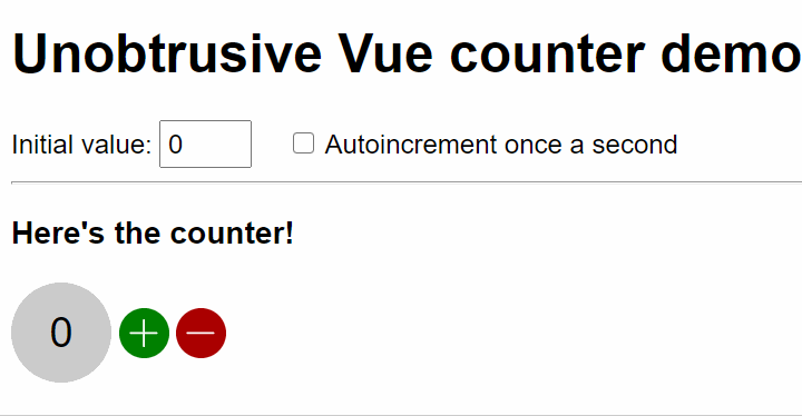
A simple demo application is available on GitHub, please review it. https://github.com/Halleymedia/unobtrusive-vue/tree/master/sample
const container = document.querySelector('[data-app]');
const appOptions = {
  isDev: true,
  onAppCreating: (vue, components) => console.log(vue, components),
  onComponentUpdated: (componentDescriptor) => console.log(componentDescriptor),
  onComponentCreating: (componentDescriptor, componentPropertyBag) => { componentPropertyBag.title = () => 'Hello unobtrusive Vue!'; },
  errorHandler: (err, component, info) => console.error(err, component, info),
  warnHandler: (err, component, info) => console.warn(err, component, info)
};
const componentConstructorParams = { foo: 'bar' }; // Each component will get this object in its constructor
const app = new UnobtrusiveVueApp(container, componentConstructorParams, appOptions);
Why unobtrusive
If you take a look at the Vue.js v2 documentation, you'll bump into code like this.
var app5 = new Vue({
  el: '#app-5',
  data: {
    message: 'Hello Vue.js!'
  },
  methods: {
    reverseMessage: function () {
      this.message = this.message.split('').reverse().join('')
    }
  }
})
This way of doing things looks artificial and tightly coupled to Vue.js itself and the DOM. We believe the application logic should be freed from any framework convention. What if we could, instead, express data as simple properties and methods as... well, methods of an ES6 class?
Imagine we could rewrite the previous code in a more idiomatic way.
import { component } from '@halleymedia/unobtrusive-vue'
import template from './my-component.html' //use webpack for this, see sample

@component('my-component', template)
export default class MyComponent {
  message = 'Hello Unobtrusive!' // A simple property

  reverseMessage () { // A method
    this.message = this.message.split('').reverse().join('')
  }
}
Now there's no trace whatsover of any JavaScript framework being used. It's just simple, natural and readable JavaScript code we can easily unit test. Any developer who knows how to write basic ES6 code can now take part in the project without actually having to read the Vue.js manual beforehand.
This package takes the burden of mapping ES6 classes to Vue.js convetions.
- Public properties are
data. Use these for two-way binding with input elements; - Public getters are mapped to
computedto Vue.js; - Public setters are mapped to component properties (or
propsas Vue.js calls them); - Public methods are... well, mapped to
methods; - Private members are not mapped at all. Feel free to use them to store internal state of a component.
The View
Just use the moustache syntax everywhere:
<button type="button" title="{{ message }}" onclick="{{ reverseMessage() }}">{{ message }}</button>
Again, there's no trace of a framework being used.
Use the special attribute render-if when you want to dynamically render an HTML element.
<div render-if="{{loading}}">loading</div>
And use the attribute render-for when you want to repeat an HTML element. The $index and $item variables will be automatically made available in this context.
<ul>
  <li render-for="{{ results }}">
    <span>{{ $index }}</span>. <span>{{ $item }}</span></li>
  </li>
</ul>
The moustached binding also works two-way for input elements:
<input type="text" value="{{ query }}">
The query property is updated as soon as the user types a character. In case you wanted to execute some code when the user stops typing, just bind a function to the onchange or onblur event handlers.
<input type="text" value="{{ query }}" onchange="{{ performSearch() }}">
This package aims at simplicity and it intentionally does without more advanced features of Vue.js. Developers can now spend more time on the project, instead of wasting time on a framework documentation.
Slotted components
Components can have a default slot and any number of named slots by using the HTML specification. Define some <slot> elements in your view component
<div class="modal-dialog">
  <div class="modal-body">
    <slot></slot>
  </div>
  <footer class="modal-dialog-toolbar">
    <slot name="toolbar">
    </slot>
  </footer>
</div>
And then, use the component like this. The <h2> and <p> elements will be added to the default slot, while the <button> element will be added to the toolbar named slot.
<modal-dialog>
  <h2>Attention!</h2>
  <p>This is the modal body</p>
  <slot name="toolbar">
    <button onclick="{{ closeModal() }}">Close</button>
  </slot>
</modal-dialog>
Component life-cycle
Components are notified when they are mounted in the DOM and when they are detached. You may create the init and dispose methods for this.
/**
 * @param {HTMLElement} element
 */
init (element) {
  // Component has been mounted in the DOM
  // Do something with element
}

dispose () {
  // Component has been detached, perform some cleanup here
}
As you can see, the init method receives a reference to the component root element. You now have full access to its APIs.
Dynamic components
You can dynamically create a component instance just by passing its name to a is attribute. In case you also need to pass a parameter object, then also add a data-with-is-* attribute. In this case, data-with-is-params is used.
<div is="{{ componentName }}" data-with-is-params="{{ componentParams }}"></div>
The component will then receive the parameters via a property setter by the same name, e.g. params in this case.
/**
 * @param {any} value
 */
set params (value) {
  console.log(value);
}
Only one data-with-is-* attribute can be used at this time. Wrap all parameters in a single object, in case you need to pass more than one.
Handling events
Custom component setters/attributes starting with on are meant to be events. In the component:
/**
 * @param {function|undefined} callback
 */
set onselect (callback) {
  // save callback to a private field so you can invoke it later
}
While on the view side, you can handle the event like this.
<my-component onselect="{{ doSomething(args) }}" />
The args identifier contains a reference to the arguments array provided by the caller. Or, if you just need the first of those arguments you could do:
<my-component onselect="{{ doSomething(value) }}" />
The value identifier references the first of those arguments, if present, otherwise it's undefined.
If, instead, you're subscribing an event of a HTML element, then you can use the event identifier which is a reference to Vue's $event object.
<button type="button" onclick="{{ doSomething(event) }}">Do something</button>
Template transformations
The moustached syntax is converted to Vue.js conventions. Template transformation is done with by the @component decorator at runtime but, since it might be slow with lots of components, it's preferred to do it beforehand, at compile time. Here's an example on how to do it with webpack using the html-loader and its preprocessor option (see ./sample/webpack.config.babel.js).
import { templateTransformer } from '@halleymedia/unobtrusive-vue'
//...
module: {
  rules: [
    {
      test: /\.html$/i,
      loader: 'html-loader',
      options: {
        attributes: {
          root: path.resolve(__dirname, '.')
        },
        minimize: {
          removeAttributeQuotes: false
        },
        preprocessor: (content) => templateTransformer.transform(content, { preserveWhitespace: false })
      }
    }
  ]
}
Style guidance
You must:
Name your custom components using one or more hyphens
-, e.g.my-componentand notmycomponent. See the valid custom element name in the HTML specification;Add only one root HTML node in each component.
You may:
- Self-close custom components, even if Vue recommends against it.
You should:
Use ES6 class
propertiesfor two-way data binding andgettersfor one-way data binding since properties are publicly writable, while getters are not;Use lowercase for custom component events e.g. use
onclickand noton-clickoronClick.NOT use the
classattribute with moustached syntax because it would compromise readability. Instead, keep things simple: use individualdata-*attributes named as you like e.g.<my-component data-is-hidden="{{ isHidden }}">Thing</my-component>Then, add this selector to your (S)CSS file:
div[data-hidden] { display: none }There's no performance penalty in using
data-*attributes as selectors so there's really no need to use dynamic CSS classes;As expected,
data-*attributes are removed when you bind them to a booleanfalsevalue.NOT use
render-ifon a component root element because, if you do, you won't get a properHTMLElementas an argument to theinitfunction. Vue.js replaces it with a comment when an element is not to be rendered.
Notes
All attributes on custom components elements, even known HTML attributes such as
titleandhrefare treated as component properties and they're not carried over to the root HTML element in the child component. There's an exception to that:data-*attributes, which you're free to (ab)use as you like.Each component should be the only responsible of defining its own HTML elements and their attributes. This will reduce code duplication.
Form
submitevents are always prevented.
App lifecycke hooks
(Optionally) Pass these to the UnobtrusiveVueApp constructor.
onAppCreatingfires when components have been created but just before Vue is instanced. It gives an opportunity to register components with the vue-hot-reload-api for Hot Module Replacement;onComponentUpdatedfires when after the Hot Module Replacement reloads changed component files. It gives an opportunity to make the vue-hot-reload-apireloadorrerendera component;onComponentCreatingallows you to add computed functions to a component. Useful to expose values to each component instead of using global variables.
Hot Module Replacement
This package support the live reload of components, such as the Hot Module Replacement feature of Webpack. Components can be rerendered (in case just the template changes, which will preserve state) or completely reloaded. See the sample on how to use with Webpack 5.
Dev tools
You're free to use the Vue.js devtools, if you want. Just set isDev: true when you're creating the UnobtrusiveVueApp instance.
You can also provide a custom errorHandler and warnHandler. If omitted, warning and errors will be logged in the console as expected.
Batteries not included (so you can bring the most appropriate ones for your project)
Vue.js is used here just as a rendering engine. You'll have to bring your own router and event bus, if needed in your application.
Coding style
This project follow the JavaScript Semi Standard Style. Click the banner to learn more about it.
Changelog
v1.8.1
- Bugfix: multiple spaces in a tag element would break template transform.
v1.8.0
- Getter properties of an object are now also exposed as instance properties, so that Vue can find and observe them.
v1.7.3
- Form submit events are also stopped and not just prevented.
v1.7.2
- Fix error: do not attempt to make null values observable.
v1.7.1
- Fix: accidental conversion to number when passing a guid or other non-numeric string via custom components attribute.
v1.7.0
- The
initmethod can beasync: the UI will also be automatically updated when the operation completes; - Fix: setters now trigger a UI update even when you set a value yourself.
v1.6.6
- Add a
preverseWhiteSpace: booloption to the template transformer.
v1.6.5
- Fix: complex objects returned by getters are now Vue observables.
v1.6.4
- Fix: property setters are now invoked on
beforeMount, i.e. before component rendering takes place.
v1.6.3
- Fixed a bug which would prevent component constructor parameters to be passed to hot-reloaded instances.
v1.6.2
- The
eventidentifier is now available in all event handlers. Custom components also get theargsandvalueidentifiers which are reference to - respectively - all arguments and the first argument (if any).
v1.6.1
- Added hooks
onAppCreating,onComponentCreatingandonComponentUpdated. Sample updated with Hot Module Replacement with Webpack. - Also added options for
errorHandlerandwarnHandler. If omitted, warning and errors will be logged in the console as expected; - Set
isDevto true to enable support for Vue dev tools.
v1.5.4
- Fix incorrect transformations for element names with multiple dashes;
- Component setters are no longer invoked when the custom element is missing the attribute;
- Add support for numbers in custom attribute names.
v1.5.3
- Prop object values are now Vue observables.
v1.5.1
- Fix transformer issue with the
data-with-is-*attribute.
v1.5.0
- Add support for dynamic components via the
isanddata-with-is-*attributes.
v1.4.2
- You can now add a
data-objectattribute to the app root element, in case you need to provide some data to the root component. Its value should be serialized as a JSON object.
<div data-myapp data-object="{"value": false}"></div>
v1.4.1
- Fixes to documentation and sample.
v1.4.0
- Added support for self-closing components.