README
Language selector menu for React
A flexible language selector component for React, where you can change the format and the look with many options. The actual state is stored in a context, whose value can be used in other parts of the project.
Part of the @kekalma component family.
Usage examples
The following simple code example demonstrates the use of the language selector, with separate (optional) context and an event handler function.
You should use at least one of context or onLanguageChange properties.
App.tsx
The <LanguageSelector> component can be placed into an <ul> element, as it produces a list item.
import React,{useState} from 'react'
import {LanguageSelector as Language, emptyLanguage} from '@kekalma/language-selector'
import type { languageType } from '@kekalma/language-selector'
import { languageContext } from './context'
import Info from './Info'
import { languages } from './languageList'

export default function App() {
  const [selectedLanguage, setSelectedLanguage] = useState<languageType>(emptyLanguage);
  const changeHandler = (newLang: languageType, oldLang: languageType) => {
    console.log("The language has been changed: ", oldLang.name, " -> ", newLang.flag)
  }
  return (
    <languageContext.Provider value={{language: selectedLanguage, setLanguage: setSelectedLanguage}}>
    <Info context={languageContext}/>
    <ul>
      <Language
          languages={languages}
          selectedLanguageFlag="us"
          context={languageContext}
          onLanguageChange={changeHandler}
      />
    </ul>
      <Info/>
    </languageContext.Provider>
  )
}
languageList.ts
import React from 'react'
import type { languageType } from '@kekalma/language-selector'

export const languages: languageType[] = [
  { "code": "hu","name": "Hungarian" },
  { "code": "de","name": "German" },
  { "code": "en","name": "US English","flag": "us" },
  { "code": "en","name": "British English","flag": "gb" },
  { "code": "fr","name": "French" }
]
Note the use of the 'flag' property. It is only necessary, if the same language may be used with a different flag from country to country. The flag is the key, it should be unique!
context.ts
import React, {createContext} from 'react'
import type {languageType, languageContextType } from '@kekalma/language-selector'
import {emptyLanguage } from '@kekalma/language-selector'

export const languageContext = createContext<languageContextType>({
  language: emptyLanguage,
  setLanguage: (value: languageType):void =>{}
})
info.tsx
In this component you get an example, how to use the value from the context.
import React, {useContext} from 'react'
import { languageContext } from './context'
import {languageContextType} from '@kekalma/language-selector'

type myProps = { context: React.Context<languageContextType> }

export default function Info(props : myProps) {
  const { language : selectedLanguage } = useContext(props.context)
  return (
    <span style={{margin: "0 5px"}}>Selected language: {selectedLanguage.name} ({selectedLanguage.code}_{selectedLanguage.flag})</span>
  )
}
The currently selected value is stored in the following format (languageType):
{
  code: string,   // ISO language code (2 chars)
  name: string,   // Language name
  flag: string    // Flag code (2 chars)
}
Property parameters
Only the bold properties are obligatory, all others are optional, but you should use one of context or onLanguageChange.
| property | format | Description |
|---|---|---|
| languages | languageType[ ] | (Required) The JSON list of the languages, defined in the example file above. |
| selectedLanguageFlag | flagCodeType | The initialy selected language. Default: first item.flagCodeType: The string literal values of useable flag codes. |
| context | React.Context <languageContextType> |
Required. The context, to store the state and the handler. See the above example for the format. |
| onLanguageChange | Function (newLanguage: languageType, oldLanguage: languageType) |
The callback function for the change event. It is called with two parameters, holding the new and the old language objects. |
| titleFormat | string | A definition of the freely formatted label text, put together with \|Flag\| \|Name\| \|Code\| \|FlagCode\| placeholder, where Flag represents the flag icon. |
| menuFormat | string | - same as the above - |
| align | left - left alignedright - right alignedcenter - centeredauto - automaticaly aligned right if it is the last item in the listcenter auto - center aligned, but automaticaly aligned right if it is the last item in the list |
|
| format | dropdown : classic dropdown menudropdown-ordered : dropdown, but the currently selected item is not listed flat : the selectable items appear in a row, under the title flat-reverse : same as the previous, but right alignedlinear : the items are shown permanently in a rowlinear-ordered : same as before, but the selected item comes first in the listhorizontal : same as the previous, but the list is shown only upon hoverhorizontal-reverse : same as the previous, but right aligned |
|
| titleFont | string | CSS font type, like "1rem bold Verdana" |
| titleFontColor | string | CSS font color, like "#11F" |
| titleFontColorHover | string | CSS font color during hover |
| titleBgColor | string | CSS background color |
| titleBgColorHover | string | CSS background color during hover |
| titleFlagSize | number | The size of the flag icon in pixels (without any dimension) |
| menuFont | string | CSS font type for the menu items |
| menuFontColor | string | CSS font color |
| menuFontColorHover | string | CSS font color during hover |
| menuFontColorSelected | string | CSS font color of the currently selected item |
| menuBgColor | string | CSS background color for the menu items |
| menuBgColorHover | string | CSS background color for the menu items during hover |
| menuBgColorSelected | string | CSS background color for the currently selected menu item |
| menuFlagSize | number | The size of the flag icon in pixels (without any dimension) |
| menuStyleSelected | CSSProperties | Inline CSS definition for the currently selected menu item |
| titleStyle | CSSProperties | Inline CSS definition for the title |
| menuStyle | CSSProperties | Inline CSS definition for the list items |
| style | CSSProperties | Global inline CSS definiton object |
Exported items:
| exported item | type | description |
|---|---|---|
| languageProps | type | All the properties listed above. |
| languageContextType | type | Context type definition. |
| languageType | type | Type holding the language properties: code, name, flag. |
| flagCodeType | type | The string literal values of useable flag codes. |
| emptyLanguage | object | The type languageType with empty values. |
| getLanguageByCode | function | Usage: getLanguageByCode(languages: languageType[], code: flagCodeType): languageType Input: Use the array from props.languages and the 2 character language or flag ISO code as flagCodeType.Return: An object of type languageType or if the code is not found, the emptyLanguage. |
Format examples with property code samples:
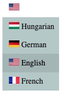
dropdown:
titleFormat="|Flag| |Name|"
menuFormat="|Flag| |Name| (|Code|_|FlagCode|)"
format="dropdown"
align="left"
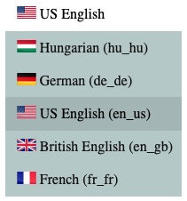
dropdown-ordered:
titleFormat="|Flag| |Name|"
menuFormat="|Flag| |Name|"
format="dropdown-ordered"
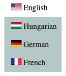
flat:
titleFormat="|Flag| |Name|"
menuFormat="|Flag| |Name|"
format="flat"

titleFormat="|Flag| |Name|"
menuFormat="|Flag| |Name|"
format="flat-reverse"
align="right"

titleFormat="|Flag| |Name|"
menuFormat="|Flag| |Name|"
format="flat"
align="center"
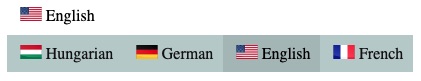
linear:

titleFormat="|Flag| |Name|"
menuFormat="|Flag| |Name|"
format="linear-ordered"
## __`Changelog:`__
| Version | What's new, description |
|---|---|
| 1.0.0 | First official, working release. |
| 1.0.1 | Exporting the function getLanguageByCode and the type flagCodeType |
License
MIT © kissato70