README
Globals Controls Storybook Addon
Sometimes your design is built to scale among various projects and needs to set some customizations between those. In these cases, you might want to set variables in the global context to configure your components in the specific way needed for a particular project. It is also a good idea to develop the design components checking possibles pre configurations that apply to them.
For these, Globals Controls addon gives you the same graphical UI as Storybook Controls, but to dynamically interact with the Storybook's globals variables.
Getting Started
Install Globals Controls Storybook Addon using:
yarn add -D @luigiminardim/storybook-addon-globals-controls
Then, add following content to .storybook/main.js:
module.exports = {
  addons: ['@luigiminardim/storybook-addon-globals-controls'],
};
Usage
In your .storybook/preview.js export the global types in the same API you set the argTypes. Check
Storybook's official documentation for controls annotation
to see the control API.
You can also set the preset colors using the same API as in the standard Storybook Controls.
Although is not necessary, to use the global variables, we recommend using the exported decorator withGlobals.
Example:
// .storybook/preview.js
import { withGlobals } from "@luigiminardim/storybook-addon-globals-controls";
export const globalTypes = {
uncontrolled: {
name: "Uncontrolled",
description: "Should not have any controls.",
},
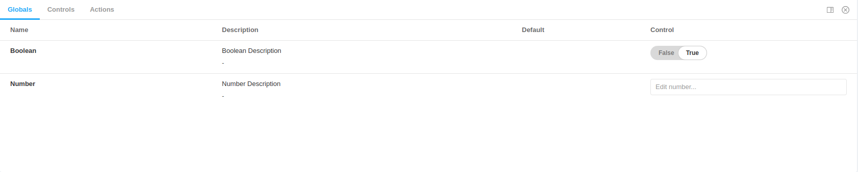
boolean: {
name: "Boolean",
description: "Boolean Description",
defaultValue: true,
control: { type: "boolean" },
},
number: {
name: "Number",
description: "Number Description",
defaultValue: 8,
control: { type: "number", min: 6, max: 10, step: 2 },
},
};
export const parameters = {
globalsControls: {
presetColors: [
{ color: "#ff4785", title: "Coral" },
"rgba(0, 159, 183, 1)",
"#fe4a49",
],
},
};
const withDisplayGlobals = withGlobals((Story, globalValues) => (
<div>
{JSON.stringify(globalValues, null, 2)}
<Story />
</div>
));
export const decorators = [withDisplayGlobals];
NOTE: The controls only work for parameters marked with the
controlattribute, as in (control: {type: 'text'}).
Contribute
Contribute to this addon by forking the main branch and sending pull requests, you can
also start an issue in the repo for help or to request new features.