README
🥢 React Select Zero

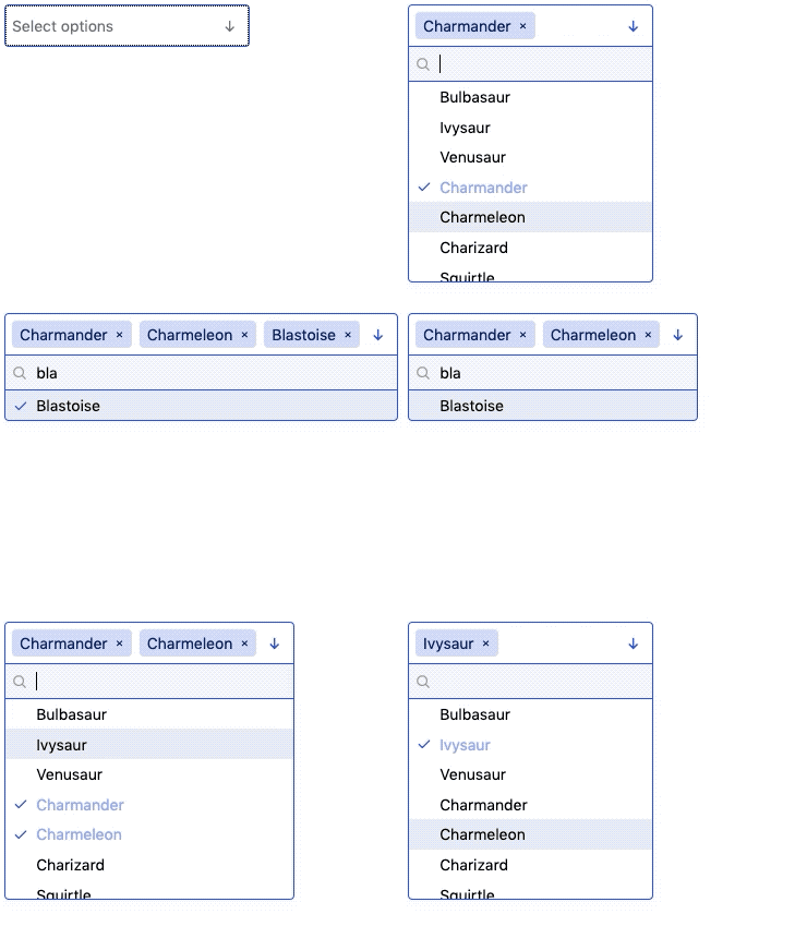
Lightweight, accessible, zero-dependency combobox alternative to
react-select. Supports single selection, multiselection,
search, and full keyboard controls in a handsome 5 KB component (1.8 KB
gzipped).
Comparison
react-select-zero sheds most of its weight through zero dependencies, but it
also gets a boost from React Hooks, modern JS, and leveraging HTML and
browser functionality wherever possible rather than JS logic (e.g.:
<button>s are used in many places, which don’t require enter and
space keybindings—only an onClick callback).
| Name | Minified | Minified + gzip |
|---|---|---|
@manifoldco/react-select-zero |
🔥5 KB🔥 |
1.8 KB |
@zendeskgarden/react-selection@6.0.1 |
26.6 KB |
6.6 KB |
downshift |
21.9 KB |
7.1 KB |
rc-select |
164.3 KB |
46.3 KB |
react-select |
86.6 KB |
26.1 KB |
🍚 Usage
npm i @manifoldco/react-select-zero
Basic usage
const [selection, setSelection] = useState([]);

return (
  <Select
    name="pokemon"
    options={['Bulbasaur', 'Charmander', 'Squirtle']}
    onChange={setSelection} // ['Bulbasaur']
    value={selection}
  >
    Select a Pokémon
  </Select>
);
Note: onChange always returns an array, even in single selection mode.
Multi selection
const [selection, setSelection] = useState([]);

return (
  <Select
    multi
    name="pokemon"
    onChange={setSelection}
    options={['Bulbasaur', 'Charmander', 'Squirtle']}
    value={selection}
  >
    Select a Pokémon
  </Select>
);
Set initial selection
const [selection, setSelection] = useState(['Bulbasaur']);

return (
  <Select
    name="pokemon"
    onChange={setSelection}
    options={['Bulbasaur', 'Charmander', 'Squirtle']}
    value={selection}
  >
    Select a Pokémon
  </Select>
);
Hide search (shown by default)
const [selection, setSelection] = useState([]);

return (
  <Select
    noSearch
    name="pokemon"
    onChange={setSelection}
    options={['Bulbasaur', 'Charmander', 'Squirtle']}
    value={selection}
  >
    Select a Pokémon
  </Select>
);
Note: search won’t appear if there are fewer than 5 items
Allow creation of new entry (works for single and multi)
const [selection, setSelection] = useState([]);

return (
  <Select
    name="pokemon"
    options={['Bulbasaur', 'Charmander', 'Squirtle']}
    allowCreate
    onChange={setSelection} // ['Bulbasaur', 'Charmander', 'Squirtle', 'Missingno']
    value={selection}
  >
    Select a Pokémon
  </Select>
);
User-created values will appear in the same array. To determine new from
existing, you’ll have to scan the options you passed for any differences,
e.g.:
onChange={
  (newVal) => {
    const created = newVal.filter(val => !options.includes(val));
    const existing = newVal.filter(val => options.includes(val));
    setCreated(created);
    setExisting(existing);
  }
}
All Props
| Name | Type | Default | Description |
|---|---|---|---|
name |
string |
Required Form name of this input. Query this like a normal form input. Also assits in a11y. | |
onChange |
(string[]) => void |
Required Form callback called when state changes | |
options |
string[] |
Required Array of strings to display as options | |
value |
string[] |
Required Set selected values | |
allowCreate |
boolean |
false |
Set <Select allowCreate /> to allow creating new entries (note: noSearch can’t be set) |
max |
number |
Infinity |
Set maximum number of items (only works with multi) |
multi |
boolean |
false |
Set <Select multi /> to allow multiple selection |
noSearch |
boolean |
false |
Set <Select noSearch /> to hide searching (by default shows with > 5 options) |
placeholder |
string |
Specify placeholder text |
💅 Styling
This component ships with some lightweight styles to extend. Either import them like so:
import '@manifoldco/react-select-zero/assets/react-select-zero.css';
Or copy the CSS directly, and modify as you wish. There are some CSS variables you can overwrite to control colors & background images.
Alternatively, you can also use Styled Components or your favorite CSS-in-JS solution to extend the existing styles:
import styled from 'styled-components';
import Select from '@manifoldco/react-select-zero';

const StyledSelect = styled(Select)`
  /* overrides go here */
`;

<StyledSelect name="dropdown" options={options} />;
Accessibility
This component ships with the following accessibility features out-of-box:
- listbox role with
aria-expanded,aria-haspopup, andaria-multiselectableproperties - Focusable main input
- Keyboard ↓ opens dropdown when focused
- Keyboard ↑/↓ navigation through items
- Keyboard enter to select items
- Keyboard Home/End to jump to beginning/end of list
- Keyboard esc to close the combo box
- Searchable items
- Removal of multiselect items also fully keyboard-navigable
Using labels
This component doesn’t come with a label, but you can add one yourself! This
component will pass through any additional properties to the root element
that also has [role="listbox"].
import React from 'react';
import Select from '@manifoldco/react-select-zero';

const MySelect = () => (
  <>
    <label htmlFor="country" id="country-label"></label>
    <Select aria-labelledby="country-label" id="country" name="country" options={options} />
  </>
);