README
<mwc-menu> 
IMPORTANT: The Material Web Components are a work in progress and subject to major changes until 1.0 release.
Menus display a list of choices on temporary surfaces.
Material Design Guidelines: menus
Installation
npm install @material/mwc-menu
NOTE: The Material Web Components are distributed as ES2017 JavaScript Modules, and use the Custom Elements API. They are compatible with all modern browsers including Chrome, Firefox, Safari, Edge, and IE11, but an additional tooling step is required to resolve bare module specifiers, as well as transpilation and polyfills for IE11. See here for detailed instructions.
Example usage
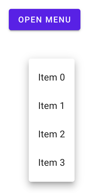
Basic
Note, mwc-menu internally uses
mwc-list,
so its main slot has the same interface as the main slot of a mwc-list.
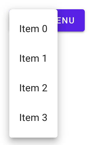
<div style="position: relative;">
  <mwc-button id="button" raised label="Open Menu"></mwc-button>
  <mwc-menu id="menu">
    <mwc-list-item>Item 0</mwc-list-item>
    <mwc-list-item>Item 1</mwc-list-item>
    <mwc-list-item>Item 2</mwc-list-item>
    <mwc-list-item>Item 3</mwc-list-item>
  </mwc-menu>
</div>

<script type="module">
  import '@material/mwc-menu';
  import '@material/mwc-list/mwc-list-item';

  // anchor must share a parent with menu that is `position: relative`
  menu.anchor = button;

  button.addEventListener('click', function (e) {
    menu.open = true;
    // alternatively you can use menu.show();
  });
</script>
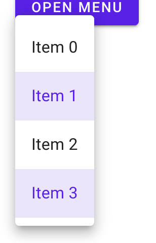
Activatable
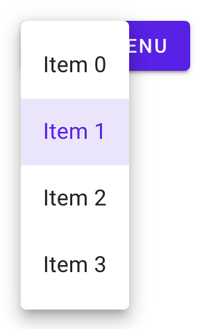
<div style="position: relative;">
  <mwc-button id="button" raised label="Open Menu"></mwc-button>
  <mwc-menu activatable id="menu">
    <mwc-list-item>Item 0</mwc-list-item>
    <mwc-list-item selected activated>Item 1</mwc-list-item>
    <mwc-list-item>Item 2</mwc-list-item>
    <mwc-list-item>Item 3</mwc-list-item>
  </mwc-menu>
</div>
Multi-selectable (activatable)
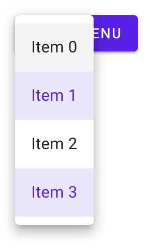
<div style="position: relative;">
  <mwc-button id="button" raised label="Open Menu"></mwc-button>
  <mwc-menu activatable multi id="menu">
    <mwc-list-item>Item 0</mwc-list-item>
    <mwc-list-item selected activated>Item 1</mwc-list-item>
    <mwc-list-item>Item 2</mwc-list-item>
    <mwc-list-item selected activated>Item 3</mwc-list-item>
  </mwc-menu>
</div>
Absolute
<!--
  Note: no position: relative; This will make x and y relative to whatever
  ancestor is position: relative;
-->
<div>
  <mwc-button id="button" raised label="Open Menu"></mwc-button>
  <mwc-menu absolute x="50" y="100" id="menu">
    <mwc-list-item>Item 0</mwc-list-item>
    <mwc-list-item>Item 1</mwc-list-item>
    <mwc-list-item>Item 2</mwc-list-item>
    <mwc-list-item>Item 3</mwc-list-item>
  </mwc-menu>
</div>
<!-- No anchor associated -->
Fixed
<div>
  <mwc-button id="button" raised label="Open Menu"></mwc-button>
  <mwc-menu fixed id="menu">
    <mwc-list-item>Item 0</mwc-list-item>
    <mwc-list-item>Item 1</mwc-list-item>
    <mwc-list-item>Item 2</mwc-list-item>
    <mwc-list-item>Item 3</mwc-list-item>
  </mwc-menu>
</div>
<script type="module">
  import '@material/mwc-menu';
  import '@material/mwc-list/mwc-list-item';

  menu.anchor = button;

  button.addEventListener('click', function (e) {
    menu.open = true;
    // alternatively you can use menu.show();
  });
</script>
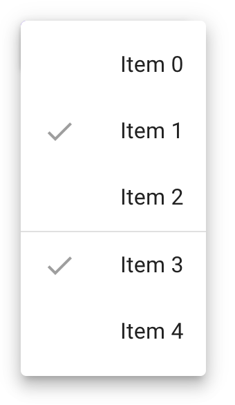
Selection Groups
Adding a group to your mwc-list-items will associate them with other
[mwc-list-item]s in the same group and make selection function similarly to
a radio group.
<style>
  /* Hide the icon of unselected menu items that are in a group */
  #menu > [mwc-list-item][group]:not([selected]) [slot="graphic"] {
    display: none;
  }
</style>
<div style="position:relative;">
  <mwc-button id="button" raised label="Open Menu"></mwc-button>

  <mwc-menu multi id="menu">
    <mwc-list-item group="a" graphic="icon">
      <mwc-icon slot="graphic">check</mwc-icon>
      <span>Item 0</span>
    </mwc-list-item>
    <mwc-list-item group="a" graphic="icon" selected>
      <mwc-icon slot="graphic">check</mwc-icon>
      <span>Item 1</span>
    </mwc-list-item>
    <mwc-list-item group="a" graphic="icon">
      <mwc-icon slot="graphic">check</mwc-icon>
      <span>Item 2</span>
    </mwc-list-item>
    <li divider role="separator"></li>
    <mwc-list-item group="b" graphic="icon" selected>
      <mwc-icon slot="graphic">check</mwc-icon>
      <span>Item 3</span>
    </mwc-list-item>
    <mwc-list-item group="b" graphic="icon">
      <mwc-icon slot="graphic">check</mwc-icon>
      <span>Item 4</span>
    </mwc-list-item>
  </mwc-menu>
</div>
Styled
mwc-menu internally uses
mwc-list,
and all CSS custom properties exposed by mwc-list apply here as well.
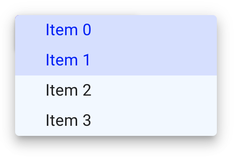
<style>
  #menu {
    --mdc-menu-min-width: 200px;
    --mdc-menu-item-height: 30px;
    --mdc-theme-surface: aliceblue;

    /* inherits the styles of mwc-list internally */
    --mdc-theme-primary: blue;
    --mdc-list-vertical-padding: 0px;
    --mdc-list-side-padding: 30px;
  }
</style>
<div style="position: relative;">
  <mwc-button id="button" raised label="Open Menu"></mwc-button>
  <mwc-menu activatable multi id="menu">
    <mwc-list-item selected activated>Item 0</mwc-list-item>
    <mwc-list-item selected activated>Item 1</mwc-list-item>
    <mwc-list-item>Item 2</mwc-list-item>
    <mwc-list-item>Item 3</mwc-list-item>
  </mwc-menu>
</div>
API
Slots
| Name | Description |
|---|---|
| default | Content to display in the menus internal <mwc-list> element. |
mwc-menu internally uses
mwc-list,
so the default slot has the same interface as the default slot of mwc-list.
Properties/Attributes
| Name | Type | Default | Description |
|---|---|---|---|
open |
boolean |
false |
Whether the menu should open and display. |
anchor |
HTMLElement\|null |
null |
Determines from which element the floating menu should calculate sizing and position offsets. In the default case, both mwc-menu and the anchor should share a parent with position:relative. Changing anchor typically requires absolute or fixed. |
corner |
Corner* |
"TOP_START" |
Corner of the anchor from which the menu should position itself. |
menuCorner |
MenuCorner** |
"START" |
Horizontal corner of the menu from which the menu should position itself. NOTE: Only horizontal corners are supported. |
quick |
boolean |
false |
Whether to skip the opening animation. |
absolute |
boolean |
false |
Makes the menu's position absolute which will be relative to whichever ancestor has position:relative. Setting x and y will modify the menu's left and top. Setting anchor will attempt to position the menu to the anchor. |
fixed |
boolean |
false |
Makes the menu's position fixed which will be relative to the window. Setting x and y will modify the menu's left and top. Setting anchor will attempt to position the menu to the anchor's immediate position before opening. |
x |
number\|null |
null |
Sets horizontal position when absolute. When given an anchor, sets horizontal position relative to anchor at given corner. Requires y not to be null. |
y |
number\|null |
null |
Sets vertical position when absolute. When given an anchor, sets vertical position relative to anchor at given corner. Requires x not to be null. |
forceGroupSelection |
boolean |
false |
Forces a menu group to have a selected item by preventing deselection of menu items in menu groups via user interaction. |
defaultFocus |
DefaultFocusState*** |
"LIST_ROOT" |
Item to focus upon menu open. |
fullwidth |
boolean |
false |
Sets surface width to 100%. |
stayOpenOnBodyClick |
boolean |
false |
Prevents the menu from closing when clicking outside the menu. |
wrapFocus |
boolean |
false |
Proxies to mwc-list's wrapFocus property. |
innerRole |
"menu"\|"listbox" |
"menu" |
Proxies to mwc-list's innerRole property. |
multi |
boolean |
false |
Proxies to mwc-list's multi property. |
activatable |
boolean |
false |
Proxies to mwc-list's activatable property. |
items |
ListItemBase[] (readonly) |
[] |
Proxies to mwc-list's items property. |
index |
MWCListIndex (readonly)**** |
-1 |
Proxies to mwc-list's index property. |
selected |
SelectedType (readonly)***** |
null |
Proxies to mwc-list's selected property. |
* Corner is equivalent to type
"TOP_LEFT"|"TOP_RIGHT"|"BOTTOM_LEFT"|"BOTTOM_RIGHT"|"TOP_START"|"TOP_END" |"BOTTOM_START"|"BOTTOM_END"
** Corner is equivalent to type "START"|"END"
*** DefaultFocusState is equivalent to type
"NONE"|"LIST_ROOT"|"FIRST_ITEM"|"LAST_ITEM"
**** MWCListIndex is equivalent to type number|Set<number>.
***** SelectedType is equivaalent to type ListItemBase|ListItemBase[]|null.
ListItemBase is the base class of mwc-list-item of which both
mwc-check-list-item and mwc-radio-list-item also inherit from.
Methods
| Name | Description |
|---|---|
show() => void |
Sets open to true. |
close() => void |
Sets open to false. |
select(index: MWCMenuIndex) => void |
Selects the elements at the given index / indices. |
getFocusedItemIndex() => number |
Returns the index of the currently-focused item. -1 if none are focused. |
focusItemAtIndex(index) => void |
Focuses the item at the given index and manages tabindex on all other items. |
layout(updateItems = true) => void |
Resets tabindex on all items and will update items model if provided true. It may be required to call layout if selectability of an element is dynamically changed. e.g. [mwc-list-item] attribute is removed from a list item or noninteractive is dynamically set on a list item. |
Events
| Event Name | Target | Detail | Description |
|---|---|---|---|
opened |
mwc-menu-surface |
none | Fired when opened. |
closing |
mwc-menu-surface |
none | Fired when closing but animation may not have completed yet. Use for time-sensitive logic that must be run immediately upon close. |
closed |
mwc-menu-surface |
none | Fired when closed. |
action |
mwc-list |
ActionDetail* |
Fired when a selection has been made via click or keyboard aciton. |
selected |
mwc-list |
SelectedDetail* |
Fired when a selection has been made. index is the selected index (will be of type Set<number> if multi and number if single), and diff (of type IndexDiff**) represents the diff of added and removed indices from previous selection. |
* See
mwc-list's Events section for more details.
CSS Custom Properties
mwc-menu inherits from mwc-list, so all custom properties from mwc-list
propagate through mwc-menu.
| Name | Default | Description |
|---|---|---|
--mdc-menu-item-height |
48px |
Height of single-line list-items in the menu. |
--mdc-menu-min-width |
112px |
Menu min-width. |
--mdc-menu-max-width |
calc(100vw - 32px) |
Menu max-width. |
--mdc-menu-max-height |
calc(100vh - 32px) |
Menu max-height. |
--mdc-menu-z-index |
8 |
Z-index of the popup menu surface. |
mwc-menu internally uses
mwc-list,
see the
styling documentation
for further details.
Global Custom Properties
This component exposes the following global theming custom properties.
| Name | Description |
|---|---|
--mdc-theme-surface |
Color of the menu surface. |
--mdc-shape-medium |
Border radius of the dropdown. |