README
ng2-bs4-modal 


Angular2 Bootstrap4 Modal Component
Demo
http://maxfisher05.github.io/ng2-bs4-modal/
Dependencies
ng2-bs4-modal depends on bootstrap which depends on jquery, you'll need to include both scripts before ng2-bs4-modal:
<script src="https://cdnjs.cloudflare.com/ajax/libs/jquery/2.2.0/jquery.js"></script>
<script src="https://cdn.rawgit.com/twbs/bootstrap/v4-dev/dist/js/bootstrap.js"></script>
Or, if you're using SystemJS, configure it to load them. And import them in your typscript.
Install
> npm install --save ng2-bs4-modal
Include a reference to the bundle in your html:
<script src="node_modules/ng2-bs4-modal/bundles/ng2-bs4-modal.js"></script>
Or, if you're using SystemJS, add a mapping to your System.config:
System.config({
    defaultJSExtensions: true,
    map: {
        'ng2-bs4-modal': 'node_modules/ng2-bs4-modal'
    }
});
Then import into your application or component's module:
import {ModalModule} from 'ng2-bs4-modal/ng2-bs4-modal';

@NgModule({
    imports: [
        ...
        ModalModule,
    ]
    ...
})
export class AppModule {
}
See examples for npm, SystemJS, jspm, and angular-cli.
API
ModalComponent
Inputs
animation: boolean, default:trueSpecify
falseto simply show the modal rather than having it fade in/out of view.backdrop: string | boolean, default:trueSpecify
'static'for a backdrop which doesn't close the modal on click orfalsefor no backdrop.keyboard: boolean, default:trueCloses the modal when escape key is pressed. Specify
falseto disable.size: string, default:undefinedSpecify
'sm'for small and'lg'for large.
Outputs
onClose: EventEmitterEmits when
ModalComponent.close()is called.onDismiss: EventEmitterEmits when
ModalComponent.dismiss()is called, or when the modal is dismissed with the keyboard or backdrop.onOpen: EventEmitterEmits when
ModalComponent.open()is called.
Methods
open(size?: string): PromiseOpens the modal. Size is optional. Specify
'sm'for small and'lg'for large to override size. Returns a promise that resolves when the modal is completely shown.close(): PromiseCloses the modal. Causes
onCloseto be emitted. Returns a promise that resolves when the modal is completely hidden.dismiss(): PromiseDismisses the modal. Causes
onDismissto be emitted. Returns a promise that resolves when the modal is completely hidden.
ModalHeaderComponent
Inputs
show-close: boolean, default:falseShow or hide the close button in the header. Specify
trueto show.
ModalFooterComponent
Inputs
show-default-buttons: boolean, default:falseShow or hide the default 'Save' and 'Close' buttons in the header. Specify
trueto show.
Examples
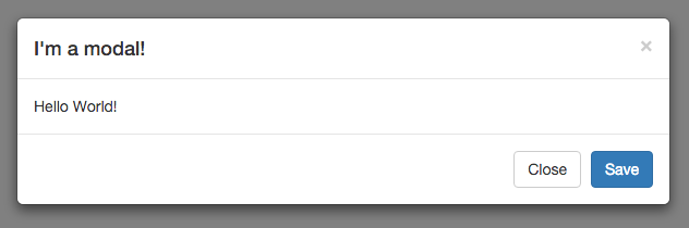
Default modal
<button type="button" class="btn btn-default" (click)="modal.open()">Open me!</button>

<modal #modal>
    <modal-header [show-close]="true">
        <h4 class="modal-title">I'm a modal!</h4>
    </modal-header>
    <modal-body>
        Hello World!
    </modal-body>
    <modal-footer [show-default-buttons]="true"></modal-footer>
</modal>
Static modal
This will create a modal that cannot be closed with the escape key or by clicking outside of the modal.
<modal #modal [keyboard]="false" [backdrop]="'static'">
    <modal-header [show-close]="false">
        <h4 class="modal-title">I'm a modal!</h4>
    </modal-header>
    <modal-body>
        Hello World!
    </modal-body>
    <modal-footer [show-default-buttons]="true"></modal-footer>
</modal>
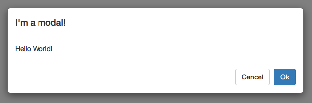
Use custom buttons in footer
<modal #modal>
    <modal-header>
        <h4 class="modal-title">I'm a modal!</h4>
    </modal-header>
    <modal-body>
        Hello World!
    </modal-body>
    <modal-footer>
        <button type="button" class="btn btn-default" data-dismiss="modal" (click)="modal.dismiss()">Cancel</button>
        <button type="button" class="btn btn-primary" (click)="modal.close()">Ok</button>
    </modal-footer>
</modal>
Opening and closing the modal from the host/parent component
import { Component, ViewChild } from 'angular/core';
import { ModalComponent } from 'ng2-bs4-modal/ng2-bs4-modal';

@Component({
    selector: 'parent-component',
    template: `
        <modal #myModal>
            ...
        </modal>
    `
})
export class ParentComponent {
    @ViewChild('myModal')
    modal: ModalComponent;

    close() {
        this.modal.close();
    }

    open() {
        this.modal.open();
    }
}
Autofocus on a textbox when modal is opened
<modal #modal>
    <modal-header>
        <h4 class="modal-title">I'm a modal!</h4>
    </modal-header>
    <modal-body>
        <div class="form-group">
            <label for="textbox">I'm a textbox!</label>
            <input autofocus type="text" class="form-control" id="textbox">
        </div>
    </modal-body>
    <modal-footer [show-default-buttons]="true"></modal-footer>
</modal>
Building
git clone https://github.com/maxfisher05/ng2-bs4-modal.git
npm install
npm run build
Testing
npm test
To tell karma to watch for changes:
npm run test-watch
Bugs/Contributions
Report all bugs and feature requests on the issue tracker.
Contributions are welcome! Feel free to open a pull request.