README
react-accordion
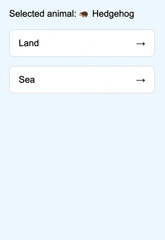
Minimalistic accordion for React. Without styles and prepared elements. Create what you need using JSX and returned data.
Demo
https://mukhindev.github.io/react-accordion/
What new?
- v1.0.4
- fix image in readme.md
- v1.0.3
- headerProps and bodyProps now return group index (for example you can style the first or last elements)
- bodyProps now return
onToggle(for example can be used for auto-close)
- v1.0.2
- v1.0.1
- v1.0.0
How to use
Install
npm i @mukhindev/react-accordion
Props
<Accordion
  className="" // custom class, optional (default: 'accordion')
  data={ data } // data array
  keyField="groupId" // unique key field in the data array
  Header={ (headerProps) => (
    // any JSX for header
  ) }
  Body={ (bodyProps) => (
    // any JSX for body
  ) }
  duration={ 0.25 } // transition duration in s / optional (default: 0.25)
  single // automatic closing for other groups / optional (default: false)
  onOpen={ () => {} } // group opening hook, returns the group key
  onClose={ () => {} } // group closing hook, returns the group key (not if 'single')
/>
Returned Props
<Accordion
  Header={ (headerProps) => () }
  Body={ (bodyProps) => () }
/>
headerProps and bodyProps contain the same data:
{
  ...data // data item from data array
  onToggle // function —> open/close
  isOpen // bool, сurrent open/close state
  index // group index
}
Example-1
import Accordion from '@mukhindev/react-accordion';

const data = [
  {
    id: '1',
    header: 'Card-1',
    body: 'Body-1'
  },
  {
    id: '2',
    header: 'Card-2',
    body: 'Body-2'
  }
];

const Example1 = () => {
  return {
    <Accordion
      data={ data }
      keyField="id"
      Header={ (headerProps) => (
        <button onClick={ headerProps.onToggle } >
          { headerProps.header }
        </button>
      ) }
      Body={ (bodyProps) => (
        <div>
          { bodyProps.body }
        </div>
      ) }
    />
  }
};

export default Example1;
----------
Card-1 ↓
----------
Body-1
----------
Card-2 →
----------
Example-2
import Accordion from '@mukhindev/react-accordion';

const data = [
  {
    groupId: 'g1',
    groupName: 'Group-1',
    groupData: [
      {
        id: 'g1-1',
        value: 'Value-1'
      },
      {
        id: 'g1-2',
        value: 'Value-2'
      }
    ]
  },
  {
    groupId: 'g2',
    groupName: 'Group-2',
    groupData: [
      {
        id: 'g2-1',
        value: 'Value-3'
      }
    ]
  }
];

const Example2 = () => {
  return {
    <Accordion
      data={ data }
      keyField="groupId"
      Header={ (headerProps) => (
        <button onClick={ headerProps.onToggle } >
          { headerProps.groupName }
        </button>
      ) }
      Body={ (bodyProps) => (
        <div>
          { bodyProps.groupData.map((el) => (
            <div key={ el.id }>{ el.value }</div>
          )) }
        </div>
      ) }
    />
  }
};

export default Example2;
----------
Group-1 ↓
----------
Value-1
Value-2
----------
Group-2 →
----------
Todo:
- v1
- Publish to npm
- return props onOpen()
- return props onClose()
- return props group index
- Auto-close
- Footer
- remove
overflow: hidden;after transition