README
myuw-card
Getting Started
Import and include the component as follows:
<script type="module" src="https://cdn.my.wisc.edu/@myuw-web-components/myuw-card@latest/myuw-card.min.mjs"></script>

<!-- fallback for browsers without ES2015 module support -->
<script nomodule src="https://cdn.my.wisc.edu/@myuw-web-components/myuw-card@latest/myuw-card.min.js"></script>

<myuw-card-frame>
  <myuw-card-header>
    Course Search and Enroll
    <myuw-card-menu fname="course-search-and-enroll">
      Search for courses, plan your next semester and enroll in one convenient, easy-to-use app.
    </myuw-card-menu>
  </myuw-card-header>
  <myuw-card-content>
    <myuw-icon-link href="https://www.google.com">
      <img src="/path/to/icon.svg" alt="icon description">
    </myuw-icon-link>
  </myuw-card-content>
  <myuw-card-footer href="https://www.google.com">
    Launch full app
  </myuw-card-footer>
</myuw-card-frame>
Note: The evergreen "latest" version can be used for convenience, but in production settings it is recommended to use the latest release version specifically, and upgrade only after testing!
Composable Card Layouts
MyUW Card layouts are composable, which enables a degree of flexibility with widget content. The example above shows the basic usage, but it is possible to mix and match content blocks to create new widget variations.
All content blocks must be placed inside a <myuw-card-content></myuw-card-content> component.
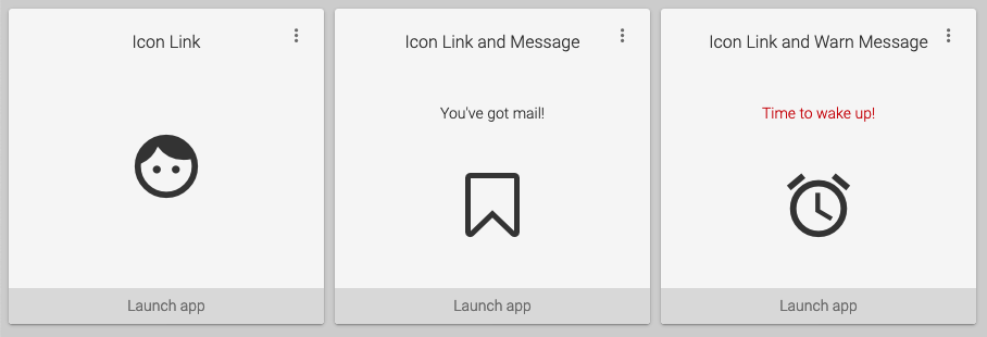
Basic icon link
<myuw-card-content>
  <myuw-icon-link href="https://wisc.edu">
    <img src="/path/to/icon.svg" alt="icon description">
  </myuw-icon-link>
<myuw-card-content>
Icon link with message
<myuw-card-content>
  <myuw-card-message>Your message here</myuw-card-message>
  <myuw-icon-link href="https://wisc.edu">
    <img src="/path/to/icon.svg" alt="icon description">
  </myuw-icon-link>
<myuw-card-content>
List of links with message
<myuw-card-content>
  <myuw-card-message variant="warn">
    You need to click these buttons!
  </myuw-card-message>
  <myuw-fab-link href="https://www.google.com">
    <img slot="fab-icon" src="/path/to/icon.svg" alt="icon description">
    <p>Deposit money</p>
  </myuw-fab-link>
  <myuw-fab-link href="https://www.google.com">
    <img slot="fab-icon" src="https://my.wisc.edu/images/widgetIcons/canvas-logo.svg">
    <p>Report lost card</p>
  </myuw-fab-link>
</myuw-card-content>
Two rows of list of links
<myuw-card-content>
  <myuw-link-list>
    <myuw-fab-link href="https://www.google.com">
      <img slot="fab-icon" src="/path/to/icon.svg" alt="icon description">
      <p>Jump around</p>
    </myuw-fab-link>
    <myuw-fab-link href="https://www.google.com">
      <img slot="fab-icon" src="/path/to/icon.svg" alt="icon description">
      <p>Sit on Terrace</p>
    </myuw-fab-link>
  </myuw-link-list>
  <myuw-link-list>
    <myuw-fab-link href="https://www.google.com">
      <img slot="fab-icon" src="/path/to/icon.svg" alt="icon description">
      <p>Deposit money</p>
    </myuw-fab-link>
    <myuw-fab-link href="https://www.google.com">
      <img slot="fab-icon" src="/path/to/icon.svg" alt="icon description">
      <p>Report lost card</p>
    </myuw-fab-link>
  </myuw-link-list>
</myuw-card-content>
Customization
The following CSS variables are defined for customization:
| Variable | Description | Default |
|---|---|---|
--myuw-fab-color |
FAB button background color | #0479a8 |
--myuw-fab-color-hover |
FAB button background color when hovering | #034e6c |
Contributing
See also: CONTRIBUTING
Developer Requirements
Install dependencies:
$ yarn install
# or
$ npm install
Run the development server:
$ yarn start
# or
$ npm start
Build modules to dist/:
$ yarn build
# or
$ npm run build
ESLint and Prettier will be install and are already configured. It is recommended that you use them.