README
@nghinv/react-native-dropdown
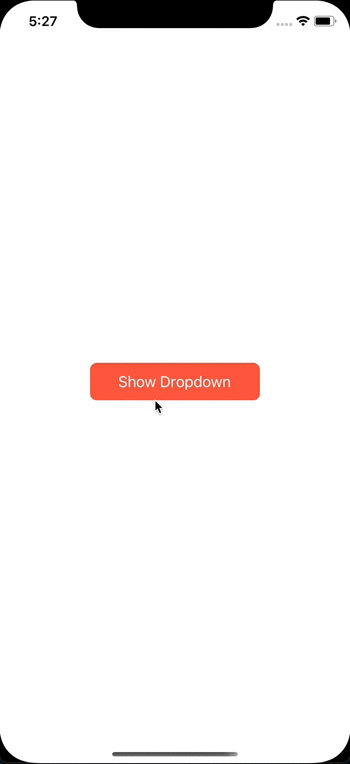
A dropdown component with react-native-reanimated


Installation
Installing the package
- Use yarn
yarn add @nghinv/react-native-dropdown
- Use npm
npm install @nghinv/react-native-dropdown
- peerDependencies
yarn add react-native-gesture-handler react-native-reanimated @nghinv/react-native-icons
How to use
import React from 'react';
import { View, StyleSheet, TouchableOpacity } from 'react-native';
import { Dropdown } from '@nghinv/react-native-dropdown';

export default function Example() {
  return (
    <View style={styles.container}>
      <Dropdown
        position='auto'
        contentAlign='auto'
        overlayOpacity={0.1}
        options={[
          { title: 'Phuong an 1', iconName: 'photo' },
          { title: 'Phuong an 2', checked: true, iconName: 'photo' },
          {
            title: 'Phuong an 4',
            checked: true,
            renderIcon: () => (
              <View
                style={{ width: 24, height: 32, backgroundColor: 'red' }}
              />
            )
          },
          { title: 'Phuong an 3', checked: true, disable: true },
          { title: 'Phuong an 4', checked: true },
        ]}
      // renderContent={({ direction, dismiss, maxHeight, pointStyle }) => (
      //   <Dropdown.Card
      //     pointStyle={pointStyle}
      //     maxHeight={maxHeight}
      //   >
      //     <ScrollView>
      //       <Dropdown.Button title='Test 1' onPress={dismiss} />
      //       <Dropdown.Separator />
      //       <Dropdown.Button title='Test 1' />
      //       <Dropdown.Separator />
      //       <Dropdown.Button title='Test 1' />
      //       <Dropdown.Separator />
      //       <Dropdown.Button title='Test 1' />
      //       <Dropdown.Separator />
      //       <Dropdown.Button title='Test 1' />
      //       <Dropdown.Separator />
      //       <Dropdown.Button title='Test 1' />
      //       <Dropdown.Separator />
      //       <Dropdown.Button title='Test 1' />
      //       <Dropdown.Separator />
      //       <Dropdown.Button title='Test 1' />
      //       <Dropdown.Separator />
      //       <Dropdown.Button title='Test 1' />
      //       <Dropdown.Separator />
      //     </ScrollView>
      //   </Dropdown.Card>
      // )}
      >
        <TouchableOpacity style={styles.button}>
          <Text style={styles.txtTitle}>Show Dropdown</Text>
        </TouchableOpacity>
      </Dropdown>
    </View>
  )
}

const styles = StyleSheet.create({
  container: {
    flex: 1,
    justifyContent: 'center',
    alignItems: 'center',
  },
  button: {
    justifyContent: 'center',
    alignItems: 'center',
    width: 200,
    height: 44,
    backgroundColor: 'tomato',
    borderRadius: 8,
    marginVertical: 5,
  },
  txtTitle: {
    fontSize: 18,
    color: 'white',
  },
});