README

@Ngx-dummy/Select-simple library


Features
This is an Angular "version" of html select element (which could hardly be styled / templated ... hence the library)
- :gear: Completely customizable: you can change the colors, styles ...
- :pencil2: Create your own templates: create your own Options' templates
- :ok_hand: You can use right away: there are basic items styles included
- :rocket: No extra deps: depends only on
@angular/core / @angular/common - :satellite: Options' Elements object bindings data-bind
Options to string of complex objects
Install
Yarn
yarn add @ngx-dummy/select-simple
With Npm
npm install -save @ngx-dummy/select-simple@0.0.5-v9
Usage
See the sample app setup Stackblitz

samples
import { SelectSimpleModule } from '@ngx-dummy/select-simple';

@NgModule({
    imports: [SelectSimpleModule],
})
export class AppModule {}
with Options (Array of Strings) binding:
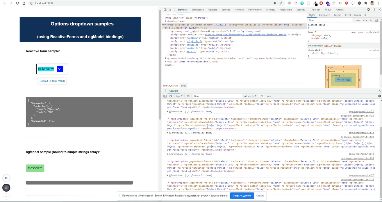
<ngxd-select id="select1" [options]="options" [readonly]="false" [required]="true" [none]="true" formControlName="selector" placeholder="Select a City"></ngxd-select>
//... options as simple strings
options = ['opt1', 'opt2', 'opt2'];
//...
with Options (Array of Strings) binding:
<ngxd-select id="select1" [options]="options" [readonly]="false" [required]="true" [none]="true" formControlName="selector" placeholder="Select a City" optionLabelKey="name"></ngxd-select>
//... Select-items's Captions resolved by `optionLabelKey` param
options = [{ name: 'opt1' , value: { param1: 'para1', param2: 'para2' } }, ...];
//...
and Option are declared directly:
<ngxd-select id="select1" [options]="options" [readonly]="false" [required]="true" [none]="true" formControlName="selector" placeholder="Select a City" optionLabelKey="name">
    <ngxd-select-item [label]="'Option 1'" [option]="'Opt1'" (onClick)="selected = $event"></ngxd-select-item>
</ngxd-select>
//...
selected = undefined;
//...
More detailed showcase (the video clip demonstrates most of use cases of the library)
Versioning
supports Angular 11 - 13.
-*v9
`@ngx-dummy/select-simple` versioned `*-v9` supports Angular 9 - 11.Browser Support
 Chrome Chrome |
 Firefox Firefox |
 Edge Edge |
 Safari Safari |
 Opera Opera |
|---|---|---|---|---|
| last 2 versions | last 2 versions | Edge versions | last 2 versions | last 2 versions |
To support my work, maybe ..👏 🍭 :
Other projects:
| Name | URL |
|---|---|
| Accordion Simple | https://github.com/ngx-dummy/accordion-simple |
Usage
Licensed under

Licensed under the MIT License - see the LICENSE file for details. _Copyright (c) belongs to Vladimir Ovsyukov <ovsyukov@yandex.com>