README
react-native-pickerise


Description
React Native cross-plateform (iOS/Android) modal picker/selector highly customizable.
Install
$ npm install @rimiti/react-native-pickerise --save
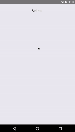
Demo
react-native-pickerise">
Examples
import React, {Component} from 'react';
import {StyleSheet} from 'react-native';
import Pickerise from '@rimiti/react-native-pickerise';

export default class Example extends Component {
    constructor(props) {
        super(props);
    }

    render() {
        const items = [
            { section: true, label: 'Cars' }, { label: 'Audi' }, { label: 'Dodge' }, { label: 'Ford' }, { label: 'Renault' },
            { section: true, label: 'Bikes' }, { label: 'Kawasaki' }, { label: 'Suzuki' }, { label: 'Triumph' }
        ];

        return (
            <Pickerise
                itemsContainerStyle={styles.itemsContainerStyle}
                itemsChildStyle={styles.itemsChildStyle}
                itemStyle={styles.itemStyle}
                itemTextStyle={styles.itemTextStyle}
                selectTextStyle={styles.selectTextStyle}
                selectStyle={styles.selectStyle}
                sectionStyle={styles.sectionStyle}
                sectionTextStyle={styles.sectionTextStyle}
                cancelStyle={styles.cancelStyle}
                cancelTextStyle={styles.cancelTextStyle}
                items={items}
                initValue="Select"
                cancelText="Cancel"
                onChange={(item) => console.log(`You chose ${item.label}`)} />
        )
    }
}

const styles = StyleSheet.create({
    itemsContainerStyle: {
        borderRadius: 0,
        backgroundColor: 'transparent',
        marginBottom: 30,
        padding: 0,
    },
    itemsChildStyle: {
        paddingHorizontal: 0
    },
    itemStyle: {
        marginTop: 10,
        backgroundColor: '#919191',
        borderBottomColor: 'transparent',
    },
    itemTextStyle: {
        color: '#fff',
        fontSize: 18,
    },
    selectTextStyle: {
        color: '#000',
        fontSize: 20,
    },
    selectStyle: {
        borderWidth: 0,
        paddingTop: 21,
        paddingLeft: 0,
    },
    sectionStyle: {
        borderRadius: 0,
    },
    sectionTextStyle: {
        fontSize: 20,
        color: '#fff',
    },
    cancelStyle: {
        backgroundColor: '#22A7F0',
        paddingVertical: 20,
        alignItems: 'center',
        justifyContent: 'center',
        marginBottom: 15,
        borderRadius: 0,
    },
    cancelTextStyle: {
        color: "#FFF",
        fontSize: 18,
    },
});
Documentation
Props                     Type                  Description                                                 Usage
----------------------------------------------------------------------------------------------------------------------
items                     {array of objects}    With a unique key and label
onChange                  {function}            Callback function, when the users has selected an item      (optional)
initValue                 {string}              Text that is initially shown on the button                  (optional)
cancelText                {string}              Text of the cancel button                                   (optional)
style                     {object}              Style definitions for the global element                    (optional)
itemsContainerStyle       {object}              Style definitions for the items container element           (optional)
itemsContainerChildStyle  {object}              Style definitions for the itemsChild element                (optional)
selectStyle               {object}              Style definitions for the select element                    (optional)
itemStyle                 {object}              Style definitions for the item element                      (optional)
cancelStyle               {object}              Style definitions for the cancel element                    (optional)
sectionStyle              {object}              Style definitions for the section element                   (optional)
overlayStyle              {object}              Style definitions for the overlay element                   (optional)
itemTextStyle             {object}              Style definitions for the item text element                 (optional)
sectionTextStyle          {object}              Style definitions for the section text element              (optional)
cancelTextStyle           {object}              Style definitions for the cancel text element               (optional)
selectTextStyle           {object}              Style definitions for the select text element               (optional)
modalAnimationType        {none, slide, fade}   Modal animation type                                        (optional)
modalTransparent          {bool}                If true render the modal with transparent background        (optional)
Scripts
Run using npm run