README
react-dates 


An easily internationalizable, mobile-friendly datepicker library for the web.
Live Playground
For examples of the datepicker in action, go to http://airbnb.io/react-dates.
OR
To run that demo on your own computer:
- Clone this repository
npm installnpm run storybook- Visit http://localhost:9001/
Getting Started
Install dependencies
Ensure packages are installed with correct version numbers by running:
(
  export PKG=react-dates;
  npm info "$PKG" peerDependencies --json | command sed 's/[\{\},]//g ; s/: /@/g; s/ *//g' | xargs npm install --save "$PKG"
)
Which produces and runs a command like:
npm install --save react-dates moment@>=#.## react@>=#.## react-dom@>=#.## react-addons-shallow-compare@>=#.##
Include component
import { SingleDatePicker } from 'react-dates';
Include CSS
When you use Webpack with CSS loader:
import 'react-dates/lib/css/_datepicker.css';
Otherwise create a CSS file with the contents of require.resolve('react-dates/lib/css/_datepicker.css') and include it in the html <head> section.
Make some awesome datepickers
<SingleDatePicker
  id="date_input"
  date={this.state.date}
  focused={this.state.focused}
  onDateChange={(date) => { this.setState({ date }); }}
  onFocusChange={({ focused }) => { this.setState({ focused }); }}
/>
API
We have a handful of different components and utilities available for all of your date picking needs!
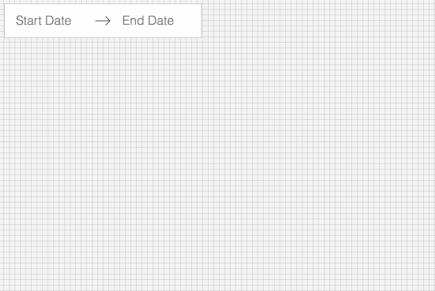
DateRangePicker
This fully-controlled component is designed to allow a user to select both a start date and an end date. It is best suited for a selecting a relatively short date range some time in the next year.
Props
Dates:
Moment objects representing the currently selected start and end dates. To indicate that a date has not yet been selected, these are set to null.
  startDate: momentPropTypes.momentObj,
  endDate: momentPropTypes.momentObj,
onDatesChange is the callback necessary to update the date state being held in the parent component and pass that back down to the DateRangePicker as props. onDatesChange receives an object of the form
{ startDate: momentPropTypes.momentObj, endDate: momentPropTypes.momentObj }
as an argument.
onDatesChange: PropTypes.func,
Focus:
The focusedInput prop indicates which of the two inputs is currently focused, if either. You can import the START_DATE and END_DATE constants from react-dates/constants.
focusedInput: PropTypes.oneOf([START_DATE, END_DATE]),
onFocusChange is the callback necessary to update the focus state being held in the parent component and pass that back down to the DateRangePicker as a prop. onFocusChange receives either START_DATE, END_DATE, or null as an argument.
onFocusChange: PropTypes.func,
Date selection rules:
The value of minimumNights indicates the minimum number of days between the start date and the end date.
minimumNights: PropTypes.number,
To indicate which days are blocked from selection, you may provide a function to the isDayBlocked prop. As of v1.0.0, we allow blocked dates inside of ranges.
isDayBlocked: PropTypes.func,
isOutsideRange indicates which days are out of selectable range.
Past dates out of range by default. If you would like to allow the user to select days in the past, you may set isOutsideRange to () => false.
Right now we have an expectation that this function returns true for a continuous range of dates from -Infinity to some date and/or from some date to +Infinity. This is relevant to the minimum nights logic. If you would like to prevent the user from selecting a non-continuous set of dates, you should use isDayBlocked instead.
isOutsideRange: PropTypes.func,
Calendar presentation:
numberOfMonths indicates the number of visible months at a time.
numberOfMonths: PropTypes.number,
By default, we do not show days from the previous month and the next month in the same table as the currently visible month. However, sometimes, and especially if the numberOfMonths prop is set to 1, it might make sense to allow users to see these days as well. To do, you may set enabledOutsideDays to true. These days can still be styled by selecting on the CalendarMonth__day--outside class.
enableOutsideDays: PropTypes.bool,
initialVisibleMonth indicates the month that should be displayed initially when the calendar is first opened. The prop is a function that must return a Moment.js object. This function will be called the first time the user focuses on the DateRangePicker/SingleDatePicker inputs or when the focused prop is passed to the DayPicker component.
initialVisibleMonth: PropTypes.func,
DayPicker presentation:
The orientation prop indicates whether months are stacked on top of each other or displayed side-by-side. You can import the HORIZONTAL_ORIENTATION and VERTICAL_ORIENTATION constants from react-dates/constants.
orientation: PropTypes.oneOf([HORIZONTAL_ORIENTATION, VERTICAL_ORIENTATION]),
The anchorDirection prop indicates whether the calendar is anchored to the right or left side of the input. You can import the ANCHOR_LEFT and ANCHOR_RIGHT constants from react-dates/constants. Defaults to ANCHOR_LEFT.
anchorDirection: PropTypes.oneOf([ANCHOR_LEFT, ANCHOR_RIGHT]),
withPortal was designed for use on mobile devices. Namely, if this prop is set to true, the DayPicker will be rendered centrally on the screen, above the current plane, with a transparent black background behind it. Clicking on the background will hide the DayPicker. This option is currently only available for a DateRangePicker with a horizontal orientation.
withPortal: PropTypes.bool,
withFullScreenPortal is a full-screen takeover version of the withPortal prop. Similarly to withPortal, the DayPicker is rendered centrally on the screen, above the current plane. However, instead of a clickable transparent black background, the background is solid and white. To close the datepicker, the user must either select a date or click the close button located at the top right of the screen.
withFullScreenPortal: PropTypes.bool,
Input presentation:
The startDateId and endDateId props are assigned to the actual <input> DOM elements for accessibility reasons. They default to the values of the START_DATE and END_DATE constants.
  startDateId: PropTypes.string,
  endDateId: PropTypes.string,
The startDatePlaceholderText and endDatePlaceholderText props are the placeholders for the two inputs. As of v1.0.0, they are also used as the label text for their respective inputs.
  startDatePlaceholderText: PropTypes.string,
  endDatePlaceholderText: PropTypes.string,
If the showClearDates prop is set to true, an x shows up in the input box that allows you to clear out both dates and reset the input.
showClearDates: PropTypes.bool,
If the showDefaultInputIcon prop is set to true, the default calendar icon is displayed at the start of the input box. Interaction is the same as focusing the start date.
Optionally, you can display a React node using props.customInputIcon
  showDefaultInputIcon: PropTypes.bool,
  customInputIcon: PropTypes.node,
To replace the default arrow icon, you may pass a React node to props.customArrowIcon.
customArrowIcon: PropTypes.node,
If the disabled prop is set to true, onFocusChange is not called when onStartDateFocus or onEndDateFocus are invoked and disabled is assigned to the actual <input> DOM elements.
disabled: PropTypes.bool,
If the required prop is set to true, the input will have to be filled before the user can submit the form. The standard HTML5 error message will appear on the input when the form is submitted and the input has no value.
required: PropTypes.bool,
The screenReaderInputMessage prop accepts a contextual message for screen readers. When an input is focused, the screenReaderInputMessage prop value is read. This can inform users about constraints, such as the date format, minimum nights, blocked out dates, etc.
screenReaderInputMessage: PropTypes.string,
Custom Navigation Icons:
The navPrev and navNext props are used to assign custom icons to the "Next", and "Previous" arrows for the top navigation. If you do specify a custom icon you'll have to do the styling of the button yourself (e.g. the color, border, and things of that nature). All that comes "out of the box" is your button being positioned correctly.
  navPrev: PropTypes.node,
  navNext: PropTypes.node,
Custom content in calendar days:
If you want to customize the content in a calendar day, you can specify a renderDay function which receives the day moment object as its only argument. renderDay will be responsible for rendering every day and should return day.format('D') for the default display.
renderDay: PropTypes.func,
Some useful callbacks:
If you need to do something when the user navigates between months (for instance, check the availability of a listing), you can do so using the onPrevMonthClick and onNextMonthClick props.
  onPrevMonthClick: PropTypes.func,
  onNextMonthClick: PropTypes.func,
Internationalization:
While we have reasonable defaults for english, we understand that that's not the only language in the world! :) At Airbnb, more than 50% of users visit our site in a language other than english. Thus, in addition to supporting moment locales, the DateRangePicker accepts a number of props to allow for this.
The displayFormat prop is either a string that abides by moment's date formatting rules or a function that returns a string that follows these rules. It defaults to the value of moment's L format in whatever locale you happen to be in at the time of render.
displayFormat: PropTypes.oneOfType([PropTypes.string, PropTypes.func]),
The monthFormat prop abides by moment's date formatting rules and indicates the format in which to display dates at the top of each calendar. It defaults to MMMM YYYY.
monthFormat: PropTypes.string,
The phrases prop is an object that contains all the English language phrases currently part of the class. As of now, we only have three such phrases and none are visible but they are used for screen-reader navigation of the datepicker.
  phrases: PropTypes.shape({
    closeDatePicker: PropTypes.node,
    clearDates: PropTypes.node,
    clearDate: PropTypes.node,
  }),
Display picker when clicked on clear button:
The reopenPickerOnClearDates prop helps to control whether to show the date picker when the clear option is clicked. This is set to false by default
which means that the picker does not open when the clear button is clicked by default. To display the picker one must explicitly set it to true.
reopenPickerOnClearDates: PropTypes.bool,
Keep picker open on date selection:
The keepOpenOnDateSelect prop allows you to better control in what scenario the DayPicker stays visible or not. If it is set to false (the default value), once a date range has been successfully selected, the DayPicker will close. If true, it will stay open.
keepOpenOnDateSelect: PropTypes.bool,
SingleDatePicker
This fully-controlled component is designed to allow a user to select a single date.
Props
Dates:
Moment objects representing the currently selected date. This is set to null when no date has yet been selected.
date: momentPropTypes.momentObj,
onDateChange is the callback necessary to update the date state held in the parent component. It expects a single argument equal to either null or a moment object.
onDateChange: PropTypes.func,
Focus:
A boolean representing whether or not the date input is currently focused.
focused: PropTypes.bool,
onFocusChange is the callback necessary to update the focus state in the parent component. It expects a single argument of the form { focused: PropTypes.bool }.
onFocusChange: PropTypes.func,
Date selection rules:
These properties are the same as provided to the <DateRangePicker /> component.
To indicate which days are blocked from selection, you may provide a function to the isDayBlocked prop. As of v1.0.0, we allow blocked dates inside of ranges.
isDayBlocked: PropTypes.func,
isOutsideRange indicates which days are out of selectable range.
Past dates out of range by default. If you would like to allow the user to select days in the past, you may set isOutsideRange to () => false.
Right now we have an expectation that this function returns true for a continuous range of dates from -Infinity to some date and/or from some date to +Infinity. This is relevant to the minimum nights logic. If you would like to prevent the user from selecting a non-continuous set of dates, you should use isDayBlocked instead.
isOutsideRange: PropTypes.func,
Calendar presentation:
These properties are the same as provided to the <DateRangePicker /> component.
numberOfMonths indicates the number of visible months at a time.
numberOfMonths: PropTypes.number,
By default, we do not show days from the previous month and the next month in the same table as the currently visible month. However, sometimes, and especially if the numberOfMonths prop is set to 1, it might make sense to allow users to see these days as well. To do, you may set enabledOutsideDays to true. These days can still be styled by selecting on the CalendarMonth__day--outside class.
enableOutsideDays: PropTypes.bool,
initialVisibleMonth indicates the month that should be displayed initially when the calendar is first opened. The prop is a function that must return a Moment.js object. This function will be called the first time the user focuses on the DateRangePicker/SingleDatePicker inputs or when the focused prop is passed to the DayPicker component.
initialVisibleMonth: PropTypes.func,
DayPicker presentation:
These properties are the same as provided to the <DateRangePicker /> component.
The orientation prop indicates whether months are stacked on top of each other or displayed side-by-side. You can import the HORIZONTAL_ORIENTATION and VERTICAL_ORIENTATION constants from react-dates/constants.
orientation: PropTypes.oneOf([HORIZONTAL_ORIENTATION, VERTICAL_ORIENTATION]),
The anchorDirection prop indicates whether the calendar is anchored to the right or left side of the input. You can import the ANCHOR_LEFT and ANCHOR_RIGHT constants from react-dates/constants. Defaults to ANCHOR_LEFT.
anchorDirection: PropTypes.oneOf([ANCHOR_LEFT, ANCHOR_RIGHT]),
withPortal was designed for use on mobile devices. Namely, if this prop is set to true, the DayPicker will be rendered centrally on the screen, above the current plane, with a transparent black background behind it. Clicking on the background will hide the DayPicker. This option is currently only available for a DateRangePicker with a horizontal orientation.
withPortal: PropTypes.bool,
withFullScreenPortal is a full-screen takeover version of the withPortal prop. Similarly to withPortal, the DayPicker is rendered centrally on the screen, above the current plane. However, instead of a clickable transparent black background, the background is solid and white. To close the datepicker, the user must either select a date or click the close button located at the top right of the screen.
withFullScreenPortal: PropTypes.bool,
Input presentation:
The id prop is assigned to the actual <input> DOM element. It is currently required for accessibility reasons.
id: PropTypes.string.isRequired,
The placeholder props is the placeholder text for the input. It is both applied as an actual placeholder to the DOM <input> and as a placeholder for the display text. As of v1.0.0, it is also used as label text.
placeholder: PropTypes.string,
If the showClearDate prop is set to true, an x shows up in the input box that allows you to clear out both dates and reset the input.
showClearDate: PropTypes.bool,
If the disabled prop is set to true, onFocusChange is not called when onStartDateFocus or onEndDateFocus are invoked and disabled is assigned to the actual <input> DOM elements.
disabled: PropTypes.bool,
If the required prop is set to true, the input will have to be filled before the user can submit the form. The standard HTML5 error message will appear on the input when the form is submitted and the input has no value.
required: PropTypes.bool,
Some useful callbacks:
These properties are the same as provided to the <DateRangePicker /> component.
If you need to do something when the user navigates between months (for instance, check the availability of a listing), you can do so using the onPrevMonthClick and onNextMonthClick props.
  onPrevMonthClick: PropTypes.func,
  onNextMonthClick: PropTypes.func,
Internationalization:
The displayFormat prop is either a string that abides by moment's date formatting rules or a function that returns a string that follows these rules. It defaults to the value of moment's L format in whatever locale you happen to be in at the time of render.
displayFormat: PropTypes.oneOfType([PropTypes.string, PropTypes.func]),
The monthFormat prop abides by moment's date formatting rules and indicates the format in which to display dates at the top of each calendar. It defaults to MMMM YYYY.
monthFormat: PropTypes.string,
The phrases prop is an object that contains all the English language phrases currently part of the class. As of v1.0.0, we only have one such phrases and it is not visible but is used for screen-reader navigation of the datepicker.
  phrases: PropTypes.shape({
    closeDatePicker: PropTypes.node,
  })
Display picker when clicked on clear button:
The reopenPickerOnClearDates prop helps to control whether to show the date picker when the clear option is clicked. This is set to false by default
which means that the picker does not open when the clear button is clicked by default. To display the picker one must explicitly set it to true.
reopenPickerOnClearDates: PropTypes.bool,
Keep picker open on date selection:
The keepOpenOnDateSelect prop allows you to better control in what scenario the DayPicker stays visible or not. If it is set to false (the default value), once a date range has been successfully selected, the DayPicker will close. If true, it will stay open.
keepOpenOnDateSelect: PropTypes.bool,
DayPicker
This fully-controlled component renders a designated number of months and allows for user interaction with days. It is possible to navigate between months using this component.
Props
Calendar Presentation:
These properties are the same as provided to the <DateRangePicker /> and <SingleDatePicker /> components.
numberOfMonths indicates the number of visible months at a time.
numberOfMonths: PropTypes.number,
By default, we do not show days from the previous month and the next month in the same table as the currently visible month. However, sometimes, and especially if the numberOfMonths prop is set to 1, it might make sense to allow users to see these days as well. To do, you may set enabledOutsideDays to true. These days can still be styled by selecting on the CalendarMonth__day--outside class.
enableOutsideDays: PropTypes.bool,
DayPicker Presentation:
The orientation prop indicates whether months are stacked on top of each other or displayed side-by-side. You can import the HORIZONTAL_ORIENTATION and VERTICAL_ORIENTATION constants from react-dates/constants.
orientation: PropTypes.oneOf([HORIZONTAL_ORIENTATION, VERTICAL_ORIENTATION]),
withPortal exists primarily for use in conjunction with the <DateRangePicker /> and <SingleDatePicker /> components. It will not do much if a DayPicker is rendered on its own with it set to true other than modify some position-related styles and remove a box-shadow.
withPortal: PropTypes.bool,
The modifiers object maps modifier names (designated as strings) to functions that take in a moment object and return a boolean value. An example of a modifiers object could be as follows:
  modifiers={{
    friday: (day) => moment.weekdays(day.weekday()) === 'Friday',
  }}
Then, every Friday in the visible calendar would have the class CalendarMonth__day--friday applied to it and could be styled appropriately. By default, the only modifier that is always applied is the outside modifier which is applied to dates on the calendar that might still be visible but fall outside of the current month.
modifiers: PropTypes.object,
Day interaction callbacks:
These callbacks get triggered when the relevant event ('click', 'mouseenter', etc.) occurs on any visible CalendarDay component. The callback gets back 3 arguments, the day represented as a moment object, an array of strings representing the modifiers that are applicable to that day, and the event object itself.
onDayTouchTap has been implemented in-house and has not yet been thoroughly tested. We recommend using onDayClick whenever possible.
  onDayClick: PropTypes.func,
  onDayMouseEnter: PropTypes.func,
  onDayMouseLeave: PropTypes.func,
Some other useful callbacks:
If you need to do something when the user navigates between months (for instance, check the availability of a listing), you can do so using the onPrevMonthClick and onNextMonthClick props.
  onPrevMonthClick: PropTypes.func,
  onNextMonthClick: PropTypes.func,
If you need to do something when the user clicks outside of the DayPicker (for instance, hide the DayPicker), you may do so using the onOutsideClick prop.
onOutsideClick: PropTypes.func,
Internationalization:
The monthFormat prop abides by moment's date formatting rules and indicates the format in which to display dates at the top of each calendar. It defaults to MMMM YYYY.
monthFormat: PropTypes.string,
Utility Methods
Date Comparison
We provide four utility methods for date comparison:
  isInclusivelyAfterDay
  isInclusivelyBeforeDay
  isNextDay
  isSameDay
Each of these methods takes in two moment objects and returns a boolean, indicating whether the first argument is inclusively after, inclusively before, the day immediately after, or the same day as the second argument.
Theming
react-dates comes with a set of SCSS variables that can be overridden to add your own project-specific theming. Override any variables found in css/variables.scss with your own and then import ~react-dates/css/styles.scss (and ~react-dates/css/variables.scss if you're only overriding a few). If you were using sass-loader with webpack, the code below would properly override the selected variables:
//overriding default sass variables with my project's colors
$react-dates-color-primary: $some-color-specific-to-my-project;
$react-dates-color-primary-dark: $some-other-color-specific-to-my-project;
@import '~react-dates/css/variables.scss';
@import '~react-dates/css/styles.scss';