README
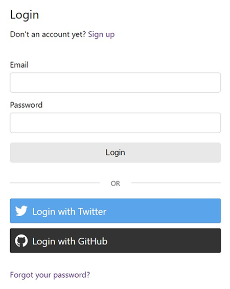
Login


Customizable React login component in Typescript that validates with a built-in or custom Yup schema. It accepts custom fields, header/footer, social login buttons and forgot password link.
Install
npm install @unleashit/login
Required peer dependencies: react, formik and yup.
Example
class LoginDemo extends React.Component {
  async loginHandler(values) {
    // should return a Promise in the shape of LoginHandlerResponse below
    return await fetch('https://api.example.com/auth', {
      method: 'POST',
      headers: {
        'Content-Type': 'application/json',
      },
      body: JSON.stringify(values),
    }).then(resp => resp.json());
  }

  onSuccess(resp) {
    // set auth state, etc. resp has full server response from loginHandler().
    window.location.href = '/signed-in';
  }

  render() {
    return <Login loginHandler={this.loginHandler} onSuccess={this.onSuccess} />;
  }
}

export default LoginDemo;
Social Logins
Adding social logins is easy. Simply include them as children and they will display under the main login with a nice separator. You must supply the buttons themselves, but for something fast and nice I recommend react-social-login-buttons.
import { GithubLoginButton, TwitterLoginButton } from 'react-social-login-buttons';

const btnStyle = {
  margin: '10px 0',
  boxShadow: 'none',
};

render() {
  return (
    <Login
      loginHandler={() => Promise.resolve({ success: true })}
      onSuccess={(resp) => alert(JSON.stringify(resp, null, 2))}
    >
      <TwitterLoginButton onClick={() => alert('Hello')} style={btnStyle} />
      <GithubLoginButton onClick={() => alert('Hello')} style={btnStyle} />
    </Login>
  );
}
Custom Fields
It's possible to replace the default fields with custom fields and attributes by adding a customFields prop. The loginHandler will be called with their values after passing validation.
This array of fields will replace the defaults, so don't forget to add email/username and password if you need them. If you create a Yup schema with matching name attributes, it will properly validate.
Currently input, select, checkbox and textarea fields are supported.
<Login
  loginHandler={this.loginHandler}
  onSuccess={this.onSuccess}
  forgotPasswordLink={'/auth/password-reset'}
  schema={schema}
  customFields={[
    {
      element: 'input',
      type: 'text',
      name: 'username',
      label: 'Username',
    },
    {
      element: 'input',
      type: 'password',
      name: 'password',
      label: 'Password',
    },
    {
      element: 'text',
      type: 'checkbox',
      name: 'persistLogin',
      label: 'Remember me?',
      defaultChecked: true,
      defaultValue: true,
    },
  ]}
/>;

// yup schema
const schema = yup.object().shape({
  username: yup
    .string()
    .matches(/^[a-zA-Z0-9\._-]+$/, 'Enter a valid username')
    .max(56)
    .required(),
  password: yup
    .string()
    .min(8)
    .max(512)
    .required(),
});
CSS
Basic namespaced (BEM) css can be imported: import '@unleashit/login/dist/login.css'. CSS Module support is baked in. If you use CSS Modules you can import '@unleashit/login/dist/login.module.css' or import your own custom module targeting the internal classes and pass to the cssModuleStyles prop. Please see CSS in the main readme of the repo for more info.
API
// loginHandler() should return this shape:

interface LoginHandlerResponse {
  success: boolean;
  errors?: {
    // error msg to print in browser when auth fails
    serverAuth: string;
    // optionally validate anything else on server
    // key is the field's name attr, value is error msg to display
    [key: string]: string;
  };
}

// customFields prop should be an array of objects in this shape:
interface CustomField {
  element: 'input' | 'select' | 'textarea';
  type: string;
  name: string;
  label: string;
  options?: string[][]; // for select element
  defaultChecked?: boolean; // for checkbox
  custAttrs?: { [key: string]: string };
}
Props
| Name | Type | Description | default |
|---|---|---|---|
| loginHandler | (values: any) => Promise<LoginHandlerResponse> | Called on submission and after validation. Use to check auth. Should return the above interface | required |
| onSuccess | (resp: LoginHandlerResponse) => any | Called if loginHandler returns success. Provides the server response from loginHandler. Use to redirect, store auth state, etc. | required |
| schema | yup.Schema<LoginSchema> | Yup schema to override the default | standard validation |
| header | React Component | React component to override default header | basic header |
| loader | React Component | React component to override default loader | Logging in... |
| signupUrl | string | Url for signup page. Use only if using default header | /signup |
| customFields | CustomField[] | Array of custom fields. Replaces defaults (including email/password). Custom validation schema will be needed. | n/a |
| forgotPassword | boolean | Include the default forgot password link | true |
| forgotPasswordLink | string | Url to forgot password | /forgot-password |
| forgotPasswordText | string | Forgot password link text | Forgot password? |
| orLine | boolean | Display a "nice" line rule above social login buttons | true (note: requires children) |
| cssModuleStyles | { [key: string]: string } | CSS Module object that optionally replaces default. Class names need to match expected names. | BEM CSS |
| children | React Children | Use for Social login buttons or anything else (displays as footer) | n/a |