README
Navigation


Customizable auth aware navigation component for React in Typescript. Comes with optional sidecar component for login/login/signup.
Install
npm install @unleashit/navigation
Required peer dependencies: react.
Example
const links = [
  {
    text: 'Home',
    url: '/home',
  },
  {
    text: 'Products',
    url: '/products',
  },
  {
    text: 'About',
    url: '/about-us',
  },
  {
    text: 'Partner Site',
    url: 'https://example.com',
    attrs: {
      target: '_blank',
      rel: 'noopener noreferrer',
    },
  },
];

const NavigationDemo = () => (
  <Navigation
    links={links}
    // setting the isAuth prop displays
    // default login/logout/signup btns
    isAuth={false}
  />
);

export default NavigationDemo;
Authenticated Links
You can manually manage the display state for each link with by adding a display property. Setting a display property will always override any managed link state the component does.
links = [
  {
    text: 'Members Only',
    url: '/members',
    display: false, // boolean
  },
];
Login/Logout/Signup Sidecar
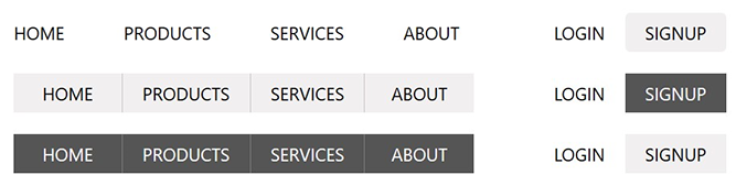
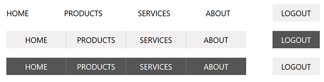
If you set an isAuth and/or authLinks prop, the component will add a sub-component for authentication and signup links as appropriate. If isAuth is set to false, both login and signup will show up. If true, logout instead.
If you need to customize the titles, urls or anything about the auth links (chances are you do), add an authLinks prop. authLinks should be an object with login, logout and signup properties (see AuthLinkTypes below):
const authLinks = {
  login: {
    text: 'Sign In',
    url: '/login',
  },
  logout: {
    text: 'Logout',
    url: '/logout',
  },
  signup: {
    text: 'Register',
    url: '/signup',
    icon: '/images/login-icon.svg',
    iconPosition: 'right', // left is default
  },
};

<Navigation
  links={links}
  authLinks={authLinks}
  isAuth={false}
  template="light-buttons"
/>;
If you add authlinks, including isAuth is optional as long as you manage the individual display properties yourself like:
const authLinks = {
  login: {
    display: !isLoggedIn,
    // you can leave any props if you like the defaults
  },
  logout: {
    display: isLoggedIn,
  },
  signup: {
    display: false, // never display signup
  },
};
CSS
Basic namespaced (BEM) css can be imported: import '@unleashit/navigation/dist/navigation.css'. CSS Module support is baked in. If you use CSS Modules you can import styles from '@unleashit/navigation/dist/navigation.module.css' or import your own custom module targeting the internal classes and pass to the cssModuleStyles prop. Please see CSS in the main readme of the repo for more info.
Themes
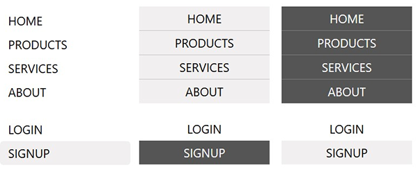
If you include the CSS, you can choose from a few basic themes by setting the template prop:
plain: no style (same as not adding the CSS but it adds a class calledplain)clean: clean style. This is the defaultlight-buttons: light buttons styledark-buttons: dark buttons style
You can also set the direction to be horizontal or vertical with the direction prop. The themes are designed to work in either direction.
Lastly, you can optionally add an icon to some or all links by setting the icon and optionally iconPosition props of a link. If you're using the default CSS, you may or may not have to tweak it to get the right results.
API and Props
// Link contains all the possible props for a link (either normal link or authLink)
export interface Link {
  url: string; // not required for authLink
  text: string; // not required for authLink
  active?: boolean;
  classes?: string[];
  style?: React.CSSProperties;
  icon?: string; // path to image
  iconPosition?: 'left' | 'right';
  display?: boolean;
  // a key/val object with any extra html attributes
  attrs?: React.HTMLAttributes<any>;
}
export interface AuthLinkTypes {
  login?: Link;
  logout?: Link;
  signup?: Link;
}
// main component props
export interface Props {
  links: Link[];
  direction?: 'horizontal' | 'vertical' | 'horz' | 'vert';
  template?: 'plain' | 'clean' | 'dark-buttons' | 'light-buttons';
  isAuth?: boolean;
  authLinks?: AuthLinkTypes;
  cssModuleStyles?: { [key: string]: string };
}
| Name | Type | Description | default |
|---|---|---|---|
| links | Link[] | array of objects (links) each with a minimum of url and name props | required |
| direction | horizontal or vertical | adds css classes to nav container for horz and vert | horizontal |
| template | string | choice of theme if using the default CSS | clean |
| isAuth | boolean | if set, component will set appropriate state to login/logout/signup links | undefined |
| authLinks | AuthLinkTypes | if set, these links will be added to the auth sidecar (a second ul within the nav container that can be styled separately) | undefined |
| cssModuleStyles | { [key: string]: string } | CSS Module object that optionally replaces default. Class names need to match expected names. | BEM CSS |