README
aframe-gui
A graphical User Interface framework for A-Frame.
The aframe-gui components provide layout and gui widgets that can be used
to create a user interface in an A-Frame scene.
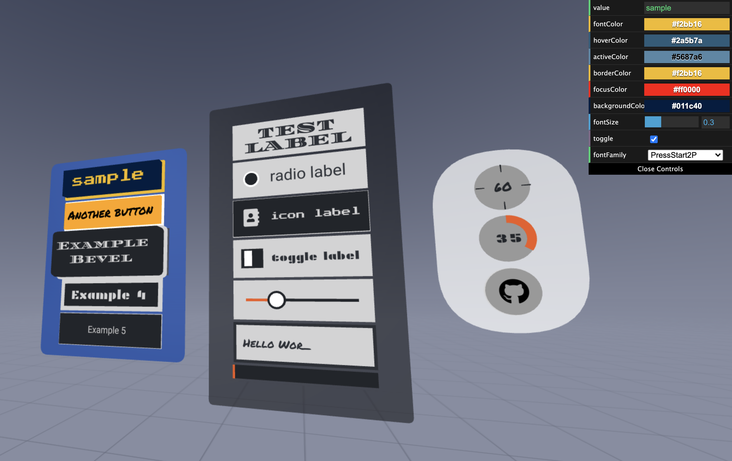
The dist/aframe-gui.js file defines the following components:
| Component | Primitive | Description |
|---|---|---|
| gui-flex-container | a-gui-flex-container | Layout container with flexbox-inspired |
| gui-item | Used by other components for common properties like height and width | |
| gui-interactable | Used by other components to define onclick behavior | |
| gui-cursor | a-gui-cursor | Cursor used to interact with GUI elements. |
| gui-button | a-gui-button | Standard button component with text label |
| gui-icon-button | a-gui-icon-button | Button with icon label instead of text |
| gui-icon-label-button | a-gui-icon-label-button | Button with both icon and text labels |
| gui-radio | a-gui-radio | Radio button |
| gui-toggle | a-gui-toggle | Toggle button |
| gui-slider | a-gui-slider | Slider component |
| gui-vertical-slider | a-gui-slider | Vertical slider component |
| gui-input | a-gui-input | Text input field |
| gui-label | a-gui-label | Text label |
| gui-progress-bar | a-gui-progress-bar | Progress bar |
| gui-circle-loader | a-gui-circle-loader | Circular progress meter |
| gui-circle-timer | a-gui-circle-timer | Circular progress meter with timer |
key_orange | '#ed5b21' | key_orange_light | '#ef8c60' | key_grey | '#22252a' | key_grey_dark | '#2c3037' | key_grey_light | '#606876' | key_offwhite | '#d3d3d4' | key_white | '#ffffff' |
Examples
Examples are available at:
https://rdub80.github.io/aframe-gui/examples/index.html
Use in your AFrame project
Include the following Javascript in the head of the page containing your AFrame scene:
https://rawgit.com/rdub80/aframe-gui/master/dist/aframe-gui.min.js
Building
Run the following to build to the examples/js folder:
npm run dist-example
npm run dist-example-min
Run locally
Run the following start the webpack-dev-server:
npm start
The webpack-dev-server should now be running at http://localhost:8080
Components
a-gui-flex-container Component
Properties
| Property | Description | Default Value |
|---|---|---|
| flex-direction | property specifies how flex items are placed in the flex container defining the main axis and the direction: 'row', 'column' | 'row' |
| justify-content | property defines distributed space between and around content items along the main axis of their container: 'flexStart','center','flexEnd' | 'flexStart' |
| align-items | property defines distributed space between and around flex items along the cross-axis of their container. Like justify-content but in the perpendicular direction. | 'flexStart' |
| item-padding | Padding between items | 0.0 |
| opacity | Transparency of the flex-conntainer | 0.0 |
| is-top-container | Setting background of the flex-container | false |
| panel-color | Background color of the flex-container | #22252a |
| panel-rounded | flex-container panel rounding radius | 0.05 |
<a-gui-flex-container
    flex-direction="column" justify-content="center" align-items="normal" component-padding="0.1" opacity="0.7" width="3.5" height="4.5"
    panel-color="#072B73"
    panel-rounded="0.2"
    position="0 2.5 -6" rotation="0 0 0"
>
... gui items here...

</a-gui-flex-container>
a-gui-cursor Component
Properties
| Property | Description | Default Value |
|---|---|---|
| color | Cursor initial color | #ffffff |
| hover-color | Cursor hover color | #ffffff |
| active-color | Cursor selection/active color | #ed5b21 |
| distance | distance of the pointer from the camera | -1 |
| design | choose a design: 'dot', 'ring', 'cross' or 'reticle' | 'dot' |
        <!-- Camera + cursor. -->
        <a-entity id="cameraRig" position="0 1.6 0">
            <a-camera look-controls wasd-controls position="0 0 0">
                <a-gui-cursor id="cursor"
                          raycaster="objects: [gui-interactable]"
                          fuse="true" fuse-timeout="2000"
                          color="#ECEFF1"
                          hover-color="#CFD8DC"
                          active-color="#607D8B"
                          design="ring" > <!-- dot, ring, reticle, cross  -->
                </a-gui-cursor> <!-- /cursor -->
            </a-camera> <!-- /camera -->
        </a-entity>
Example without fuse/gaze trigger (click trigger):
        <!-- Camera + cursor. -->
        <a-entity id="cameraRig" position="0 1.6 0">
            <a-camera look-controls wasd-controls position="0 0 0">
                <a-gui-cursor id="cursor"
                          raycaster="objects: [gui-interactable]"
                          fuse="false"
                >
                </a-gui-cursor> <!-- /cursor -->
            </a-camera> <!-- /camera -->
        </a-entity>
a-gui-button Component
Properties
| Property | Description | Default Value |
|---|---|---|
| on | Event that triggers onclick action | click |
| value | Text of button label | |
| font-size | Font size for button | 0.2 |
| font-family | Font family for button | '' |
| font-color | Text color for button label | #d3d3d4 |
| border-color | Border color of button | #d3d3d4 |
| focus-color | Focus color of button | #ef8c60 |
| background-color | Background color of button | #22252a |
| hover-color | Background color when button is in hover state | #2c3037 |
| active-color | Background color when button is pressed down | #ed5b21 |
| toggle | If true, button acts as toggle button with on/off state | false |
| toggle-state | Setting the toggle button on/off state | false |
| width | Width of button | 1 | | height | Height of button | 1 | | depth | Depth of button | 0.02 | | base-depth | Depth of the base of the button | 0.01 | | gap | Gap between button and base | 0.025 | | margin | Margin around button | 0 0 0 0 |
| bevel | If true, button bevel is enabled | false | | bevel-segments | Segments of the button bevel | 5 | | steps | Steps of the button bevel | 2 | | bevel-size | Size of the button bevel | 0.1 | | bevel-offset | Offset of the button bevel | 0 | | bevel-thickness | Thickness of the button bevel | 0.1 |
    <a-gui-button
        width="2.5"
        height="0.7"
        base-depth="0.025"
        depth="0.1"
        gap="0.1"

        onclick="buttonActionFunction" key-code="32"
        value="Sample Button"
        font-family="assets/fonts/PermanentMarker-Regular.ttf"
        font-size="0.25"
        margin="0 0 0.05 0"

        font-color="black"
        active-color="red"
        hover-color="yellow"
        border-color="white"
        focus-color="black"
        background-color="orange"

        bevel="true"
    >
    </a-gui-button>
a-gui-circle-loader Component
Properties
| Property | Description | Default Value |
|---|---|---|
| active-color | Color of ring that indicates loading progress | #ed5b21 |
| background-color | Background color of item | #22252a |
| loaded | Initial percentage progress value | 0.5 |
| font-color | Text color for progress percentage text | #d3d3d4 |
| font-family | Font family for progress percentage text | '' |
| font-size | Font size for progress percentage text | 0.2 |
| height | Height of item | 1 |
| width | Width of item | 1 |
| margin | Margin around item | 0 0 0 0 |
    <a-gui-circle-loader
        height="0.75"
        font-family="assets/fonts/Plaster-Regular.ttf"
        font-size="0.2"
        loaded="0.3456"
        margin="0 0 0.1 0"
        background-color="#999"
    >
    </a-gui-circle-loader>
a-gui-circle-timer Component
Properties
| Property | Description | Default Value |
|---|---|---|
| font-size | Font size for countdown text | 0.2 |
| font-family | Font family for progress countdown text | '' |
| font-color | Text color for progress countdown text | #d3d3d4 |
| border-color | Color of indicators that show 25/50/75/100 progress | #22252a |
| background-color | Background color of item | #22252a |
| active-color | Color of ring that indicates countdown progress | #ed5b21 |
| count-down | Initial countdown value in seconds | 0 | | callback | callback function that fires when countdown expires | '' |
| width | Width of item | 1 | | height | Height of item | 1 | | margin | Margin around item | 0 0 0 0 |
<a-gui-circle-timer
    height="0.75"
    count-down="60"
    callback="timedout"
    font-family="assets/fonts/PermanentMarker-Regular.ttf"
    margin="0 0 0.1 0"
>
</a-gui-circle-timer>
a-gui-icon-button Component
Properties
| Property | Description | Default Value |
|---|---|---|
| on | Event that triggers onclick action | click |
| icon | | '' | | icon-active | | '' | | icon-font | Icon font family | 'assets/fonts/fa-regular-400.ttf' | | icon-font-size | Icon Font size for button | 0.4 |
| font-color | Text color for button label | #d3d3d4 | | border-color | Border color of button | #d3d3d4 | | background-color | Background color of item | #22252a | | hover-color | Background color when button is in hover state | #2c3037 | | active-color | Background color when button is pressed down | #ed5b21 | | toggle | Toggle status | false | | toggle-state | Setting the toggle button on/off state | false |
| height | Height of item | 1 | | width | Width of item | 1 | | margin | Margin around item | 0 0 0 0 |
<a-gui-icon-button
    height="0.75"
    onclick="buttonActionFunction" key-code="32"
    icon="f09b"
    icon-font="assets/fonts/fa-brands-400.ttf"
    margin="0 0 0.05 0"
>
</a-gui-icon-button>
a-gui-icon-label-button Component
Properties
| Property | Description | Default Value |
|---|---|---|
| on | Event that triggers onclick action | click |
| icon | icon char | '' | | icon-active | icon char for the active state | '' | | icon-font | Icon font family | 'assets/fonts/fa-regular-400.ttf' | | icon-font-size | Icon Font size for button | 0.35 |
| font-color | Text color for button label | #d3d3d4 | | value | | '' | | font-family | Font family for button | '' | | font-size | Font size for button | 0.2 | | font-color | Text color for button label | #d3d3d4 | | border-color | Border color of button | #d3d3d4 | | background-color | Background color of button | #22252a | | hover-color | Background color when button is in hover state | #2c3037 | | active-color | Background color when button is pressed down | #ed5b21 | | toggle | Toggle status | false | | toggle-state | Setting the toggle button on/off state | false |
| height | Height of button | 1 | | width | Width of button | 1 | | margin | Margin around button | 0 0 0 0 |
<a-gui-icon-label-button
    width="2.5" height="0.75"
    onclick="buttonActionFunction"
    icon="f2b9"
    icon-font="assets/fonts/fa-solid-900.ttf"
    value="icon label"
    font-family="assets/fonts/PressStart2P-Regular.ttf"
    font-size="0.16"
    margin="0 0 0.05 0"
>
</a-gui-icon-label-button>
a-gui-input Component
Properties
| Property | Description | Default Value |
|---|---|---|
| onclick | Function to call on click event | |
| onhover | Function to call on hover event | |
| value | Input text value |
| font-size | Font size for input | 0.2 | | font-family | Font family for input | '' | | font-color | Text input color | #2c3037 | | border-color | Border color of input | #2c3037 | | background-color | Background color of input | #22252a | | border-hover-color | Border color when input is in hover state | #22252a | | hover-color | Background color when input is in hover state | #2c3037 |
| margin | Margin around item | 0 0 0 0 | | height | Height of item | 1 | | width | Width of item | 1 |
<a-gui-input
    width="2.5" height="0.75"
    onclick="inputActionFunction"
    font-family="assets/fonts/PermanentMarker-Regular.ttf"
    font-size="0.2"
    value="Hello Wor_"
    margin="0 0 0.05 0"
>
</a-gui-input>
a-gui-label Component
Properties
| Property | Description | Default Value |
|---|---|---|
| value | '' | |
| align | text-align: 'left','center','right' | 'center' |
| anchor | text anchor position: 'left','center','right' | 'center' |
| lineHeight | line-height of the label | 0.2 |
| font-size | Font size for input | 0.2 |
| font-family | Font family for input | '' |
| font-color | Text input color | #2c3037 |
| background-color | Background color of label | #d3d3d4 |
| text-depth | distance from the text to label background | 0.01 | | height | Height of item | 1 | | width | Width of item | 1 | | margin | Margin around item | 0 0 0 0 |
<a-gui-label
    width="2.5" height="0.75"
    value="test label"
    font-family="assets/fonts/DiplomataSC-Regular.ttf"
    font-size="0.35"
    line-height="0.8"
    letter-spacing="0"
    margin="0 0 0.05 0"
>
</a-gui-label>
a-gui-progress-bar Component
Properties
| Property | Description | Default Value |
|---|---|---|
| background-color | Background color of progress bar | #22252a |
| active-color | Color for indicating progress level | #ed5b21 |
| height | Height of item | 1 |
| width | Width of item | 1 |
| margin | Margin around item | 0 0 0 0 |
<a-gui-progressbar
    width="2.5" height="0.25"
    margin="0 0 0.05 0"
>
</a-gui-progressbar>
a-gui-radio Component
Properties
| Property | Description | Default Value |
|---|---|---|
| on | Event that triggers onclick action | click |
| checked | false | |
| active | true | |
| toggle | Toggle status | false |
| toggle-state | Setting the radio button on/off state | false |
| value | | '' | | font-family | Font family for radio button | '' | | font-size | Font size for radio button | 0.2 | | font-color | Text color for radio button label | #2c3037 | | border-width | | 1 | | border-color | Border color of radio button | #ffffff | | background-color | Background color of radio button | #d3d3d4 | | hover-color | Background color when radio button is in hover state | #606876 | | handle-color | | #22252a | | active-color | Background color when radio button is pressed down | #ed5b21 |
| height | Height of radio button | 1 | | width | Width of radio button | 1 | | margin | Margin around radio button | 0 0 0 0 |
<a-gui-radio
    width="2.5" height="0.75"
    onclick="toggleActionFunction"
    value="radio label"
    font-size="0.3"
    margin="0 0 0.05 0"
>
</a-gui-radio>
a-gui-slider Component
Properties
| Property | Description | Default Value |
|---|---|---|
| active-color | #ed5b21 | |
| background-color | #d3d3d4 | |
| border-color | #22252a | |
| handle-color | #ffffff | |
| handle-outer-radius | '0.17' | |
| handle-inner-radius | '0.13' | |
| handle-outer-depth | '0.04' | |
| handle-inner-depth | '0.02' | |
| height | Height of item | 1 |
| hover-color | #606876 | |
| left-right-padding | '0.25' | |
| margin | Margin around item | 0 0 0 0 |
| onclick | Javascript function to execute on click | |
| onhover | Javascript function to execute on click | |
| percent | '0.5' | |
| slider-bar-depth | '0.03' | |
| slider-bar-height | '0.05' | |
| top-bottom-padding | '0.125' | |
| width | Width of item | 1 |
<a-gui-slider
    width="2.5" height="0.75"
    onclick="slideActionFunction"
    percent="0.29"
    margin="0 0 0.05 0"
>
</a-gui-slider>
a-gui-toggle Component
Properties
| Property | Description | Default Value |
|---|---|---|
| on | Event that triggers onclick action | click |
| checked | false | |
| active | false | |
| toggle | Toggle status | false |
| toggle-state | Setting the toggle toggle button on/off state | false |
| value | | '' | | font-family | Font family for toggle button | '' | | font-size | Font size for toggle button | 0.2 | | font-color | Text color for toggle button label | #d3d3d4 | | border-width | | 1 | | border-color | Border color of toggle button | #d3d3d4 | | background-color | Background color of toggle button | #22252a | | hover-color | Background color when toggle button is in hover state | #2c3037 | | handle-color | | #d3d3d4 | | active-color | Background color when toggle button is pressed down | #ed5b21 |
| height | Height of toggle button | 1 | | width | Width of toggle button | 1 | | margin | Margin around toggle button | 0 0 0 0 |
<a-gui-toggle
    width="2.5" height="0.75"
    onclick="testToggleAction"
    value="toggle label"
    font-family="assets/fonts/Plaster-Regular.ttf"
    font-size="0.2"
    margin="0 0 0.05 0"
>
</a-gui-toggle>
a-gui-vertical-slider Component
Properties
| Property | Description | Default Value |
|---|---|---|
| active-color | #ed5b21 | |
| background-color | #d3d3d4 | |
| border-color | #22252a | |
| handle-color | #ffffff | |
| handle-outer-radius | 0.17 | |
| handle-inner-radius | 0.13 | |
| handle-outer-depth | 0.04 | |
| handle-inner-depth | 0.02 | |
| hover-color | #606876 | |
| hover-font-size | Font size of label indicating where user is hovering | 0.2 |
| hover-height | Height of label indicating where user is hovering | 1.0 |
| hover-margin | Margin of label indicating where user is hovering | 1.0 |
| hover-percent | Current percentage where user is hovering | |
| hover-width | Width of label indicating where user is hovering | 1.0 |
| left-right-padding | 0.25 | |
| margin | Margin around item | '0 0 0 0' |
| onclick | Javascript function to execute on click | |
| onhover | Javascript function to execute on click | |
| opacity | Transparency of the vertical slider background | 1.0 |
| output-font-size | Font size of label indicating output value | 0.2 |
| output-function | Name of function to calculate output value from percent | |
| output-height | Height of label indicating output value | 1.0 |
| output-margin | Margin of label indicating output value | '0 0 0 0' |
| output-width | Width of label indicating output value | 1.0 |
| percent | Current selected slider value, from 0.0 to 1.0 | 0.5 |
| slider-bar-depth | 0.03 | |
| slider-bar-height | 0.05 | |
| top-bottom-padding | 0.125 | |
| height | Height of item | 1 |
| width | Width of item | 1 |
<a-gui-slider
    width="2.5" height="0.75"
    onclick="slideActionFunction"
    percent="0.29"
    margin="0 0 0.05 0"
>
</a-gui-slider>