README
aframe-super-keyboard


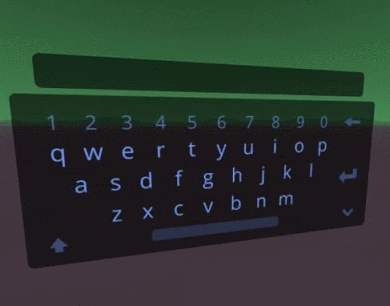
Lightweight, functional, and fully customizable keyboard for VR
For A-Frame v0.8.2+.
API
| Property | Description | Default Value |
|---|---|---|
| align | Input box text alignment (left, center, right) | 'left' |
| blinkingSpeed | Speed of the cursor. Duration in ms (less is faster) | 400 |
| filters | Text filters to apply (see next section) | [none] |
| font | Input box font | 'aileronsemibold' |
| hand | Selector of cursor entity (e.g., '#rightHand'). | [cursor], [vive-controls], [tracked-controls], [oculus-touch-controls], [windows-motion-controls], [hand-controls], [daydream-controls] [cursor] > [raycaster]. You will need to apply the cursor component to this entity for now. If this entity does not have a raycaster, one will be automatically set for you with the correct raycaster.objects property respective for the keyboard. This entity needs a cursor component. laser-controls can handle for you, if you are specifying your own cursor for a VR controller, make sure to specify cursor.upEvents and cursor.downEvents. |
| imagePath | Keyboard image folder path | '.' (current directory) |
| inputColor | Input box font color | #6699ff |
| interval | Throttling speed for calculating key hover changes (ms) | 50 |
| keyBgColor | Key background color (they are composited in additive mode, so #000 is invisible) | #000 |
| keyColor | The keyboard image is multiplied by this color | #6699ff |
| keyHoverColor | Key background hover color | #1A407F |
| keyPressColor | Key background pressed color | #5290F6 |
| label | Label text, shown on top of keyboard | [empty string] |
| labelColor | Label font color | #aaa |
| maxLength | Maximum number of characters allowed (after filtering) | 0 (unlimited) |
| model | Keyboard type (basic, numpad) | 'basic' |
| multipleInputs | Allows to enter multiple values (keyboard stays open and clears value after entry) | false |
| show | Visible or not (mainly for defining initial state) | true |
| value | Input box value (before filtering) | [empty string] |
| width | Keyboard width (in meters) | 0.8 |
Events
| Name | Description |
|---|---|
| superkeyboardchange | Value changed. |
| superkeyboarddismiss | Keyboard closed. |
| superkeyboardinput | Return key hit. |
Filters
You can choose as many filters as you want. For example: <a-entity super-keyboard="filters: title, numbers, trim"></a-entity>.
Current filters are:
| Name | Description | Example output with input "hello dear WORLD, 123! " |
|---|---|---|
| alllower | All chars lowercase | "hello dear world, 123! " |
| allupper | All chars uppercase | "HELLO DEAR WORLD, 123! " |
| custom | apply custom filter defined by user (see below) | |
| first | Uppercase only first letter in text | "Hello dear WORLD, 123! " |
| numbers | Accept only numbers or dot in text | "123" |
| title | Uppercase first letter of words | "Hello Dear WORLD, 123! " |
| trim | Remove trailing spaces | "hello dear WORLD, 123!" |
Custom filter can be set using the method setCustomFilter(func) of the component. The func parameter is a function that receives a string and must return the filtered string.
It can be defined from a custom component, for example this could be a password **** filter:
<script>
AFRAME.registerComponent('password-filter', {
  init: function () {
    this.el.components['super-keyboard'].setCustomFilter(function(str){
      return '*'.repeat(str.length);
    });
  }
});
</script>

<a-entity super-keyboard="filters: custom" password-filter></a-entity>
Defining Custom Keyboards and Layouts
super-keyboard is based on a single image for the whole keyboard and its
input box. By customizing this image and some variables, you can create any
keyboard you like, with any texture, layout and appearance.
Note: As of version 1.0, the image is expected to has double width than height (for example, 2048 x 1028). This limitation should be removed in next versions.
First, you create the image of the keyboard, with the characters and control
keys such as Enter, Dismiss, Backspace, Shift and Space.
Then you have to tell super-keyboard where the keys are, what is their size,
and what character (or command) they produce. For doing this you can use this
editor providing an image of the keyboard but with flat colored
rectangles where the keys are supposed to be (they must not overlap). Then,
just by clicking and pressing the corresponding key, you will get the code
necessary for defining the layout of the keyboard.
Finally, you call the component method addCustomModel(name, layout_definition) and set the model property to your keyboard's name.
layout_definition is an object with the following properties:
| Name | Description | Example value |
|---|---|---|
| img | Keyboard image path | "my-keyboard.png" |
| inputOffsetX | x distance increment of the input box text, to fine tune | 0.01 |
| inputOffsetY | Same as previous, but y increment | 0.01 |
| layout | Array with key slices data (the code generated in the editor) | |
| wrapCount | WrapCount value of the input box text. It sets the size of its font. | 20 |
See an example code of a custom keyboard (play example)
Installation
Browser
Install and use by directly including the browser files.
Also grab the keyboard assets (e.g., in the dist/) and drop into your
project, specifying the imagePath.
<head>
  <script src="https://unpkg.com/aframe-super-keyboard@1.0.0/dist/aframe-super-keyboard.min.js"></script>
</head>
<body>
  <a-scene>
    <a-entity id="mouseCursor" cursor="rayOrigin: mouse"></a-entity>

    <a-entity id="hand" laser-controls="hand: right"></a-entity>

    <!-- Change hand to `hand` for VR. -->
    <a-entity id="keyboard" super-keyboard="hand: #mouseCursor; imagePath:../../dist/" position="0 1.076 -0.5" rotation="-30 0 0"></a-entity>
  </a-scene>
</body>
npm
Install via npm:
npm install aframe-super-keyboard
Then require and use.
require('aframe');
require('aframe-super-keyboard');