README
AngularBeeProgressBar
A progress bar for Angular 13+ with lots of styling options
Getting Started
Instalation
Install via npm package manager
npm i angular-bee-progress-bar
Usage
Import angular-bee-progress-bar
import { AngularBeeProgressBarModule } from 'angular-bee-progress-bar';

 @NgModule({
   imports: [ AngularBeeProgressBarModule,]
 })
In html with standard options
<angular-bee-progress-bar
[totalNumberValue]="58"
[numberIndex]="12"
>
</angular-bee-progress-bar>
In html with options declared
<angular-bee-progress-bar
    [totalNumberValue]="value"
    [numberIndex]="index"
    [height]="4"
    [smooth]="true"
    [shadow]="false"
    [border]="true"
    [borderSize]=1
    [borderColor]="'blue'"
    [rounded]="false"
    [textDisplay]="true"
    [textColor]="'white'"
    [textSize]="2.5"
    [backgroundColor]="'transparent'"
  >
  </angular-bee-progress-bar>
Example of setting values from the component
value:number = 0;
index:number = 0;

methodThatContainsTheForLoop(){
this.value = maxIteratorValue;
this.index = 0;
for (this.index; this.index <=this.value; this.index++) {
//code goes here;

  }

}
Example of using an item count or page count
// The total amount of items to be counted
value:number = 27;

index:number = 0;

methodThatsCalledWhenItemNumberChanges(itemIndex:number){
  this.index = itemIndex;
}
Properties
| Name | Type | Default | Description |
|---|---|---|---|
| totalNumberValue | number | none | This is the maximum or total value of the items you are counting through |
| numberIndex | number | 0 | This is the current position that the bar will be in. should be bound to a number iteration, the bar is listening for changes |
| smooth | boolean | false | Smooths the transition between index changes |
| shadow | boolean | true | Turns off/on the bar shadow |
| rounded | boolean | true | Turns off/on the rounded ends of the bar |
| border | boolean | true | Turns off/on the black border around the bar |
| textDisplay | boolean | false | Displays a % of the position of the bar |
| height | number | 1 | Changes the height of the bar |
| textSize | number | height | Change the size of the display text, can't be larger than the bar height |
| color | string | 'linear-gradient(90deg, yellow, red)' | Changes the color of the bar, supports all css color types and gradients |
| textColor | string | 'black' | Changes the display text color |
| borderSize | number | 2 | Changes the width of the border in px |
| borderColor | string | 'black' | Changes the color of the border |
| backgroundColor | string | 'white' | Changes the color of the backround of the bar, 'transparent' can be used to set it to the color underneath |
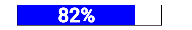
Screenshots


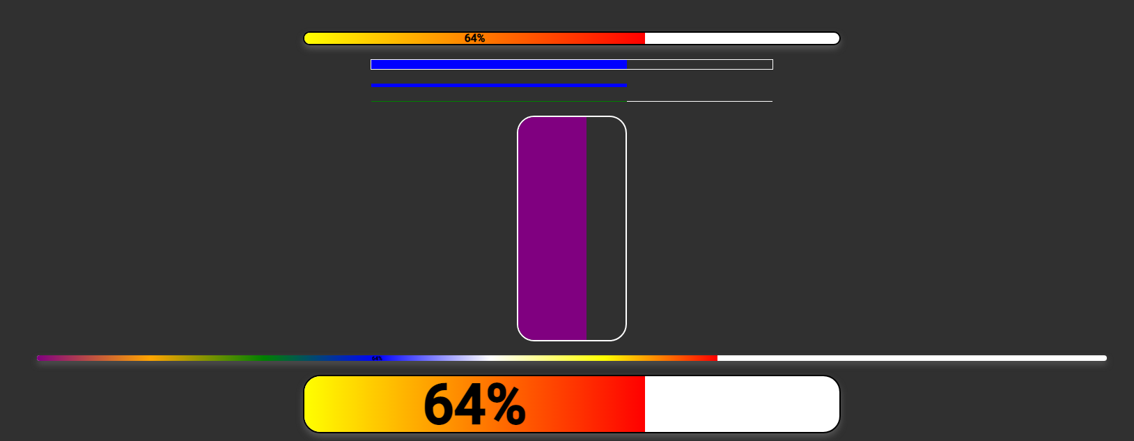
Screenshots with dark background
Notes
Version 0.x - 1.x Width removed. Width now looks to the parent container, so it works with flex and responsive layouts