itkitchen-react-native-ui-lib
itkitchen-react-native-ui-lib is a framework that contains a set of UI components and functions.
Setup
To install open your project in command line and run:
npm install itkitchen-react-native-ui-lib
OR
yarn add itkitchen-react-native-ui-lib
Thats it!
Usage
For use you can import Functions and UI:
import { Functions, UI } from 'itkitchen-react-native-ui-lib'
UI
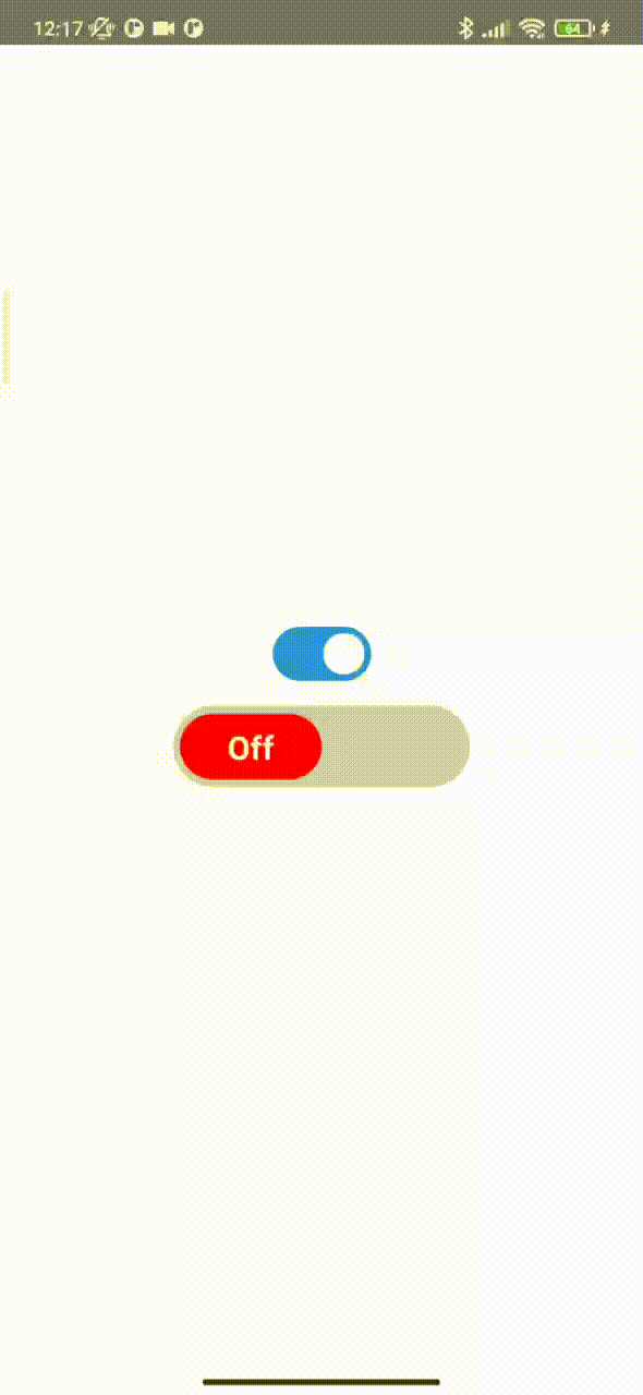
- Switch - is UI component of switch:
import { Functions, UI } from 'itkitchen-react-native-ui-lib'

const [switchState, setSwitchState] = useState(false)

//...

return (
    <View style={styles.container}>
        <UI.Switch />
        <UI.Switch
            textStyle={{
                fontSize: 20
            }}
            containderStyle={{
                width: "50%",
                height: 50,
                marginTop: 15
            }}
            circleStyle={{
                width: "50%",
                height: 40,
                borderRadius: 20
            }}
            enabledCircleColor="#4DC861"
            disabledCircleColor="red"
            enabledText="On"
            disabledText="Off"
            enabledBackgroundColor="#ccc"
            disabledBackgroundColor="#ccc"
            onChangeState={switchState => setSwitchState(switchState)}
            initValue={true}
        />
    </View>
)

//...
Props
| Name |
Description |
Default |
Type |
| activeOpacity |
opacity level on press |
0.6 |
from 0 to 1 |
| initValue |
initial position |
false |
bool |
| textStyle |
switch text style |
undefined |
style |
| containderStyle |
switch container style |
undefined |
style |
| circleStyle |
switch circle style |
undefined |
style |
| enabledCircleColor |
color for circle of switch when it is on |
'#4DC861' |
string |
| disabledCircleColor |
color for circle of switch when it is off |
'red' |
string |
| enabledText |
text of switch when it is on |
'On' |
string |
| disabledText |
text of switch when it is off |
'Off' |
string |
| enabledBackgroundColor |
switch background color when it is on |
'#ccc' |
string |
| disabledBackgroundColor |
switch background color when it is off |
'#ccc' |
string |
| onChangeState |
callback when switch is clicked |
(value) => {callback(value)} |
func |
- AnimatedHeaderList - is UI component with animated header. This component based on FlatList and support all props of it. //Removed. Maybe in the next update we will refactor and refund it.
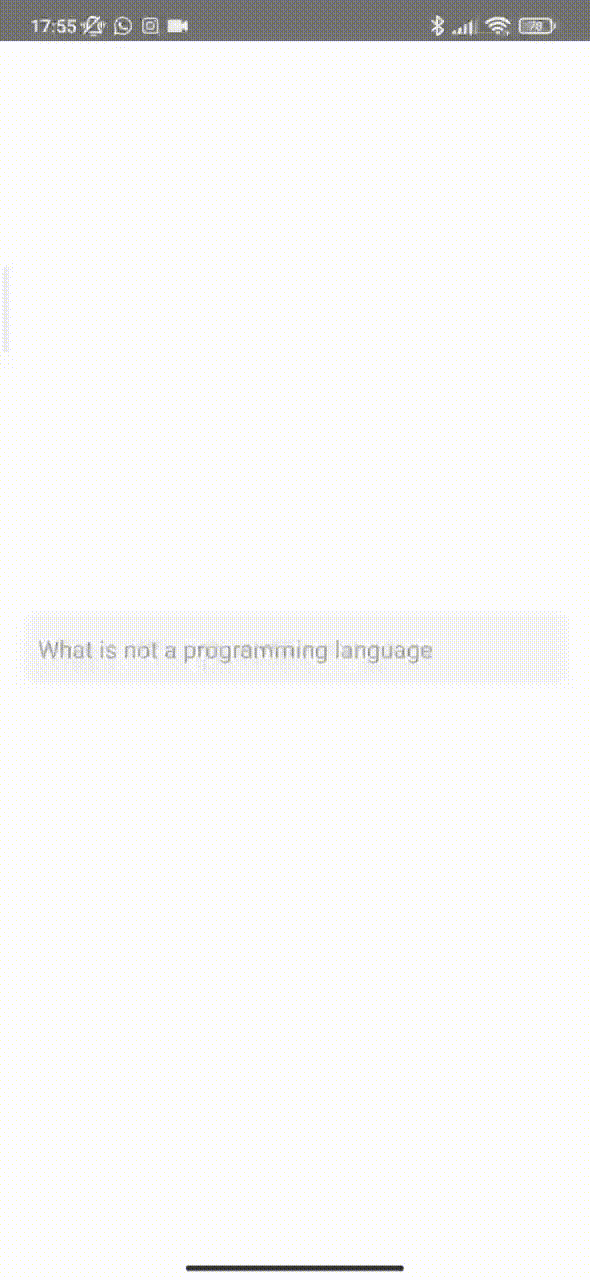
- TextInput - is UI component with animated lable of text input.
//...
import { Functions, UI } from 'itkitchen-react-native-ui-lib'
//...
const [text, setText] = useState("")

return (
    <View style={styles.container}>
        <UI.TextInput
            placeholder="What is not a programming language"
            focusedPlaceholderTextColor="red"
            focusedContainerStyle={{
                borderColor: 'red',
                borderWidth: 1
            }}
            listData={[
                { value: 'js', label: 'JavaScript' },
                { value: 'php', label: 'PHP' },
                { value: 'python', label: 'Python' },
                { value: 'c', label: 'C++' },
                { value: 'ruby', label: 'Ruby' },
                { value: 'html', label: 'HTML' },
                { value: 'dart', label: 'Dart' },
            ]}
            listProps={{
                scrollView: {
                    style: {
                        width: 200
                    }
                },
                emptyText: 'Nothing is here'
            }}
        />
    </View>
)
//...
Props
| Name |
Description |
Default |
Type |
| value |
value of TextInput component |
"" |
string |
| containerStyle |
style of text input container |
{} |
object |
| focusedContainerStyle |
style of text input container when it focused |
{} |
object |
| style |
style of TextInput component |
{} |
object |
| focusedStyle |
style of TextInput component when it focused |
{} |
object |
| IconComponent |
icon component that will render on right side of input |
null |
React Component |
| iconVisible |
the boolean prop that hide or show right icon component |
false |
bool |
| LeftIconComponent |
icon component that will render on left side of input |
null |
React Component |
| leftIconVisible |
the boolean prop that hide or show left icon component |
false |
bool |
| disableAnimation |
the boolean prop that disable animation |
false |
bool |
| focusedPlaceholderTextColor |
if lable color shuld change on focus, pass your color to this props |
same with placeholderTextColor |
string |
| listData |
array of object({value: Any, label: String}) |
[] |
array |
| listProps |
object of list props {"containerStyle": Object, style of list container. "scrollViewProps": ScrollViewProps, react-native ScrollView properties. "itemStyle": Object, list item style, "itemTextStyle": Object, list item text style, "emptyContainerStyle": Object, container style if list of suggestions is empty, "emptyTextStyle": Object, text style when list of suggestions is empty, "emptyText": Object, style of text when list of suggestions is empty } |
{} |
object |
| onListItemSelect |
call back function when list item is pressed |
() => {} |
function |
| and all TextInput component props |
|
|
any |
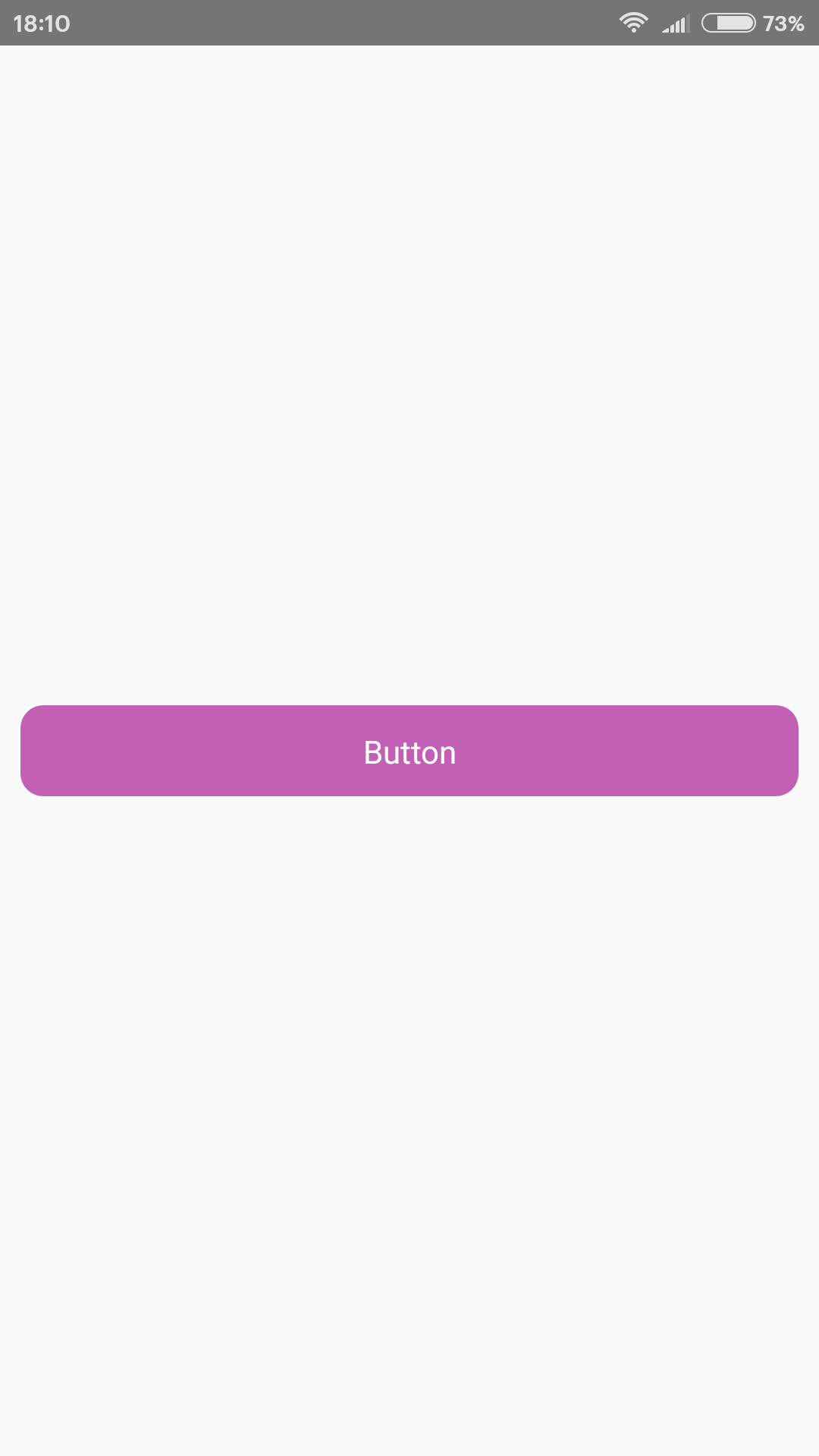
- Button - is UI component of button.
//...
import { Functions, UI } from 'itkitchen-react-native-ui-lib'
//...
return (
    <View style={styles.container}>
        <UI.Button
            text="Button"
            style={{
                width: '95%',
                height: 40,
            }}
        />
    </View>
)
Props
| Name |
Description |
Default |
Type |
| style |
style of Button component |
object |
style |
| textStyle |
style of button text |
object |
style |
| onPress |
function that call when button pressed |
onPress={()=>{}} |
func |
| activeOpacity |
determines what the opacity of the wrapped view should be when touch is active. From 0 to 1 |
0.6 |
float |
| text |
text that will display on button |
"ItKitchenButton" |
string |
| loading |
boolean props that show or hide spinner, also if loading true function "onPress" will not be called |
false |
bool |
| loadingColor |
color of loading spinner |
"#ffffff" |
string |
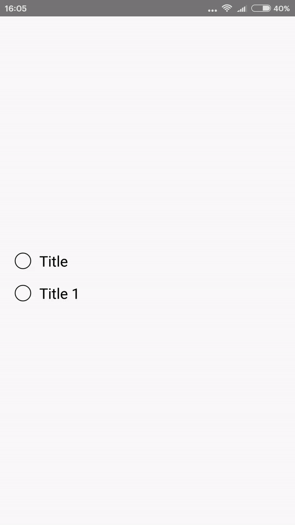
- RadioButton - is UI component of radio button.
import { Functions, UI } from 'itkitchen-react-native-ui-lib'
//...
const [value, setValue] = useState(false)
const [value1, setValue1] = useState(false)
//...
return (
    <View style={styles.container}>
        <UI.RadioButton
            value={value}
            title="Title"
            onPress={() => setValue(!value)}
            activeTintColor="red"
            inactiveTontColor="black"
        />
        <UI.RadioButton
            value={value1}
            title="Title 1"
            onPress={() => setValue1(!value1)}
            activeTintColor="red"
            inactiveTontColor="black"
        />
    </View>
)
Props
| Name |
Description |
Default |
Type |
| containerStyle |
style of the component container |
object |
style |
| radioButtonStyle |
style of the outer circle |
object |
style |
| circleStyle |
style of the inner circle |
object |
style |
| value |
value of button, if true button is checked |
false |
bool |
| onPress |
function that call when button pressed |
onPress={()=>{}} |
func |
| activeOpacity |
determines what the opacity of the wrapped view should be when touch is active. From 0 to 1 |
0.6 |
float |
| title |
text that will display on right side of button |
"" |
string |
| activeTintColor |
color when button is checked |
"#494043" |
string |
| inactiveTontColor |
color when button is unchecked |
"#494043" |
string |
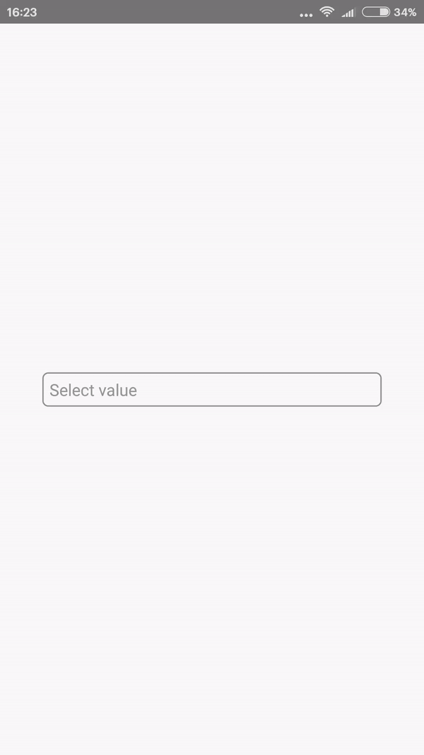
- DropDown - is UI component of drop down list.
import { Functions, UI } from 'itkitchen-react-native-ui-lib'
//...
const styles = StyleSheet.create({
    container: {
        flex: 1,
        width,
        alignItems: "center",
        justifyContent: "center"
    },
    dropdown: {
        width: "80%",
        borderRadius: 5,
        borderColor: "grey",
        borderWidth: 1,
        paddingHorizontal: 5
    }
})
//...
const [state, setState] = useState("")

const stringData = ["value 1", "value 2"]
const odjData = [{value: 1, label: "value 1"}, {value: 2, label: "value 2"}]

return (
    <View style={styles.container}>
        <UI.DropDown
            data={stringData}
            value={state}
            placeholder="Select value"
            onDataChange={value => setState(value)}
            style={styles.dropdown}
        />
    </View>
)
Props
| Name |
Description |
Default |
Type |
| data |
array of strings that will display on drop down list |
[] |
array |
| value |
value that will display on button |
"" |
string |
| onDataChange |
function that call when selected new value |
onDataChange={value => {}} |
func |
| style |
style of the component container |
object |
style |
| textStyle |
style of the component text |
object |
style |
| placeholderTextStyle |
style of the component placeholder |
object |
style |
| menuStyle |
style of the menu container |
object |
style |
| itemStyle |
style of the menu item container |
object |
style |
| itemTextStyle |
style of the menu item text |
object |
style |
| placeholder |
value that will display when "value" property is empty |
"" |
string |
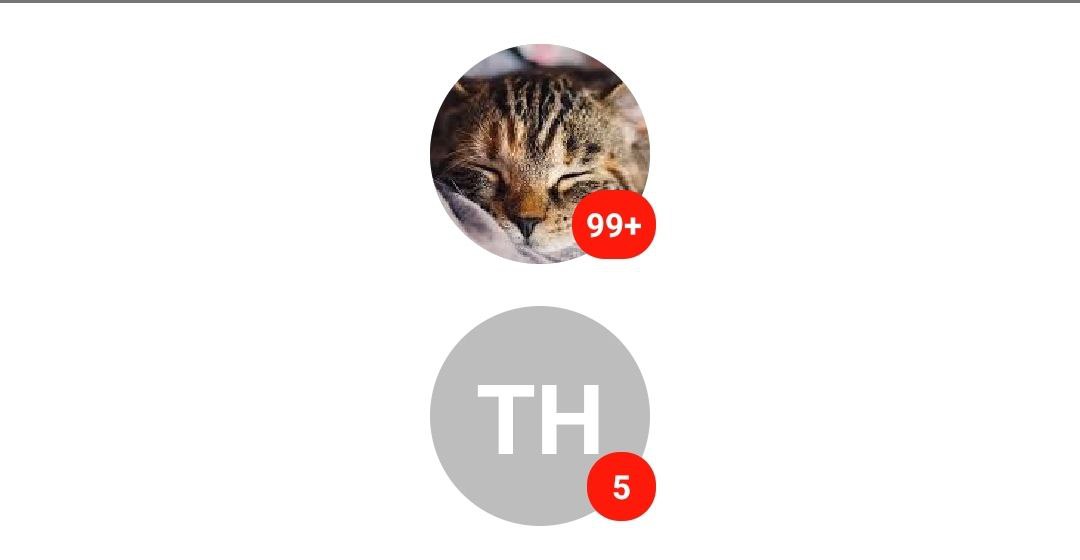
- Avatar - is UI component of image for lists to profile screens.
import { Functions, UI } from 'itkitchen-react-native-ui-lib'
//...
const styles = StyleSheet.create({
    container: {
        flex: 1,
        width,
        alignItems: "center",
        justifyContent: "center"
    }
})
//...

return (
    <View style={styles.container}>
        <UI.Avatar
            imageUrl="https://encrypted-tbn0.gstatic.com/images?q=tbn%3AANd9GcSsb3dnwW7TWK8zRGaCQ_ThqeLRWTZKXsWAL5z6rI_9UAwM0NqH"
            nameString="Tit Hardwood"
            badge={100}
            style={{ marginBottom: 15 }}
        />
        <UI.Avatar
            nameString="Tit Hardwood"
            badge={5}
        />
    </View>
)
Props
| Name |
Description |
Default |
Type |
| imageUrl |
url to image |
"" |
String |
| nameString |
string of user name or description |
"" |
string |
| onPress |
function that call when avatar pressed |
onPress={()=>{}} |
func |
| badge |
used if you need to render badge on avatar |
0 |
number |
| style |
style of the component container |
{} |
style |
| imageStyle |
style of the image |
{} |
style |
| badgeStyle |
style of the badge |
{} |
style |
| badgeTextStyle |
style of the badge |
{} |
style |
| letterStyle |
style of letters of nameString when imageUrl is empty |
{} |
style |
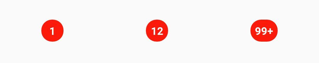
- Badge - is UI component used to render a numerical value.
    import { Functions, UI } from 'itkitchen-react-native-ui-lib'
    //...
    const styles = StyleSheet.create({
        container: {
            flex: 1,
            width,
            alignItems: "center",
            justifyContent: "center"
        }
    })
    //...
    return (
        <View style={styles.container}>
            <UI.Badge badge={1} />
            <UI.Badge badge={12} />
            <UI.Badge badge={123} />
        </View>
    )
Props
| Name |
Description |
Default |
Type |
| badge |
used if you need to render badge on avatar |
0 |
number |
| style |
style of the component container |
object |
style |
| textStyle |
style of the badge value |
object |
style |
- Card - is UI component used to render some information.
- cardType - default
    import { Functions, UI } from 'itkitchen-react-native-ui-lib'
    //...
    const styles = StyleSheet.create({
        container: {
            flex: 1,
            width
        }
    })
    //...
    const arr = new Array(10).fill({
        imageUrl: 'https://encrypted-tbn0.gstatic.com/images?q=tbn%3AANd9GcSsb3dnwW7TWK8zRGaCQ_ThqeLRWTZKXsWAL5z6rI_9UAwM0NqH',
        title: "Cat",
        subTitle: "Sleeping sleeping sleeping sleeping sleeping sleeping sleeping sleeping sleeping sleeping sleeping sleeping sleeping sleeping sleeping sleeping sleeping sleeping sleeping sleeping sleeping sleeping sleeping sleeping sleeping sleeping sleeping sleeping"
    })
    //...
    return (
        <ScrollView
            style={styles.container}
            contentContainerStyle={{ alignItems: 'center' }}
        >
            {
                arr.map((item, index) => (
                    <UI.Card
                        key={index}
                        title={item.title}
                        description={item.description}
                        imageUrl={item.imageUrl}
                        containerStyle={{ marginBottom: 15 }}
                    />
                ))
            }
        </ScrollView>
    )

Props
| Name |
Description |
Default |
Type |
| title |
title of card |
"" |
string |
| description |
subtitle of card |
"" |
string |
| imageUrl |
url to image |
"" |
string |
| onPress |
function that call when card pressed |
onPress={()=>{}} |
func |
| titleNumberOfLines |
number of title lines. React-Native Text component property |
3 |
number |
| descriptionNumberOfLines |
number of description lines. React-Native Text component property |
3 |
number |
| Footer |
Component that will render on bottom of card |
null |
React-Native Component |
| containerStyle |
style of component container |
{} |
style |
| imageStyle |
style of the image |
{} |
style |
| imageContainerStyle |
style of image container |
{} |
style |
| infoContainerStyle |
style of info container(title and subtitle) |
{} |
style |
| titleStyle |
style of card title |
{} |
style |
| descriptionStyle |
style of card subtitle |
{} |
style |
| loadingColor |
color of ActivityIndicator while image loading |
"#000" |
string |
| loadingSize |
size of ActivityIndicator while image loading |
'small' |
'small' or 'large' |
| imageProps |
Image component props |
|
|
cardType - animated //Removed.
cardType - background
    import { Functions, UI } from 'itkitchen-react-native-ui-lib'
    //...
    const styles = StyleSheet.create({
        container: {
            flex: 1,
            width,
            alignItems: "center",
            justifyContent: "center"
        }
    })
    //...
    const arr = new Array(10).fill({
        imageUrl: 'https://encrypted-tbn0.gstatic.com/images?q=tbn%3AANd9GcSsb3dnwW7TWK8zRGaCQ_ThqeLRWTZKXsWAL5z6rI_9UAwM0NqH',
        title: "Cat",
        subTitle: "Sleeping sleeping sleeping sleeping sleeping sleeping sleeping sleeping sleeping sleeping sleeping sleeping sleeping sleeping sleeping sleeping sleeping sleeping sleeping sleeping sleeping sleeping sleeping sleeping sleeping sleeping sleeping sleeping"
    })
    //...
    return (
        <ScrollView
            style={styles.container}
            contentContainerStyle={{ alignItems: 'center' }}
        >
            {
                arr.map((item, index) => (
                    <UI.Card
                        cardType="background"
                        key={index}
                        title={item.title}
                        description={item.subTitle}
                        imageUrl={item.imageUrl}
                        containerStyle={{ marginBottom: 15 }}
                    />
                ))
            }
        </ScrollView>
    )

Props
| Name |
Description |
Default |
Type |
| title |
title of card |
"" |
string |
| description |
subtitle of card |
"" |
string |
| imageUrl |
url to image |
"" |
string |
| onPress |
function that call when card pressed |
onPress={()=>{}} |
func |
| titleNumberOfLines |
number of title lines. React-Native Text component property |
3 |
number |
| descriptionNumberOfLines |
number of description lines. React-Native Text component property |
3 |
number |
| Footer |
Component that will render on bottom of card |
null |
React-Native Component |
| containerStyle |
style of component container |
{} |
style |
| imageStyle |
style of the image |
{} |
style |
| maskStyle |
style of mask view container |
{ ...StyleSheet.absoluteFillObject, backgroundColor: "rgba(0,0,0,0.4)" } |
style |
| infoContainerStyle |
style of info container(title and subtitle) |
{} |
style |
| titleStyle |
style of card title |
{} |
style |
| descriptionStyle |
style of card subtitle |
{} |
style |
| imageBackgroundProps |
ImageBackground component props |
|
|
- FlatList - is modified React-Native FlatList component.
import { Functions, UI } from 'itkitchen-react-native-ui-lib'

const { width } = Dimensions.get("window")

const arr = new Array(10).fill({
    imageUrl: 'https://encrypted-tbn0.gstatic.com/images?q=tbn%3AANd9GcSsb3dnwW7TWK8zRGaCQ_ThqeLRWTZKXsWAL5z6rI_9UAwM0NqH',
    title: "Cat",
    description: "Sleeping sleeping sleeping sleeping sleeping sleeping sleeping sleeping sleeping sleeping sleeping sleeping sleeping sleeping sleeping sleeping sleeping sleeping sleeping sleeping sleeping sleeping sleeping sleeping sleeping sleeping sleeping sleeping"
})
const loading = true

//...

return(
    <UI.FlatList
        data={arr}
        renderItem={({ item }) => (
            <View style={{ width, paddingHorizontal: 15, paddingTop: 15 }}>
                <UI.Card
                    title={item.title}
                    description={item.description}
                    imageUrl={item.imageUrl}
                />
            </View>
        )}
        loading={loading}
        useRefreshControl={false}
        LoadinComponent={
            <View style={{ flex: 1, alignItems: 'center', justifyContent: 'center' }}>
                <ActivityIndicator animating size={"large"} />
            </View>
        }
    />
)
Props
| Name |
Description |
Default |
Type |
| loading |
if this property is true refresh controll or LoadingConponent is showing up |
false |
bool |
| onRefresh |
RefreshControl onRefresh property |
() => {} |
function |
| LoadinComponent |
component that will be showing up instead of ListEmptyComponent if loading true |
null |
React-Native component |
| useRefreshControl |
if true used RefreshControll component to FlatList |
true |
bool |
| emptyComponenText |
Default ListEmptyComponent text |
"There is nothing here" |
string |
| and all FlatList component props |
|
|
any |
Functions
- normalize - is a function which normalizes the font size of the text relative to the screen size.
import { Functions, UI } from 'itkitchen-react-native-ui-lib'

//...

return (
    <View style={styles.container}>
        <Text style={{ fontSize: Functions.normalize(14), color: "#000000", marginBottom: 15 }}>Some text</Text>
    </View>
);

const styles = StyleSheet.create({
    container: {
        flex: 1,
        justifyContent: 'center',
        alignItems: 'center',
        backgroundColor: '#F5FCFF',
    },
});
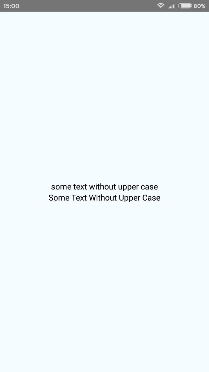
- wordsFromUpperCase - is a regex function that replace words first lower case character to upper.
import { Functions, UI } from 'itkitchen-react-native-ui-lib'

//...

return (
    <View style={styles.container}>
        <Text style={{ fontSize: 14, color: "#000000" }}>{"some text without upper case"}</Text>
        <Text style={{ fontSize: 14, color: "#000000" }}>{Functions.wordsFromUpperCase("some text without upper case")}</Text>
    </View>
);

const styles = StyleSheet.create({
    container: {
        flex: 1,
        justifyContent: 'center',
        alignItems: 'center',
        backgroundColor: '#F5FCFF',
    },
});
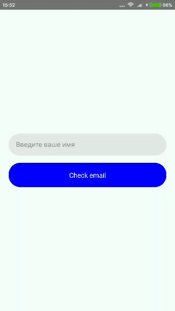
- emailValid - is a regex function that return true if email is valid and return false if is not.
import { Functions, UI } from 'itkitchen-react-native-ui-lib'

//...

const [email, setEmail] = useState("")

const checkEmail = () => {
    let check = Functions.emailValid(email)
    alert(check)
}

return (
    <View style={styles.container}>
        <UI.TextInput
            value={email}
            onChangeText={email => setEmail(email)}
            placeholder="Введите ваше имя"
            style={styles.textInput}
        />
        <TouchableOpacity onPress={checkEmail} style={styles.buttonContainer}>
            <Text style={{ color: "#ffffff" }}>Check email</Text>
        </TouchableOpacity>
    </View>
)

//...

const styles = StyleSheet.create({
    container: {
        flex: 1,
        justifyContent: 'center',
        alignItems: 'center',
        backgroundColor: '#F5FCFF',
    },
    buttonContainer: {
        width: "90%",
        height: 50,
        alignItems: "center",
        justifyContent: "center",
        backgroundColor: "blue",
        borderRadius: 24,
    },
    textInput: {
        height: 45,
        width: "90%",
        borderRadius: 24,
        backgroundColor: '#e8e8e8',
        justifyContent: "center",
        paddingHorizontal: 15,
        marginBottom: 15
    }
});
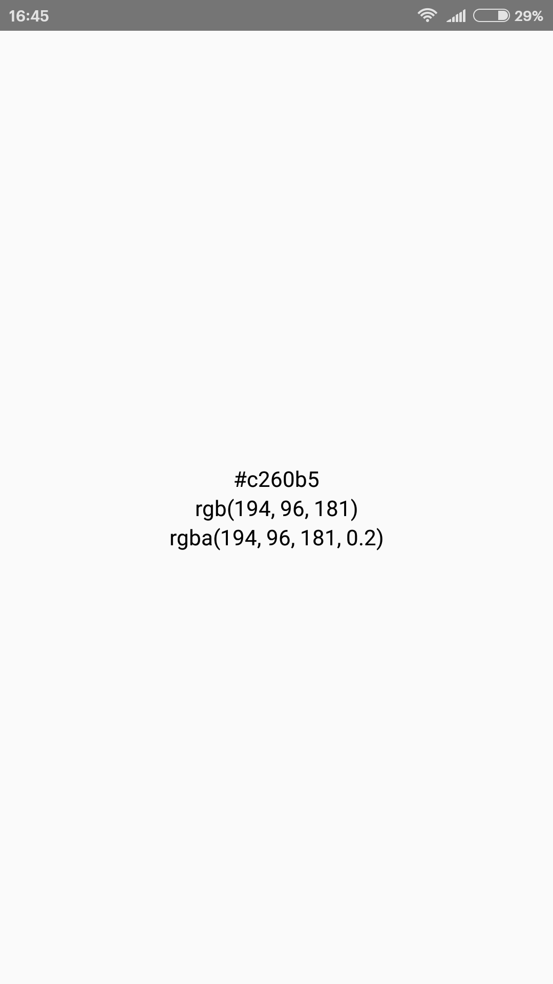
- hexToRgba - is a function that can convert color hex value to rgb or rgba.
import { Functions, UI } from 'itkitchen-react-native-ui-lib'
//...
const color = "#c260b5"
const alpha = 0.2
return (
    <View style={styles.container}>
        <Text>{color}</Text>
        <Text>{Functions.hexToRgba(color)}</Text>
        <Text>{Functions.hexToRgba(color, alpha)}</Text>
    </View>
)