README
Gradient Chooser Widget


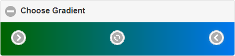
This is a widget for jQuery mobile. It is an extension of a collapsible widget. The widget has only one element in the collapsible list. This element contains a from color, to color and an action button. Specify the label of the gradient chooser widget like of the collapsible widget with e.g. an H1 tag.
Preview
Preconditions
The widget is implemented in ECMAScript 2015, so your project should support at least this version. To use the widget of course you need also jQuery and jQuery Mobile.
Installation
Installation via npm:
npm install jqm-gradient-chooser
Download built files:
Integration
Link the CSS file nearby to your other CSS files in the header section of your HTML file:
<link rel="stylesheet" href="stylesheets/jqm-gradient-chooser.min.css">
Include the JS file right after jQuery JS file and jQuery mobile JS file:
<script src="javascripts/jquery.min.js"></script>
<script src="javascripts/jquery.mobile.min.js"></script>
<script src="javascripts/jqm-gradient-chooser.min.js"></script>
Usage
Definition in your HTML file
Create the gradient chooser by adding the data-role="gradientchooser" attribute to a div:
<div id="gradient" data-role="gradientchooser"></div>
You can use also all the attributes of the collapsible widget.
Options
Beside the options of the collapsible widget, you have following options.
actionIcon
Type: String
Default: 'action'
You can specify a different action button icon.
// set action button icon to recycle
$('#gradient').gradientchooser('option', 'actionIcon', 'recycle')
fromIcon
Type: String
Default: 'carat-r'
You can specify a different from color icon.
// set from color icon to arrow right
$('#gradient').gradientchooser('option', 'fromIcon', 'arrow-r')
toIcon
Type: String
Default: 'carat-l'
You can specify a different to color icon.
// set to color icon to arrow left
$('#gradient').gradientchooser('option', 'toIcon', 'arrow-l')
colorFrom
Type: String
Default: '#000000'
With this option you can specify the from color of the gradient.
// set from color to violet
$('#gradient').gradientchooser('option', 'colorFrom', '#ff00ff')
colorTo
Type: String
Default: '#000000'
With this option you can specify the to color of the gradient.
// set to color to green
$('#gradient').gradientchooser('option', 'colorTo', 'rgb(0, 255, 0)')
Methods
You can use following methods.
colorFrom
You can get or set the from color.
// get from color
var colorFrom = $('#gradient').gradientchooser('colorFrom')

// set from color (to blue)
$('#gradient').gradientchooser('colorFrom', 'rgb(0, 0, 255)')
colorTo
You can get or set the to color.
// get to color
var colorTo = $('#gradient').gradientchooser('colorTo')

// set to color (to red)
$('#gradient').gradientchooser('colorTo', '#ff0000')
Events
You can register on following events. You will need them to supply colors and to apply the gradient for whatever you need it.
clickFrom
The widget triggers this event, if the user clicks on the from color button.
// register on the event
$('#gradient').gradientchooser('option', 'clickFrom', function(){
   // do something, e.g. let the user pick a color and set the from color
}
clickTo
The widget triggers this event, if the user clicks on the to color button.
// register on the event
$('#gradient').gradientchooser('option', 'clickTo', function(){
   // do something, e.g. let the user pick a color and set the to color
}
apply
The widget triggers this event, if the user clicks on the action button.
// register on the event
$('#gradient').gradientchooser('option', 'apply', function(){
   // do something, e.g. get the from and to color
   // to use them with a gradient effect
}
Behavior
Everytime you change one of the colors the widget shows the corresponding gradient on the expanded area.
As color you can specify two different formats:
#rrggbb- whereby rr is the hexadecimal value for red, gg for green, bb for bluergb(r, g, b)- whereby r is the decimal value for red, g for green, b for blue
The widget returns the color in the same format as given.
Example
See the manual test HTML page to get an idea how it works.
License
MIT