README


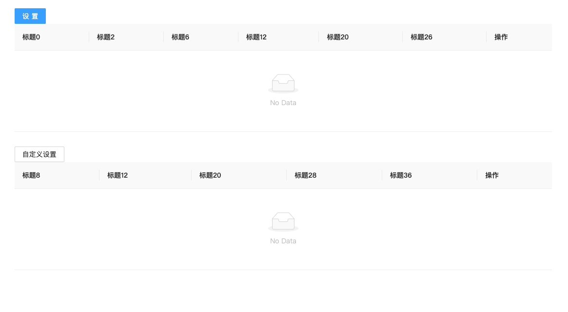
在日常业务中,经常会使用到antd的table组件。
使用的最开始只显示几行字段,可是后面展示的字段越来越多,而且不同的人希望看到的字段是不一样的。
基于此,封装了manage-table, 内部还是使用了antd,只是增加了对显示列的灵活操作的处理逻辑。
manage-table 内置了 设置展示的列 存储在localstorage的功能,将会使用参数name进行唯一存储, 所以在使用的时候,请保持单一域名内所需展示列的唯一性。
Install and Include
安装
$ npm install manage-table --save
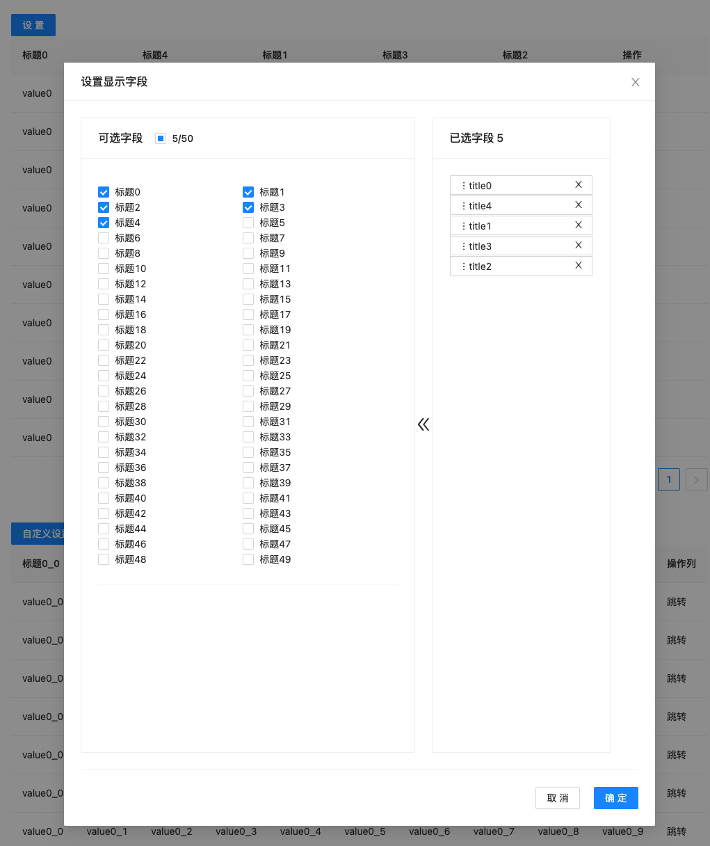
使用方式一:支持直接引用,使用内置设置
import ManageTable  from "manage-table";
import './App.css';
import React from "react";

function App() {
  const mockColumns = new Array(50).fill('').map((_item: string, index) => {
    return {
      dataIndex: 'title' + index,
      key: 'title' + index,
      title: '标题' + index,
      show: index % 3 === 0,
    };
  });
  mockColumns.push({
    dataIndex: 'action',
    key: 'action',
    title: '操作',
    show: true,
  });
  console.log(mockColumns)
  return (
    <div className="App">
      <ManageTable name="testTable" columns={mockColumns}/>
    </div>
  );
}

export default App;
使用方式二:支持自定义设置:
import React from "react";
import { Button } from "antd";
import ManageTable from "manage-table";

export default function App2() {
  const mockColumns = new Array(50).fill("").map((_item, index) => {
    return {
      dataIndex: "title" + index,
      key: "title" + index,
      title: "标题" + index,
      show: index % 3 === 0
    };
  });
  mockColumns.push({
    dataIndex: "action",
    key: "action",
    title: "操作",
    show: true
  });
  const ref = React.createRef();
  const handleShowModal = () => {
    ref.current.showModal();
  };
  const SettingHeader = (
    <div style={{ textAlign: "left" }}>
      <Button onClick={handleShowModal}>自定义设置</Button>
    </div>
  );
  return (
    <div className="App">
      <ManageTable
        ref={ref}
        SettingComp={SettingHeader}
        name="testTable2"
        columns={mockColumns}
      />
    </div>
  );
}
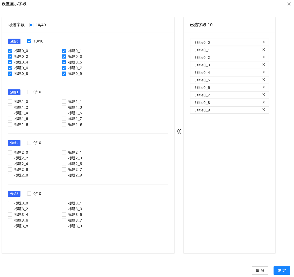
使用方式三、按组划分
import React from "react";
import { Button } from "antd";
import ManageTable from "manage-table";

const mockGroup = () => {
  const data = new Array(4).fill('').map((_item:string, index: number) => {
    return {
      title: '分组' + index,
      records: new Array(10).fill('').map((_item: string, indx) => {
        return {
          dataIndex: 'title' + index + '_' + indx,
          key: 'title' + index + '_' + indx,
          title: '标题' + index + '_' + indx,
          show: indx % 5 === 0,
        };
      }),
    };
  });
  // 任何一个索引都可以,不必须是0
  data[0].records.push({
    dataIndex: 'action',
    key: 'action',
    title: '操作列',
    show: true,
  })
  return data;
}

function AppGroupRef() {
  const ref: any = React.createRef();

  const handleSet = () => {
    ref.current.showModal();
  }

  const SettingHeader = (
    <div style={{textAlign: 'left'}}>
      <Button type="primary" onClick={handleSet}>自定义设置</Button>
    </div>
  );
  return (
    <div className="App">
      <ManageTable ref={ref} SettingComp={SettingHeader} name="testTableGroup" columns={mockGroup()}/>
    </div>
  );
}

export default AppGroupRef;
参数说明
ManageTable, 继承自antd的Table
| 参数名 | 类型 | 说明 |
|---|---|---|
| name | string | 存储所使用的唯一的key,必传 |
| columns | ManageColumnType[] | GroupManageColumn[] |
| ref | React.createRef()的返回对象 | 增加面板, 非必传 |
| SettingComp | React.ReactNode | 自定义设置头部, 非必传 |
| setTitle | React.ReactNode、string | 自定义弹窗的标题,默认'设置显示字段', 非必传 |
| defaultShowKeys | string[] | 默认显示的字段,不需要进行选择or 排序 |
| initialShowKeys | string[] | 初始显示的字段,自定义存储 |
| onKeysSelected | (keys: string[]) => void | 存储钩子函数,搭配自定义存储使用 |
ManageColumnType, 继承自antd的Table的ColumnType
| 参数名 | 类型 | 说明 |
|---|---|---|
| show | boolean | 是否默认显示 |
GroupManageColumn, 继承自antd的Table的ColumnType
| 参数名 | 类型 | 说明 |
|---|---|---|
| title | string | 组名,必传 |
| records | ManageColumnType[] | 列数据, 必传 |
demo展示
示例参考:codesanbox - manage-table
开发&测试
install and develop
git clone git@github.com:tnfe/manage-table.git
cd manage-table
npm install
npm start
Then open http://localhost:3000/
build
npm run build