README
Modal Material
A Service developed based on Angular Material using the Angular CLI framework. Containing Customized Alerts and Templates pre made with basic settings for display.


Table of contents
Installation and Dependencies
Use the command below to add the service to your Angular application.
npm install --save modal-material
Immediately after installing the service, import the module into your application.
import { ModalMaterialModule } from 'modal-material';

/*---------------------------------------------------*/

@NgModule({
  imports: [
    ModalMaterialModule
  ],
})
Once this is done, it is ready to be used, just import the service into one of its components of use.
import { Component } from '@angular/core';

// Import Service

import { ModalMaterialService } from 'modal-material';

@Component({
  selector: 'app-test-modal',
  templateUrl: './test-modal.component.html',
  styleUrls: ['./test-modal.component.scss']
})
export class TestModalComponent {

  constructor(private modal: ModalMaterialService) {}

}
It is necessary to install the Font Awesome library to use 100% of the service.
To install it in your angular application just go to the angular.json file in the styles section and add the following line.
"styles": [
  "./node_modules/components-font-awesome/css/all.css",
],
That done, you are ready to enjoy the service 100%.
Quick start
import { Component } from '@angular/core';
// Import Service
import { ModalMaterialService } from 'modal-material';
@Component({
selector: 'app-test-modal',
templateUrl: './test-modal.component.html',
styleUrls: ['./test-modal.component.scss']
})
export class TestModalComponent implements OnInit {
constructor(private modal: ModalMaterialService) {}
ngOnInit() {
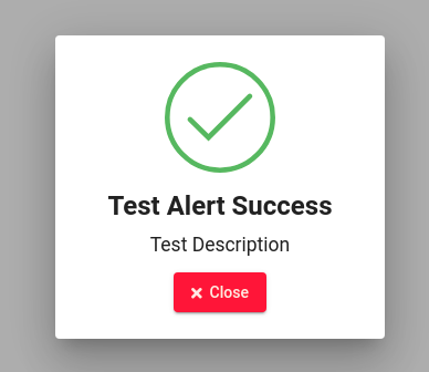
this.modal.mTSuccess({
title: 'Test Alert Success', // Alert Title
description: 'Test Description', // Alert Description
btnCloseTitle: 'Close', // Close Alert Button Title
width: 'auto', // Alert Width. Example 100px, 100%.
height: 'auto', // Alert height. Example 100px, 100%.
disableClose: true // When you click outside the modal it will close itself. True case it does not close.
});
}
}
- Quick start result
Available Functions
Below are all available functions and possible alerts.
mTSuccess
this.modal.mTSuccess({
  title: 'Test Alert Success', // Alert Title
  description: 'Test Description',  // Alert Description
  btnCloseTitle: 'Close', // Close Alert Button Title
  width: 'auto',  // Alert Width. Example 100px, 100%.
  height: 'auto', // Alert height. Example 100px, 100%.
  disableClose: true // When you click outside the modal it will close itself. True case it does not close.
});
mTSuccessLog
this.modal.mTSuccessLog(
  {
   title: 'Test Alert Success Log', // Alert Title
   description: 'Test Description Log', // Alert Description
   btnCloseTitle: 'Close', // Close Alert Button Title
   btnLogTitle: 'Details', // Details button title.
   log: 'Careful it looks like the system is getting overloaded.', // Log
   width: 'auto', // Alert Width. Example 100px, 100%.
   height: 'auto', // Alert height. Example 100px, 100%.
   disableClose: true // When you click outside the modal it will close itself. True case it does not close.
  }
);
mTSuccessConfirm
this.modal.mTSuccessConfirm(
  {
   title: 'Test Alert Success', // Alert Title
   description: 'Test Description', // Alert Description
   btnCloseTitle: 'Close', // Close Alert Button Title
   btnConfirmTitle: 'Confirm', // Confirmation Button title.
   width: 'auto', // Alert Width. Example 100px, 100%.
   height: 'auto', // Alert height. Example 100px, 100%.
   disableClose: true // When you click outside the modal it will close itself. True case it does not close.
  }
).subscribe((res) => {
  if (res) {
    console.log('Confirmed!');
  } else {
    console.log('Canceled');
  }
});
mTAlert
this.modal.mTAlert(
  {
    title: 'Test Alert', // Alert Title
    description: 'Test Description',  // Alert Description
    btnCloseTitle: 'Close', // Close Alert Button Title
    width: 'auto',  // Alert Width. Example 100px, 100%.
    height: 'auto', // Alert height. Example 100px, 100%.
    disableClose: true
  }
);
mTAlertLog
this.modal.mTAlertLog(
  {
    title: 'Test Alert Log', // Alert Title
    description: 'Test Description Log', // Alert Description
    btnCloseTitle: 'Close', // Close Alert Button Title
    btnLogTitle: 'Details', // Details button title.
    log: 'Congratulations you have just used the alert log service', // Log
    width: 'auto', // Alert Width. Example 100px, 100%.
    height: 'auto', // Alert height. Example 100px, 100%.
    disableClose: true // When you click outside the modal it will close itself. True case it does not close.
  }
);
mTAlertConfirm
this.modal.mTAlertConfirm(
  {
    title: 'Test Alert', // Alert Title
    description: 'Test Description', // Alert Description
    btnCloseTitle: 'Close', // Close Alert Button Title
    btnConfirmTitle: 'Confirm', // Confirmation Button title.
    width: 'auto', // Alert Width. Example 100px, 100%.
    height: 'auto', // Alert height. Example 100px, 100%.
    disableClose: true // When you click outside the modal it will close itself. True case it does not close.
  }
).subscribe((res) => {
  if (res) {
    console.log('Confirmed!');
  } else {
    console.log('Canceled');
  }
});
mTError
this.modal.mTError(
  {
    title: 'Test Alert Error', // Alert Title
    description: 'Test Description',  // Alert Description
    btnCloseTitle: 'Close', // Close Alert Button Title
    width: 'auto',  // Alert Width. Example 100px, 100%.
    height: 'auto', // Alert height. Example 100px, 100%.
    disableClose: true
  }
);
mTErrorLog
this.modal.mTErrorLog(
  {
    title: 'Test Alert Error Log', // Alert Title
    description: 'Test Description Log', // Alert Description
    btnCloseTitle: 'Close', // Close Alert Button Title
    btnLogTitle: 'Details', // Details button title.
    log: 'Error failed to bring user from database.', // Log
    width: 'auto', // Alert Width. Example 100px, 100%.
    height: 'auto', // Alert height. Example 100px, 100%.
    disableClose: true // When you click outside the modal it will close itself. True case it does not close.
  }
);
mTErrorConfirm
this.modal.mTErrorConfirm(
  {
    title: 'Test Alert Error', // Alert Title
    description: 'Test Description', // Alert Description
    btnCloseTitle: 'Close', // Close Alert Button Title
    btnConfirmTitle: 'Confirm', // Confirmation Button title.
    width: 'auto', // Alert Width. Example 100px, 100%.
    height: 'auto', // Alert height. Example 100px, 100%.
    disableClose: true // When you click outside the modal it will close itself. True case it does not close.
  }
).subscribe((res) => {
  if (res) {
    console.log('Confirmed!');
  } else {
    console.log('Canceled');
  }
});
mManualBasic
this.modal.mManualBasic(
  {
    title: 'Test Alert', // Alert Title
    description: 'Test Description',  // Alert Description
    btnCloseTitle: 'Close', // Close Alert Button Title
    icon: 'fab fa-npm', // Put the icon class if it is https://fontawesome.com/
    // if not just put the icon name if you are going to use https://material.io/
    mBackgroundColorIcon: 'green', // Background color that will be behind the icon when the modal appears.
    useMatIcon: false, // If using https://material.io/ leave true if using https://fontawesome.com/ leave false.
    width: 'auto', // Alert Width. Example 100px, 100%.
    height: 'auto', // Alert height. Example 100px, 100%.
    disableClose: true // When you click outside the modal it will close itself. True case it does not close.
  }
);
mManualLog
this.modal.mManualLog(
  {
    modalMB: {
     title: 'Title Alert', // Alert Title
     description: 'Title Description', // Alert Description
     btnCloseTitle: 'Close', // Close Alert Button Title
     icon: 'person', // Put the icon class if it is https://fontawesome.com/
      // if not just put the icon name if you are going to use https://material.io/
     mBackgroundColorIcon: 'red', // Background color that will be behind the icon when the modal appears.
     useMatIcon: true,  // If using https://material.io/ leave true if using https://fontawesome.com/ leave false.
     width: 'auto',  // Alert Width. Example 100px, 100%.
     height: 'auto', // Alert height. Example 100px, 100%.
     disableClose: true // When you click outside the modal it will close itself. True case it does not close.
    },
    btnLogTitle: 'Details', // Details button title.
    log: 'Failed to add person.', // Log
  }
);
mManualConfirm
this.modal.mManualConfirm(
  {
    modalMB: {
      title: 'Test Alert', // Alert Title
      description: 'Test Description', // Alert Description
      btnCloseTitle: 'Close', // Close Alert Button Title
      icon: 'warning', // Put the icon class if it is https://fontawesome.com/
      // if not just put the icon name if you are going to use https://material.io/
      mBackgroundColorIcon: 'yellow', // Background color that will be behind the icon when the modal appears.
      useMatIcon: true,  // If using https://material.io/ leave true if using https://fontawesome.com/ leave false.
      width: 'auto',  // Alert Width. Example 100px, 100%.
      height: 'auto', // Alert height. Example 100px, 100%.
      disableClose: true // When you click outside the modal it will close itself. True case it does not close.
    },
    btnConfirmTitle: 'Confirm', // Confirmation Button title.
  }
).subscribe((res) => {
  if (res) {
    console.log('Confirmed!');
  } else {
    console.log('Canceled');
  }
});