README
Description
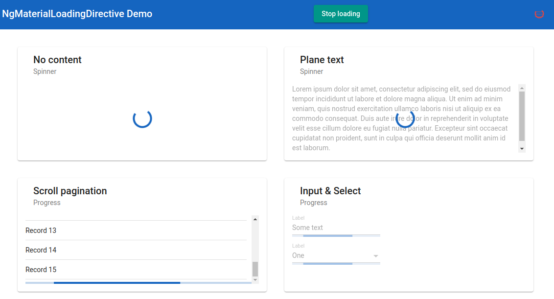
Angular directive to impose Angular Material based loading indicator on any content. The loading indicator may be an indeterminate Angular Material progress spinner or a progress bar.

- Compatible with Angular Material components such as input, select, etc.
- Uses Angular Material Theme colors.
- Well configurable.
- Works well in SSR mode.
Demo
 Also you can clone the repo and start the application locally to see ng-material-loading lib in action.
Usage
Install package
npm i ng-material-loading
Add import to your module
import { NgMaterialLoadingModule } from 'ng-material-loading';

@NgModule({
  imports: [
    ...
    NgMaterialLoadingModule.forRoot(),
    ],
  declarations: [],
  providers: []
})
Then in template:
  <mat-form-field [ngMatLoading]="loading$ | async" ngMatLoadingType="progress">
    <input matInput/>
  </mat-form-field>
or
  <mat-card>
    <mat-card-header>
      <mat-card-title>Plane text</mat-card-title>
      <mat-card-subtitle>Spinner</mat-card-subtitle>
    </mat-card-header>

    <mat-card-content [ngMatLoading]="loading$ | async">
      <p>Lorem ipsum dolor sit amet...</p>
    </mat-card-content>
  </mat-card>
Options
| Option | Type | Default | Description |
|---|---|---|---|
| opacity | number | 0.3 | Content opacity when the loading indicator is imposed |
| diameter | number | 40 | Spinner diameter in pixels |
| color | 'primary' | 'warn' | 'accent' |
| type | 'spinner' | 'progress' | 'spinner' |
| attacheTo | string | null | Selector of HTML element to which the loadinf indicator should be attached |
Configuration
You can configure default ng-material-loading options:
NgMaterialLoadingModule.forRoot({
  opacity: 0.45,
  type: 'progress',
  ...
})
The configuration interface looks like this:
export interface NgMatLoadingConfig {
  opacity?: number; // Default content opacity when the loading indicator is imposed
  diameter?: number; // Default spinner diameter in pixels
  color?: 'primary' | 'warn' | 'accent'; // Default loading indicator color
  type?: 'spinner' | 'progress'; // Default loading indicator type
  attacheTo?: { [key: string]: string; } // host to target map (see below)
}
In attacheTo object you can list selector to which loading indicator should be attached for some commonly encountered host elements.
Contributig to ng-material-loading
You are more than welcome to improve this library or create issues on the GitHub issue tracker.