README
Ngx Date Range
Current version: 1.0.44
Here's a minimal example of ngx-daterange in action, showing positioning on the left, right and using custom templating: https://ngx-daterange.netlify.app/
External Dependencies
Required Angular Modules
- FormsModule
- ReactiveFormsModule
Polyfills
If you are targeting older browsers, you may need to polyfill es7 arrays, specifically .some()
Usage
Install from npm:
npm install ngx-daterange --save
Import and add the NgxDateRangeModule to your main module, or wherever applicable. Example:
import { FormsModule, ReactiveFormsModule } from '@angular/forms';
import { NgxDateRangeModule } from 'ngx-daterange';

@NgModule({
  declarations: [
    ...
  ],
  imports: [
    ...
    FormsModule,
    NgxDateRangeModule,
    ReactiveFormsModule,
  ],
  providers: [],
  bootstrap: [AppComponent]
})
export class AppModule { }
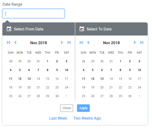
ngx-daterange is implemented as a single text input that displays one, or two calendars depending on your options. It may be implemented with, or without options in your component as such:
<date-range-picker [options]="options" [parentFormGroup]="form" [controlName]="'myDateRange'"></date-range-picker>
By default, ngx-daterange will assign a control name of "dateRange", however you may override this with the [controlName] input.
ngx-daterange assumes that you have a FormGroup instance that you are adding it to, and as such expects you to pass in the FormGroup via the [parentFormGroup] input.
Populating Existing Dates
You may pass in Moment instances via the [fromDate] and [toDate] inputs.
Using Custom Templating
A content slot is provided to override the default text input. Here's an example using a Bootstrap input group:
<date-range-picker [instanceId]="'secondDateRange'" [options]="secondFieldOptions" [parentFormGroup]="form"
    [controlName]="'secondDateRange'" #dateRangePicker>
  <div class="form-group">
    <label for="secondDateRange">Your Custom Label</label>
    <div class="input-group">
      <div class="input-group-prepend">
        <span class="input-group-text" id="date-range-icon">
          <i class="material-icons">event</i>
        </span>
      </div>
      <input id="secondDateRange" class="form-control" type="text" name="dateRange"
          [value]="dateRangePicker.range" placeholder="From - To" formControlName="secondDateRange" />
    </div>
  </div>
</date-range-picker>
You must supply one additional input: [instanceId], which must correspond to the id of the input. Otherwise, the calendar(s) won't be displayed when the input is clicked.
To access the ngx-daterange instance, assign a template variable (#dateRangePicker in the sample code) so that you may access the range value to bind to your input's [value].
The value you use for the [controlName] must correspond to the name property of the input, or use "dateRange" as the name of the input to match the default value in the component. Otherwise, the control won't be able to be added to your FormGroup instance.
Styling
ngx-daterange's default templating and styling is dependent on Bootstrap 4.x
Manual date inputs are hidden for mobile devices. Specifically, these are User Agents matching: Android, webOS, iPhone, iPod, Blackberry and Windows Phone.
Mobile styling is applied via JavaScript, not media queries.
Date Range Picker Options
Most settings are optional and an interface, IDateRangePickerOptions is provided for your convenience. Here are all of the settings currently enabled:
autoApply
Automatically sets the range value when both dates are selected and hides the calendars. If using a single calendar, the range is set and the calendar is closed when the date is selected. If false, the Apply button will be displayed.
Type: boolean
Default value: true
clickOutsideAllowed
Set this to false if you want a click outside the boundary of the DatePicker component to automatically close it.
Type: boolean
Default value: true
disableInputDisplay
Set this to true if you want to apply the disabled attribute to the input element that renders the selected range (or single date value) of the DatePicker component. Unlike the fromDate or toDate input elements displayed above the calendars, which are not affect by this option, enabling this option prevents the user from editing the displayed range/value, which can cause confusion as the edited value will not reflect the actual range/value of the component.
Type: boolean
Default value: false
format
The format of the range value as displayed in the UI.
Type: string
Default value: 'YYYY-MM-DD'
Accepted value: Any format string supported by Moment.js
icons
Icons displayed for the next/previous and month/year buttons. By default, inlined base64 images are used. If you're using Font Awesome 5, or Google Material Icons, you may specify one or the other. You are expected to apply the CSS for those libraries independent of this module.
Type: string
Default value: 'default'
Accepted values: 'default', 'font-awesome' or 'material'
labelText
The text of the form label when using the default templating.
Type: string
Default value: 'Date Range'
Accepted value: Any
maxDate
The maximum selectable date in the future.
Type: Moment
Default value: null
Accepted value: Any valid Moment instance that comes after minDate.
minDate
The maximum selectable date in the past.
Type: Moment
Default value: null
Accepted value: Any valid Moment instance that comes before maxDate.
position
The side on which you would like the date picker to open.
Type: string
Default value: 'left'
Accepted values: 'left' or 'right'
preDefinedRanges
An array of pre-defined date ranges can be displayed to the user using a friendly "name". The array will appear below the Cancel / Reset / Apply buttons.
Type: IDefinedDateRange[]
Default value: not specified
showResetButton
Show or hide the reset button.
Type: boolean
Default value: true
singleCalendar
Display a single calendar instance instead of a range. Useful when you don't want to add another dependency and need to select a single date.
Type: boolean
Default value: false
validators
One or more ValidatorFn instances may be supplied to suit your needs.
Type: ValidatorFn[] | ValidatorFn
Default value: not specified
Event Emitters
When a date is specified, an IDateRange object is emitted via the rangeSelected function.
When the datepicker is reset, a datepickerReset event is emitted.
Running the Angular Sample Project
Development server
Run ng serve for a dev server. Navigate to http://localhost:4200/. The app will automatically reload if you change any of the source files.
Build Sample App
Run ng build to build the sample app. The build artifacts will be stored in the dist/ directory. Use the --prod flag for a production build.
Rationale
This project is heavily refactored from: angular-2-daterangepicker
I needed to be able to use custom templating and reactive forms, which were the primary features of developing this module which were missing in the original project. It is intended to allow the user to quickly pick a from and to date with reasonable default settings and just enough customization to allow you to accomplish your use case without being overly burdensome.