README

Profile Hover
profile-hover is a drop-in component that displays profile metadata for any ethereum address. Available in React and HTML/CSS versions.
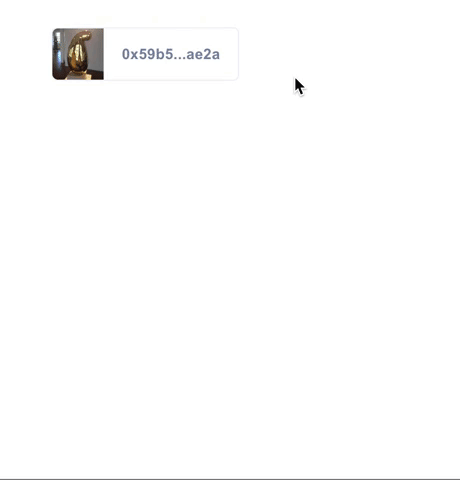
Component Overview
The Profile Hover consists of two components: the Tile, which is displayed on the page, and the Hover, which is displayed when the Tile is hovered. Profile Hover is available for React and HTML/CSS apps.
Getting Started
React Component
Installation:
npm i -S profile-hover
Usage:
import ProfileHover from 'profile-hover';

const MyComponent = () => (<ProfileHover address={'0xa8ee0babe72cd9a80ae45dd74cd3eae7a82fd5d1'} />);
HTML Element
First add the script at the end of your page.
<script type="text/javascript" src="https://unpkg.com/profile-hover"></script>
Then add the following tag where ever you display an address.
<threebox-address data-address='0xa8ee0babe72cd9a80ae45dd74cd3eae7a82fd5d1'></threebox-address>
Additional Options:
Add data-display='full' to show the entire address instead of the shorten display.
<threebox-address data-address='0xa8ee0...' data-display='full'></threebox-address>
Add data-theme='none' to not use any of our address bar styling. Allows you to wrap any existing elements in an address hover.
  <threebox-address data-address='0xa8ee0...' data-theme='none'>
    ... your own html and styling
  </threebox-address>
How to Customize
Here are the ways you can customize the profile hover to better suit your app's needs.
Prop Types
| Property | Type | Default | Component | Description |
|---|---|---|---|---|
address |
String | Address property value is required to work. Provide an Ethereum address to this property to fetch profile information. |
||
showName |
Boolean | False | Tile | Provide property showName to show the user's name from their 3Box profile instead of their Ethereum address. |
url |
String | Tile | Provide property url with url string to set where clicking on the Tile will redirect the user. |
|
displayFull |
Boolean | False | Tile | Add displayFull property to show the entire address instead of the shortened display. |
tileStyle |
Boolean | False | Tile | Add tileStyle property to render the tile component as a tile. |
noTheme |
Boolean | False | Tile | Add noTheme property to not use any of our Tile styling. Allows you to wrap any existing elements in a Hover component. |
noImgs |
Boolean | False | Hover | Add noImgs property to prevent displaying of profile image and cover image in the Hover. |
noProfileImg |
Boolean | False | Hover | Add noProfileImg property to prevent displaying of just the profile image in the Hover. |
noCoverImg |
Boolean | False | Hover | Add noCoverImg property to prevent displaying of just the cover image in the Hover. |
orientation |
String | 'right' |
Hover | Provide property orientation with string 'top', 'bottom', 'right' or 'left' to set which way the Hover will pop up from the Tile. |
Prop Types example
<ProfileHover
  address={'0xa8ee0...'}
  orientation="bottom"
  noCoverImg
  url="https://3box.io/"
/>
<ProfileHover
  address={'0xa8ee0...'}
  noTheme
>
  ... your own html and styling
</ProfileHover>
Differences Between Desktop and Mobile
Given the current state of Web3 mobile dapp browsers and their lack of browser tab support, the behavior of the profile-hover React component has minor differences depending on device context. On desktop web and web2 mobile browsers, out-bound links within the hover element work as usual and open a new tab. However on Web3 mobile dapp browsers, since tabs do not exist, clicking on a link within the hover component will, instead, copy that URL to a users clipboard.