README
progress-bar-for-react

This is a simple fully customizable react progress bar component
Author
Myron Apostolakis
Installation
npm install --save progress_bar_for_react
Import
import ProgressBar from "progress_bar_for_react";
Usage
<ProgressBar percentage={50} />
The option percentage is mandatory in order for the ProgressBar to display. When the percentage is equal to 100% the ProgressBar will hide itself.
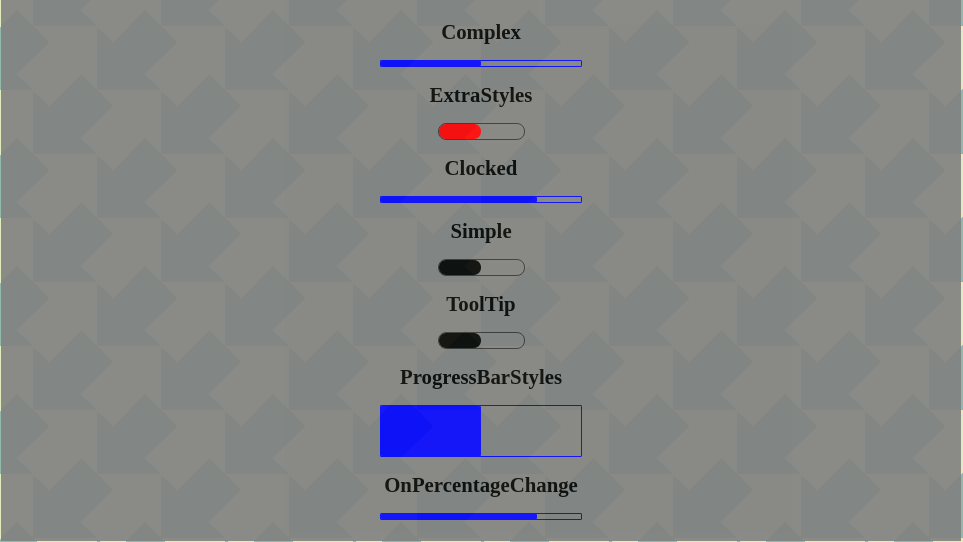
List of supported Options
| Option | Description |
|---|---|
| tooltip='Demo text' | If this option is set then the 'Demo text' appears as a tooltip on mouse hovering |
| fillerExtraStyles={{...}} | Filler extra styles will override the default styling. Usage: backgroundColor: blue or hex code |
| progressBarExtraStyles={{...}} | Progress Bar extra styles will override the default styling. Usage: position,height,width,borderRadius, border |
Please see the src/Examples folder for more descriptive usage.
API calls
onPercentageChange
It will be triggered when a new percentage is received. Please see examples
Demo
You can see a demo in the following link
Fork instructions
You can fork this repository for your own modifications following the bellow steps
Please follow the instructions from https://help.github.com/en/github/getting-started-with-github/fork-a-repo
Development
Use command npm start and visit http://localhost:3000. Every example in the Examples folder will load.
Build
Use command npm run dist:demo
Codesandbox
Testing and Code coverage
This component is tested with Cypress.
Coverage report
License
This repo is licensed under GNU General Public License v3.0