README
React 2D Canvas
Draw 2D shapes, images and text on an HTML Canvas element using a declarative JSX syntax. The library builds on top of custom elements from the Web Components standard.
React 2D Canvas makes it easy to create simple 2D canvas games by leveraging on the developer ergonomics that React offers.
React 2D Canvas is lightweight with focus on efficiently producing 2D drawings. Features such as audio, hit detection and animation are not built in. Users of React 2D Canvas are encoraged to incorporate suitable libraries to add auxiliary functionality or roll your their own custom solutions as needed.
Table of Content
Example Usage
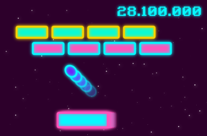
import {
  Stage,
  Layer,
  ScaleMode,
  RoundedRectangle,
  Circle,
  Label
} from 'react-2d-canvas';

function App() {
  return (
    <Stage
      width={640}
      height={420} backgroundColor="#2d002b"
      scaleMode={ScaleMode.SCALE_TO_FIT}
    >
      {/*Static background layer*/}
      <Layer>
        {[...Array(100).keys()].map(index => (
          <Circle
            key={index}
            x={Math.floor(Math.random() * 620) + 20}
            y={Math.floor(Math.random() * 400) + 20}
            radius={Math.floor(Math.random() * 2) + 1}
            backgroundColor="#fff"
            shadowColor="#fff"
            shadowOffsetX={2}
            shadowOffsetY={2}
            shadowBlur={10}
            opacity={Math.random()}
          />
        ))}
      </Layer>
      {/*Game action layer*/}
      <Layer>
        <Label
          x={360}
          y={50}
          color="#08f7fe"
          fontSize={40}
          fontFamily="Retro Gaming"
          shadowColor="#08f7fe"
          shadowBlur={8}
        >
          28.100.000
        </Label>
        {[...Array(4).keys()].map(column => (
          [...Array(2).keys()].map(row => (
            <RoundedRectangle
              key={`[${column},${row}]`}
              x={100 + column * 110 + (row % 2 ? 50 : 0)}
              y={100 + row * 50}
              radius={4}
              width={100}
              height={40}
              borderColor={row % 2 ? '#08f7fe' : '#f5d300'}
              backgroundColor={row % 2 ? '#fe53bb' : '#09fbd3'}
              borderWidth={6}
              shadowColor={row % 2 ? '#08f7fe' : '#f5d300'}
              shadowBlur={10}
            />
          ))
        ))}
        {[...Array(5).keys()].map(index => (
          <Circle
            key={index}
            x={280 - 15 * index}
            y={280 - 15 * index}
            radius={22}
            borderColor="#08f7fe"
            borderWidth={6}
            backgroundColor="#7122fa"
            shadowColor="#08f7fe"
            shadowBlur={10}
            scaleY={0.8}
            opacity={0.2 * index + 0.2}
            rotation={45 * Math.PI / 180}
          />
        ))}
        {[...Array(5).keys()].map(index => (
          <RoundedRectangle
            key={index}
            x={280 - 6 * index}
            y={370}
            width={160}
            height={50}
            radius={4}
            borderColor="#fe53bb"
            borderWidth={6}
            backgroundColor="#08f7fe"
            shadowColor="#fe53bb"
            shadowBlur={10}
            opacity={0.2 * index + 0.2}
          />
        ))}
      </Layer>
    </Stage>
  );
}
Browser Support
React 2D Canvas is supported by all modern web browsers. The support is mainly limited by the use of Autonomous custom elements.
The following browser versions are supported
- Edge >79
- Firefox >63
- Chrome >54
- Safari >10.1
- Opera >41
- Safari iOS >10.3
- Android browser >94
- Opera Mobile >64
- Chrome for Android >94
- Firefox for Android >92
- UC browser for Android >12.12
API
All components and the ScaleMode name space are exported individually from the main package.
import {
  Stage,
  ScaleMode,
  Layer,
  Rectangle,
  /* etc */
} from 'react-2d-canvas';
<Stage>
The <Stage> component is the outermost container and should have one or more <Layer> child components.
The <Stage> component handles the dimensions and scaling.
import { Stage, ScaleMode } from 'react-2d-canvas';

<Stage width={600} height={400} scaleMode={ScaleMode.SCALE_TO_FIT}>
  {/*...*/}
</Stage>
| Properties / Attributes | Description | Default value |
|---|---|---|
scaleMode |
Controlling how the child <Layer> components scale. Available options are ScaleMode.SCALE_TO_FIT or ScaleMode.SCALE_TO_COVER |
|
width |
Setting the width of the child <Layer> components. |
300 |
height |
Setting the height of the child <Layer> components. |
300 |
backgroundColor |
Setting the background color for the <Stage> component. Accepts a CSS color value. |
<Layer>
<Stage
  width={600}
  height={400}
  scaleMode={ScaleMode.SCALE_TO_FIT}
>
  <Layer>
    {/* Static background comoponents */}
  </Layer>
  <Layer>
    {/* Game play action and animation components */}
  </Layer>
  <Layer>
    {/* UI and interactive components */}
  </Layer>
</Stage>
Each <Layer> component holds an HTML <canvas> element. Using multiple sibling <Layer> components is a good way of
optimizing canvas redrawing when animating content. See for
instance "Use multiple layered canvases for complex scenes"
for a detailed explanation of this optimization strategy.
The following event handlers passed to the <Layer> component will be forwarded to the underlying HTML <canvas>
element.
onClickonMouseMoveonMouseDownonMouseUponDoubleClickonContextMenuonMouseOutonMouseOver
Shapes Components
Shape components, such as <Rectangle>, <Circle>, and <Label> are available for representing different graphical
elements and user interface controls.
All shape components accept a ref property which will be forwarded to the underlying element. Using a ref enables the possibilities to read properties / attributes on the element.
All shape components have the following common attributes:
| Common Attributes | Description | Default value |
|---|---|---|
x |
X-coordinate | 0 |
y |
Y-coordinate | 0 |
backgroundColor |
Background color expressed as a CSS color string | |
borderColor |
Border color expressed as a CSS color string | |
borderWidth |
Border width in pixels | 1 |
opacity |
Opacity in the range of 0 to 1 |
1 |
originX |
Origin on the x-axis in relation to the width of the shape, in the range of 0 to 1.A value of 0 will left align the shape, 0.5 will center align, and 1 will right align the shape. Also affects the rotation origin. |
0.5 |
originY |
Same as originX, but related to the y-axis. |
0.5 |
rotation |
Rotation in radians. The rotation origin is controlled by the values of orignX and originY |
0 |
scaleX |
Scaling factor in horizontal direction. | 1 |
scaleY |
Scaling factor in the vertical direction. | 1 |
shadowColor |
Shadow color expressed as a CSS color string. | |
shadowBlur |
Level of shadow blur. | 0 |
shadowOffsetX |
Distance that shadows will be offset horizontally. | 0 |
shadowOffsetY |
Distance that shadows will be offset vertically. | 0 |
borderDash |
String of comma separated numbers that define the border dash pattern. | |
zIndex |
Draw priority among children. Child components with higher zIndex will be drawn on top of siblings with lower zIndex. |
0 |
Event Handlers
All shapes accept the following mouse event handlers:
onClickonMouseMoveonMouseDownonMouseUponDoubleClickonContextMenuonMouseOutonMouseOver
Nesting and Inheritance
Shape components can well be nested. Child components will be affected by the following attributes of their parent component:
| Attributes affected by parent | Description |
|---|---|
x |
Child's x-coordinate will be an offset of the parent's x-coordinate |
y |
Same as above, but for the y-coordinate |
opacity |
Child's opacity will be multiplied by the parent's opacity |
rotation |
Child's rotation will be increased by the parent's rotation |
Nesting components makes it possible to update the relative position, opacity and rotation of a group of child components, by just changing the corresponding property on their common ancestor.
<Rectangle>
<Rectangle
  x={100}
  y={100}
  width={75}
  height={150}
  borderColor="#333"
  backgroundColor="#666"
/>
The <Rectangle> component accepts all common attributes, and the additional attributes listed below.
| Attributes | Description | Default value |
|---|---|---|
width |
Pixel width. | 0 |
height |
Pixel height. | 0 |
<RoundedRectangle>
<RoundedRectangle
  x={100}
  y={100}
  width={75}
  height={150}
  radius={20}
  borderColor="#333"
  backgroundColor="#666"
/>
The <RoundedRectangle> component accepts all common attributes, and the additional attributes listed below.
| Attributes | Description | Default value |
|---|---|---|
width |
Pixel width. | 0 |
height |
Pixel height. | 0 |
radius |
Corner radius. | 0 |
<Circle>
<Circle
  x={100}
  y={100}
  radius={20}
  borderColor="#333"
  backgroundColor="#666"
/>
The <Circle> component accepts all common attributes, and the additional attributes listed below.
| Attributes | Description | Default value |
|---|---|---|
radius |
Radius. | 0 |
<Arc>
<Arc
  x={100}
  y={100}
  radius={20}
  borderColor="#333"
  startAngle={45 * Math.PI / 180}
  endAngle={180 * Math.PI / 180}
/>
The <Arc> component accepts all common attributes, and the additional attributes listed below.
| Attributes | Description | Default value |
|---|---|---|
radius |
Radius. | 0 |
startAngle |
Start angle in radians measured from 12'o clock. | 0 |
endAngle |
End angle in radians measured from 12'o clock. | 0 |
counterclockwise |
Boolean value indicating direction of drawing from startAngle to endAngle. |
false |
<Sector>
<Sector
  x={100}
  y={100}
  radius={20}
  borderColor="#333"
  startAngle={45 * Math.PI / 180}
  endAngle={180 * Math.PI / 180}
/>
The <Sector> (ie. circular sector) component accepts all common attributes, and the additional attributes listed below.
| Attributes | Description | Default value |
|---|---|---|
radius |
Radius. | 0 |
startAngle |
Start angle in radians measured from 12'o clock. | 0 |
endAngle |
End angle in radians measured from 12'o clock. | 0 |
counterclockwise |
Boolean value indicating direction of drawing from startAngle to endAngle. |
false |
<Label>
<Label
  x={100}
  y={100}
  color="red"
  fontFamily="Helvetica"
  fontSize={30}
  fontStyle="italic"
  fontWeight="bold"
  align="center"
  baseline="middle"
  maxWidth={40}
  startAngle={45 * Math.PI / 180}
  endAngle={180 * Math.PI / 180}
>
  A single line of text
</Label>
The <Label> component accepts all common attributes (except originX and originY), and the additional
attributes listed below.
Use the align and baseline attributes to change the origin of a <Label>.
Note that the <Label> component does not accept width nor height attributes since the dimensions are derived from the text content, but there are read-only width and height element properties that can be accessed using a ref to the underlying element.
| Attributes | Description | Default value |
|---|---|---|
color |
Text color expressed as CSS color string. | |
fontSize |
Pixel size of the text. | 10 |
fontFamily |
Font family name of the text. | "sans-serif" |
fontStyle |
Font style expressed using one of the following values normal, italic, oblique. |
|
fontWeight |
Font weight expressed in CSS font weight string or number. | normal |
baseline |
Baseline of the text using one of the following values top, hanging, middle, alphabetic, ideographic, bottom. |
"alphabetic" |
align |
Horizontal alignment of the text using one of the following values left, right, start, end, center. |
"start" |
maxwidth |
Pixel width at which point the text will be cropped and appended with ellipses to fit within the maxWidth. |
Infinity |
<Image>
<Image
  x={100}
  y={100}
  width={48}
  height={48}
  src={myIcon}
/>
The <Image> component accepts all common attributes, and the additional attributes listed below.
| Attributes | Description | Default value |
|---|---|---|
width |
Pixel width. | 0 |
height |
Pixel height. | 0 |
src |
Path to image. |