README
Calendar
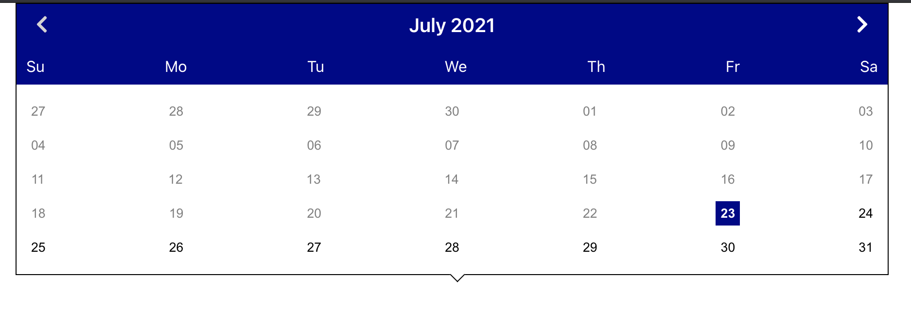
A re-usable calendar component for react.

Installation
The package can be installed via npm
npm install --save react-accessible-calendar
or via yarn
yarn add react-accessible-calendar
React should be included separately since that dependency is not included in the package. Below is the sample of how to use the Calendar in React.
import React, { useState } from 'react';
import { Calendar } from 'react-accessible-calendar';
import './App.css';

function App() {
  const [date, setDate] = useState(new Date()),
    min = '',
    max = '',
    blocked = [];
  return (
    <div className="App">
      <Calendar
        dates={{
          selectedDate: date,
          min: min,
          max: max,
          blocked: blocked
        }}
        themeColor=''
        onDateChange={setDate}
      ></Calendar>
    </div>
  );
}

export default App;
Configuration
You can pass following props to personalize the Calendar
selectedDate: The user can pass the date, that needs to be highlighted.
min: The minimum date upto which the Calendar should be active. The
dates are disabled beyond min date. By default, min date is present
date. All the past dates are disabled.
max: The maximum date upto which the Calendar should be active. The
dates are active only upto max date. The dates after max date are
disabled.
The min and max date can be a string in 'MM/DD/YYY' (eg: '01/01/2020') format or can
be in this new Date('MM/DD/YYY') format.
blocked: In the latest release, this feature has been implemented. This parameter takes the
array of dates in which each date can be in 'MM/DD/YYYY' format or new Date('MM/DD/YYY')
format or mixture of both and those dates will be blocked in the calendar.
themeColor: The Calendar month-year header background color can
be changed using themeColor.
onDateChange: The user can call a function whenever a date is
selected from the calendar.
date-fns
date-fns library has been used, which uses native Date objects.
Browser Support
It is compatible with latest versions of Chrome, Safari and IE10+.
Development
The master branch contains the latest code of react-accessible-calendar. You can clone the repo and run
npm install
npm start
to run the app.
Accessibility
Keyboard support
- Up arrow key: Moves to previous week.
- Down arrow key: Moves to next week.
- Left arrow key: Moves to previous day.
- Right arrow key: Moves to next day.
Also, aria-labels have been added so that the screen readers can read the dates in month-day-year format.
Demo
You can see the demo here,