README

VERSIONS
- Low Quality Preview
- Blur Hash
- Plain (CSS free)

React Cloudimage Responsive | Cloudimage v7
(blur hash placeholder)
Docs • Demo • Code Sandbox • Why?
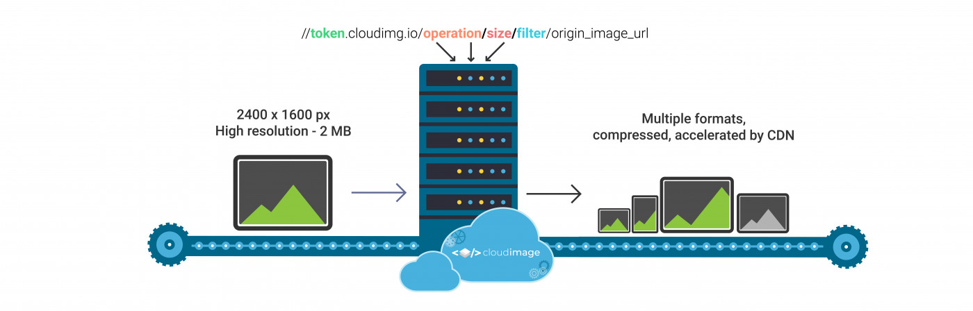
This plugin detects the width of any image container as well as the device pixel ratio density to load the optimal image size needed. Images are resized on-the-fly via the Cloudimage service, thus offering a comprehensive automated image optimization service.
When an image is first loaded on your website or mobile app, Cloudimage's resizing servers will download the origin image from the source, resize it for the client's screen size and deliver to your users through one or multiple Content Delivery Networks (CDNs). The generated image formats are cached in the CDN and will be delivered rocket fast on any subsequent request.
NOTE: Your original (master) images should be stored on a server or storage bucket (S3, Google Cloud, Azure Blob...) reachable over HTTP or HTTPS by Cloudimage. If you want to upload your master images to Cloudimage, contact us at hello@cloudimage.io.
powered by Cloudimage (Watch the video here)
Table of contents
- Demo
- Requirements
- Step 1: Installation
- Step 2: Initialize
- Step 3: Implement
- Configuration
- Image properties
- Examples & workarounds
- Browser support
- Filerobot UI Family
- Contributing
- License
Demo
To see the Cloudimage Responsive plugin in action, please check out the Demo page. Play with your browser's window size and observe your Inspector's Network tab to see how Cloudimage delivers the optimal image size to your browser, hence accelerating the overall page loading time.
Requirements
To use the Cloudimage Responsive plugin, you will need a Cloudimage token to deliver your images over CDN. Don't worry, it only takes seconds to get one by registering here. Once your token is created, you can configure it as described below. This token allows you to use 25GB of image cache and 25GB of worldwide CDN traffic per month for free.
Step 1: Installation
using npm
$ npm install --save react-cloudimage-responsive-blur-hash
Step 2: Initialize
After installing the react-cloudimage-responsive-blur-hash lib, simply initialize it with your token and the baseURL of your image storage with CloudimageProvider:
import React from 'react';
import { render } from 'react-dom';
import Img, { CloudimageProvider } from 'react-cloudimage-responsive-blur-hash';

const cloudimageConfig = {
  token: 'demo',
  baseURL: 'https://jolipage.airstore.io/'
};

const App = () => {
  return (
    <CloudimageProvider config={cloudimageConfig}>
      <h1>Simple demo of react-cloudimage-responsive-blur-hash</h1>
      <Img src="img.jpg" alt="Demo image" ratio={1.5} blurhash="L34VB$Rj8wofayfPj@azDNj[.9WB"/>
    </CloudimageProvider>
  );
};

render(<App />, document.body);
Step 3: Implement it
Img component:
<Img src="img.jpg" alt="Demo image" ratio={1.5} blurhash="L34VB$Rj8wofayfPj@azDNj[.9WB"/>
NOTE: "ratio" is recommended to prevent page layout jumping. The parameter is used to calculate image height to hold the image position while image is loading.

BackgroundImg component:
<BackgroundImg src="img.jpg"  blurhash="L34VB$Rj8wofayfPj@azDNj[.9WB">
 {'Your conent...'}
</BackgroundImg>
Config
token
Type: String | Default: "demo" | required
Your Cloudimage customer token. Subscribe for a Cloudimage account to get one. The subscription takes less than a minute and is totally free.
customDomain
Type: String | Default: "cloudimage.io" | optional
If you use a custom CNAME for your cloudimage integration, you can set it here.
Note: this will disregard your token above as this should be built into the CNAME entry.
baseURL
Type: String | Default: "/" | optional
Your image folder on server, this alows to shorten your origin image URLs.
apiVersion
Type: String |Default: 'v7' | optional
Allow to use a specific version of API.
- set a specific version of API
const cloudimageConfig = {
  token: 'demo',
  baseURL: 'https://jolipage.airstore.io/',
  apiVersion: 'v7'                            // optional
};
- disable API version
const cloudimageConfig = {
  token: 'demo',
  baseURL: 'https://jolipage.airstore.io/',
  apiVersion: null                            // optional
};
domain
Type: String | Default: "cloudimg.io"
Use your custom domain.
doNotReplaceURL
Type: bool | Default: false
If set to true the plugin will only add query params to the given source of image.
exactSize
Type: Bool | Default: false | optional
Forces to load exact size of images. By default the plugin rounds container width to next possible value which can be divided by 100 without the remainder. It’s done for cache reasons so that not all images are cached by 1px, but only 100px, 200px, 300px …
lazyLoading
Type: Bool | Default: true | optional
Only images close to the client's viewport will be loaded, hence accelerating the page loading time. The plugin uses react-lazyload library to achieve it.
lazyLoadOffset
Type: Number/Array(Number) | Default: 100
Say if you want to preload a component even if it's 100px below the viewport (user have to scroll 100px more to see this component), you can set offset props to 100. On the other hand, if you want to delay loading a component even if it's top edge has already appeared at viewport, set offset to negative number.
Library supports horizontal lazy load out of the box. So when you provide this prop with number like 100 it will automatically set left edge offset to 100 and top edge to 100;
If you provide this prop with array like [100, 200], it will set left edge offset to 100 and top offset to 200.
params
Type: String | Default: 'org_if_sml=1' | optional
Applies default Cloudimage operations/ filters to your image, e.g. brightness, contrast, rotation...
Multiple params can be applied, separated by "&" e.g. wat_scale=35&wat_gravity=northeast&wat_pad=10&grey=1
params: 'org_if_sml=1'
alternative syntax: type: Object
params: {
    org_if_sml: 1,
    grey: 1,
    ...
}
Full cloudimage v7 documentation here.
presets
Type: Object
Default:
const cloudimageConfig = {
  token: 'demo',
  baseURL: 'https://jolipage.airstore.io/',
  ...
  presets: {
      xs: '(max-width: 575px)', // up to 575    PHONE
      sm: '(min-width: 576px)', // 576 - 767    PHABLET
      md: '(min-width: 768px)', // 768 - 991    TABLET
      lg: '(min-width: 992px)', // 992 - 1199   SMALL_LAPTOP_SCREEN
      xl: '(min-width: 1200px)' // from 1200    USUALSCREEN
  }
};
Breakpoints shortcuts to use in image size property, can be overwridden.
limitFactor
Type: Number | Default: 100 | optional
Rounds up size of an image to nearest limitFactor value.
For example
- for an image with width 358px and limitFactor equals 100 the plugin will round up to 400px
- for an image with width 358px and limitFactor equals 5 the plugin will round up to 360px
devicePixelRatioList
Type: [Number,...] | Default: [1, 1.5, 2] | optional
List of supported device pixel ratios. If there is no need to support retina devices, you should set empty array devicePixelRatioList: []
ImageSizeAttributes
Type: String | possible values: 'use', 'ignore', 'take-ratio' | Default: 'use'
If width and height attributes are set:
use - width & height attributes values will be used to calculate image size (according to user's DPR) and ratio.
take-ratio - width & height attributes values will be used only to calculate ratio.
ignore - width & height attributes will be ignored.
If width and height attributes are NOT set, image container size will be detected to calculate result image size (according to user's DPR)
Note: If only width or height attributes is set, ratio is going to be taken from ci-ratio image attribute
Image properties
src
Type: String | Default: undefined | required
Original image hosted on your web server. You can use absolute path or relative to baseURL in your config.
NOTES:
The plugin uses a special algorithm to detect the width of image container and set the image size accordingly. This is the recommended way of using the Cloudimage Responsive plugin.
blurhash
Type: String | Default: undefined | required
BlurHash is a very compact representation of a placeholder for an image. read more
width
Type: String (e.g. 300px, 20vw) | Default: undefined
If it's set the plugin will use width as fixed value and change only according device pixel ratio.
height
Type: String (e.g. 300px, 20vh) | Default: undefined
If it's set the plugin will use height as fixed value and change only according device pixel ratio.
params
Type: String | Default: undefined | optional
You can apply any Cloudimage operations/ filters to your image, e.g. brightness, contrast, rotation...
Multiple params can be applied, separated by "&" e.g. wat_scale=35&wat_gravity=northeast&wat_pad=10&grey=1
params="gray=1&bright=10"
alternative syntax: type: Object
params={{
    bright: 10,
    grey: 1,
    ...
}}
Full cloudimage v7 documentation here.
sizes
Type: Object | Default: undefined
{preset breakpoint (xs,sm, md,lg,xl) or media query + ' ' + image params}:
<Img
  src="dino-reichmuth-1.jpg"
  sizes={{
    '(max-width: 575px)': { w: 400, h: 150 },
    '(min-width): 576px)': { r: 1 },
    '(min-width: 620px)': { h: 560 },
    '(min-width: 768px)': { w: '50vw' },
    '(min-width: 992px)': { w: '55vw', h: 300 },
    '(min-width: 1200px)': { w: 1200 }
 }}/>
You can drop some breakpoints, for example:
<Img
  src="dino-reichmuth-1.jpg"
  sizes={{
      sm: { w: 400, h: 200 },
      '(min-width: 620px)': { w: 200, h: 60 }
 }}/>
new experimental syntax
md: { w: '40vw', h: 350 } or md: { w: 250, h: '20vh' }
adds possibility to use fixed height or width and change dynamically other dimension
NOTE: if size is not set, the plugin uses a special algorithm to detect the width of image container and set the image size accordingly. This is the recommended way of using the Cloudimage Responsive plugin.
ratio
Type: Number | optional
It is recommended to prevent page layout jumping. The parameter is used to calculate image height to hold the image position while image is loading.
lazyLoading
Type: Bool | optional
Make it possible to disable lazyLoading for each image.
lazyLoadConfig
Type: Object | optional
The lazyLoad configuration to LazyLoad component.
To see the full cloudimage documentation click here
Examples & workarounds
Browser support
Tested in all modern browsers and IE 11.
Filerobot UI Familiy
Contributing!
All contributions are super welcome!
License
React Cloudimage Responsive is provided under the MIT License