README
react-declarative
Material-ui json endpoint form builder. Check this storybook for more samples...

A React form builder which interacts with a JSON endpoint to generate nested 12-column grids with input fields and automatic state management in a declarative style. Endpoint is typed by TypeScript guards (IntelliSense available). This tool is based on material-ui components, so your application will look beautiful on any device...
Install
There is a sample app avalible in demo folder...
npm install --save react-declarative
Demos
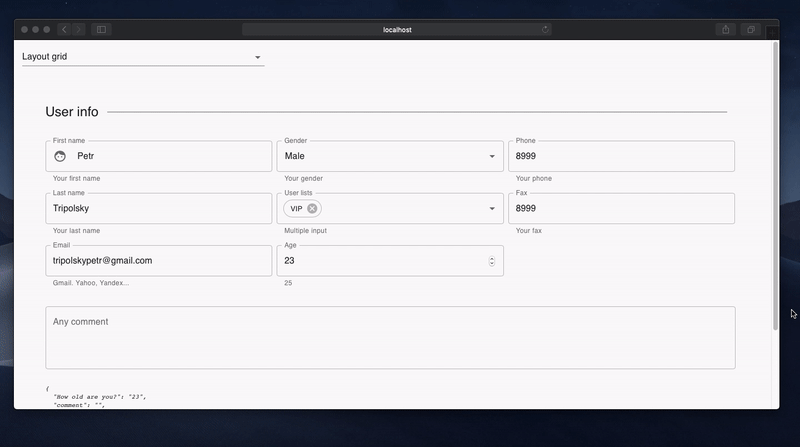
1. Layout grid
Link to source code
const fields: TypedField[] = [
  {
    type: FieldType.Line,
    title: 'User info',
  },
  {
    type: FieldType.Group,
    phoneColumns: '12',
    tabletColumns: '6',
    desktopColumns: '4',
    fields: [
      {
        type: FieldType.Text,
        title: 'First name',
        defaultValue: 'Petr',
        description: 'Your first name',
        leadingIcon: Face,
        focus() { console.log("focus :-)"); },
        blur() { console.log("blur :-("); },
        name: 'firstName',
      },
      {
        type: FieldType.Text,
        title: 'Last name',
        defaultValue: 'Tripolsky',
        description: 'Your last name',
        name: 'lastName',
      },

      ...

];
2. Form validation
Link to source code
const fields: TypedField[] = [
  {
    type: FieldType.Text,
    name: 'email',
    trailingIcon: Email,
    defaultValue: 'tripolskypetr@gmail.com',
    isInvalid({email}) {
      const expr = /^[\w-.]+@([\w-]+\.)+[\w-]{2,4}$/g;
      if (!expr.test(email)) {
        return 'Invalid email address';
      } else {
        return null;
      }
    },
    isDisabled({disabled}) {
      return disabled;
    },
    isVisible({visible}) {
      return visible;
    }
},
{
    type: FieldType.Expansion,
    title: 'Settings',
    description: 'Hide or disable',
    fields: [
      {
        type: FieldType.Switch,
        title: 'Mark as visible',
        name: 'visible',
        defaultValue: true,
      },

      ...
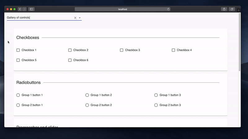
3. Gallery of controls
Link to source code
const fields: TypedField[] = [
  {
    type: FieldType.Paper,
    fields: [
      {
        type: FieldType.Line,
        title: 'Checkboxes',
      },
      {
        type: FieldType.Checkbox,
        name: 'checkbox1',
        columns: '3',
        title: 'Checkbox 1',
      },
      {
        type: FieldType.Checkbox,
        name: 'checkbox2',
        columns: '3',
        title: 'Checkbox 2',
      },

      ...
4. JSX Injection
Link to source code
const fields: TypedField[] = [
  {
    type: FieldType.Paper,
    fields: [
      {
        type: FieldType.Component,
        element: (props) => <Logger {...(props || {})}/>,
      },
    ],
  },

  ...

];
License
MIT © tripolskypetr