Webpack loader to generate docgen information from TypeScript React components.
Usage no npm install needed!
<script type="module">
  import reactDocgenTypescriptLoader from 'https://cdn.skypack.dev/react-docgen-typescript-loader';
</script>
README
Webpack loader to generate docgen information from TypeScript React components. The primary use case is to get the prop types table populated in the Storybook Info Addon.
Version 2 supported the options includes and excludes, which were arrays of regular expressions. If you made use of these options, remove them from and use the Webpack equivalents.
includes would default to ["\\.tsx
quot;] which meant that only files ending in the extension .ts or .tsx would be processed. This default behavior is already covered by Webpack's test field.
excludes would default to ["node_modules"]. This would prevent the processing of files in node_modules. This option was added to allow further filtering to hopefully speed up processing. When this loader is used in monorepo environments, this option would complicate configuration.
In version 3, the loader no longer performs its own filtering. If you relied on the additional filtering behavior, you should be able to reimplement it using options in Webpack.
This change shouldn't affect the majority of projects.
Quick Start
Requirements
The source code generation relies on being able to insert // @ts-ignore in a few select places and as such requires TypeScript 2.3 or above.
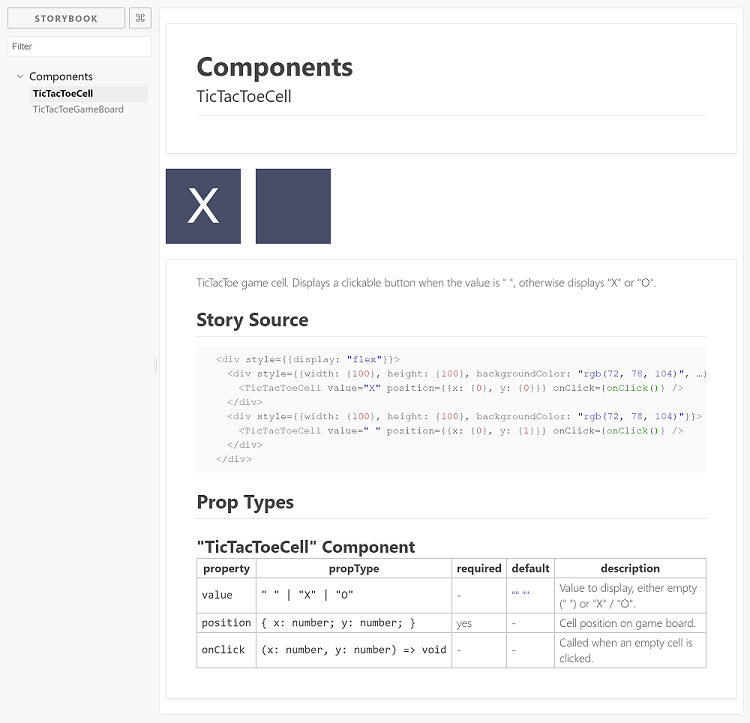
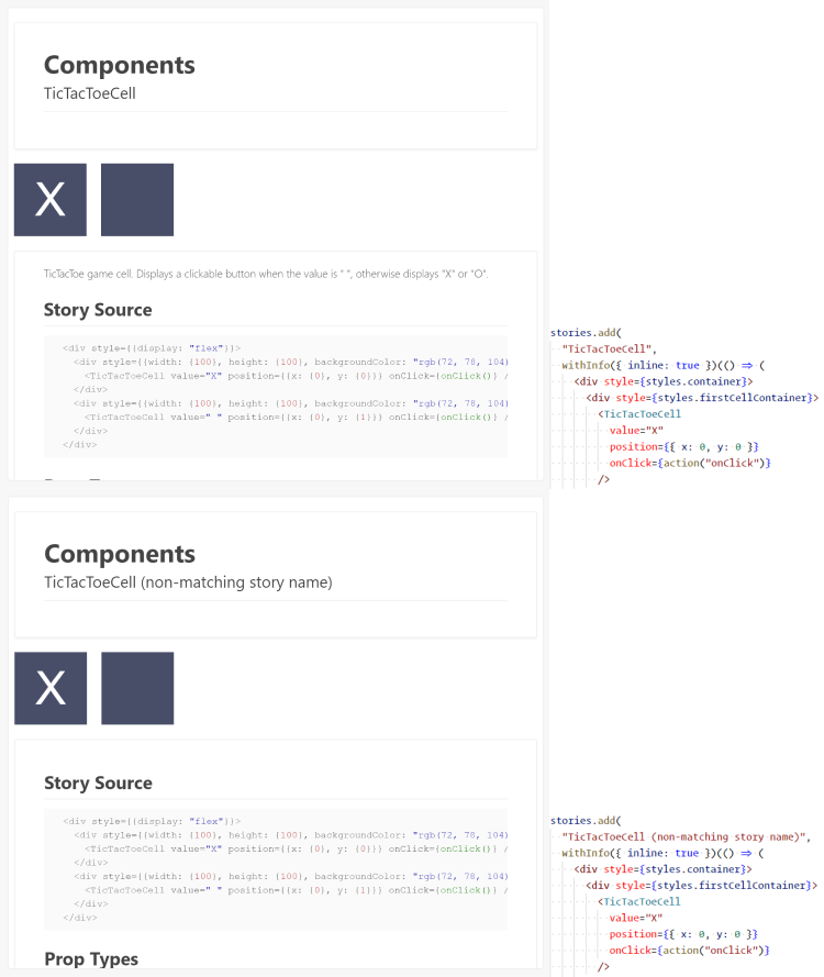
The Storybook Info Addon is able to populate the component description from your component's documentation. It does this when your story name matches the display name of your component. The prop tables will populate in either case.
In the first example you are able to see above Story Source the component description. The second example shows a story with a name different from the component. In the second example the component description is missing.
If you have a component named
TicTacToeCell, then you would have to use something like: storiesOf("...", module).add("TicTacToeCell", ...) to have the story description come from the component description.
In addition to the description from the component, you may still include story description text using the normal withInfo api.
Exporting Components
It is important to export your component using a named export for docgen information to be generated properly.
TicTacToeCell.tsx:
import React, { Component } from "react";
import * as styles from "./TicTacToeCell.css";

interface Props {
  /**
   * Value to display, either empty (" ") or "X" / "O".
   *
   * @default " "
   **/
  value?: " " | "X" | "O";

  /** Cell position on game board. */
  position: { x: number, y: number };

  /** Called when an empty cell is clicked. */
  onClick?: (x: number, y: number) => void;
}

/**
 * TicTacToe game cell. Displays a clickable button when the value is " ",
 * otherwise displays "X" or "O".
 */
// Notice the named export here, this is required for docgen information
// to be generated correctly.
export class TicTacToeCell extends Component<Props> {
  handleClick = () => {
    const {
      position: { x, y },
      onClick,
    } = this.props;
    if (!onClick) return;

    onClick(x, y);
  };

  render() {
    const { value = " " } = this.props;
    const disabled = value !== " ";
    const classes = `${styles.button} ${disabled ? styles.disabled : ""}`;

    return (
      <button
        className={classes}
        disabled={disabled}
        onClick={this.handleClick}
      >
        {value}
      </button>
    );
  }
}

// Component can still be exported as default.
export default TicTacToeCell;
Filter props using a function. If skipPropsWithName or skipPropsWithoutDoc is defined the function will not be used. Function accepts two arguments: object with information about prop and an object with information about component. Return true to include prop in documentation. https://github.com/styleguidist/react-docgen-typescript#parseroptions
tsconfigPath
string
Specify the location of the tsconfig.json to use. Can not be used with compilerOptions.
compilerOptions
typescript.CompilerOptions
Specify TypeScript compiler options. Can not be used with tsconfigPath.
docgenCollectionName
string or null
Specify the docgen collection name to use. All docgen information will be collected into this global object. Set to null to disable. Defaults to STORYBOOK_REACT_CLASSES for use with the Storybook Info Addon. https://github.com/gongreg/react-storybook-addon-docgen
setDisplayName
boolean
Automatically set the components' display name. If you want to set display names yourself or are using another plugin to do this, you should disable this option. Defaults to true. This is used to preserve component display names during a production build of Storybook.
Specify the name of the property for docgen info prop type.
Performance
There is a significant startup cost due to the initial type parsing. Once the project is running in watch mode, things should be smoother due to Webpack caching.
Alternative Implementation
This plugin uses a Webpack loader to inject the docgen information. There is also a version which works as a Webpack plugin. I will be supporting both versions. The loader version more accurately generates the injected code blocks and should work with all module types but at the cost of a longer initial startup. The plugin version may be faster.
When extending from React.Component as opposed to Component, docgens don't seem to be created. Ref issue #10 (thanks @StevenLangbroek for tracking down the cause).
Doesn't work:
import React from 'react';

interface IProps {
  whatever?: string;
};

export default class MyComponent extends React.Component<IProps> {}
Works:
import React, { Component } from 'react';

export default class MyComponent extends Component<IProps> {}
Export Names
Component docgen information can not be
generated for components that are only exported as default. You can work around
the issue by exporting the component using a named export.
import * as React from "react";

interface ColorButtonProps {
  /** Buttons background color */
  color: "blue" | "green";
}

/** A button with a configurable background color. */
export const ColorButton: React.SFC<ColorButtonProps> = props => (
  <button
    style={{
      padding: 40,
      color: "#eee",
      backgroundColor: props.color,
      fontSize: "2rem",
    }}
  >
    {props.children}
  </button>
);

export default ColorButton;
Contributing
Pull requests are welcome. For major changes, please open an issue first to discuss what you would like to change.