README
react-exp-table
A react table component with expandable rows. This table uses consistent columns across all child rows and does not nest tables within rows.

Features
- Nested expandable rows
- Child row key mapping
- Conditional initial expand/collapse state by row
- Conditional row background colors
- Columns can include multiple entries per column
- All rows are loaded on initial load to ensure high performance when expanding/collapsing rows
Installation
npm i react-exp-table
Example
Usage
import ExpandableTable from "react-exp-table";
function App() {
const columns = [
{
title: "Location",
key: "location"
},
{
title: "Population",
key: "population"
},
{
title: "Party",
key: "party"
}
];
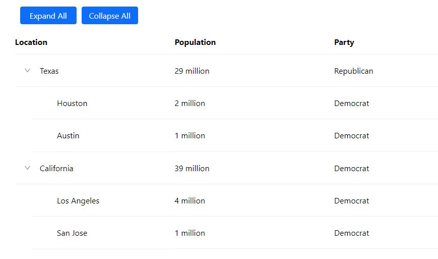
const data = [
{
location: "Texas",
population: "29 million",
party: "Republican",
child: [
{
location: "Houston",
population: "2 million",
party: "Democrat"
},
{
location: "Austin",
population: "1 million",
party: "Democrat"
}
]
},
{
location: "California",
population: "39 million",
party: "Democrat",
child: [
{
location: "Los Angeles",
population: "4 million",
party: "Democrat"
},
{
location: "San Jose",
population: "1 million",
party: "Democrat"
}
]
}
];
return <ExpandableTable columns={columns} data={data}></ExpandableTable>;
}
Result
Props
| Prop | Type | Required | Description |
|---|---|---|---|
| data | [ ] | x | data to be displayed in the table rows |
| columns | column (see below) | x | definition for column titles, keys, and optional css classes |
| rowKey | string | key used for react to identify each row of the table - must be unique | |
| childDataKey | string | key used to identify the child row within a row's data, default is "child" | |
| rowColor | function(rowData) | returns the css class used to set the background color of the row - uses the row data object as the parameter | |
| visibleOnInit | function(rowData) | returns a boolean to identify if the row should be visible on the initial load of the table - uses the row's js object as the parameter | |
| hideCollapseExpandButtons | boolean | hides the "Expand All" and "Collapse All" buttons at the top of the table |
Column definition
export interface Column {
  title: string;
  key: string | string[];
  class?: string | string[];
}
Changelog
- 2.0.0 (30 Nov 2021) - Simplify column definition
- 1.0.0 (21 Nov 2021) - Initial release
Authors
- Chris Lapidas - Development
Questions
License
This project is licensed under the MIT License - see the LICENSE file for details