README
React Multiple Password Validator


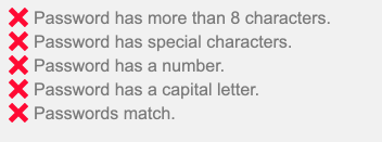
A React Component to display the success or failure of password strength rules that updates as a user types.
Example
Install in your project
npm install --save react-multiple-password-validator
yarn add react-multiple-password-validator
Note: react is a peer dependency. You should be using this in a React project.
Example Usage
import React, {useState} from "react"
import PasswordChecklist from "react-multiple-password-validator"

const SignUp = () => {
    const [password, setPassword] = useState("")
    const [passwordAgain, setPasswordAgain] = useState("")
    return (
        <form>
            <label>Password:</label>
            <input type="password" onChange={e => setPassword(e.target.value)}>
            <label>Password Again:</label>
            <input type="password" onChange={e => setPasswordAgain(e.target.value)}>

            <PasswordChecklist
                rules={["minLength","specialChar","number","capital","match"]}
                minLength={5}
                specialCharLength={2}
                numberLength={2}
                capitalLength={2}
                lowerCaseLength={2}
                value={password}
                valueAgain={passwordAgain}
                onChange={(isValid) => {}}
            />
        </form>
    )
}
Custom Messages/Translations
import React, {useState} from "react"
import PasswordChecklist from "react-multiple-password-validator"

const SignUp = () => {
    const [password, setPassword] = useState("")
    const [passwordAgain, setPasswordAgain] = useState("")
    return (
        <form>
            <label>Password:</label>
            <input type="password" onChange={e => setPassword(e.target.value)}>
            <label>Password Again:</label>
            <input type="password" onChange={e => setPasswordAgain(e.target.value)}>

            <PasswordChecklist
                rules={["minLength","specialChar","number","capital","match"]}
                minLength={8}
                value={password}
                valueAgain={passwordAgain}
                specialCharLength={2}
                numberLength={2}
                capitalLength={2}
                lowerCaseLength={2}
                messages={{
                    minLength: `Password has ${minLength} minimum length.`,
                    specialChar: `Password has ${specialCharLength} special characters.`,
                    lowercase: `Password has ${lowerCaseLength} lowercase letters.`,
                    number: `Password has ${numberLength} numbers.`,
                    capital: `Password has ${capitalLength} capital letters.`,
                    match: `Passwords match.`,
                }}
            />
        </form>
    )
}
Available Rules
Customize the component to display only the rules you need in the desired order you wish to display them.
minLength
Valid if the password meets the minimum length. Requires minLength prop to be included.
maxLength
Valid if the password meets the maximum length. Requires maxLength prop to be included.
specialChar
Valid if the password contains a special character from this list.
number
Valid if the password contains a number.
capital
Valid if the password contains a capital letter.
match
Valid if the password matches the confirm password valid. Requires valueAgain prop to be included.
lowercase
Valid if the password contains a lowercase letter
notEmpty
Valid if the password and confirm passwords both contain any character. Requires valueAgain prop to be included.
Props
| Prop | Description | Type | Required | Default |
|---|---|---|---|---|
| rules | Rules to display in the order desired. Options are minLength, maxLength, specialChar,number, capital, match, lowercase, notEmpty |
array | yes | |
| value | Current potential password | string | yes | |
| valueAgain | Current potential password confirmation | string | Only withmatch rule |
|
| minLength | Minimum Password Length | number | Only withminLength rule |
|
| maxLength | Maximum Password Length | number | Only withmaxLength rule |
|
| specialCharLength | Maximum Special Characters Length | number | Only withspecialCharLength rule |
|
| numberLength | Maximum Number Length | number | Only withnumberLength rule |
|
| capitalLength | Maximum Capital Length | number | Only withcapitalLength rule |
|
| lowerCaseLength | Maximum Lower Case Length | number | Only withlowerCaseLength rule |
|
| onChange | Callback that is triggered when the password becomes valid or invalid across all rules. |
function | (isValid) => {} |
|
| messages | Object with keys as rules, and values as strings to use as the message to be displayed | object | ||
| className | Class applied to the entire component | string | ||
| rtl | apply rtl styles | boolean | false | |
| style | Inline styles applied to the outer component wrapper |
object | ||
| iconSize | Size of ✔ or 𐄂 icon | number | 18 |
|
| validColor | Color of checkmark icon. Not used with custom iconComponents |
string | #4BCA81 |
|
| invalidColor | Color of X icon. Not used with custom iconComponents |
string | #FF0033 |
|
| iconComponents | Optional object containing keys of ValidIcon and InvalidIcon with a React Node to be displayed in place of icon. Both icons required if used. Example: {ValidIcon: <img src="valid.png" />, InvalidIcon: <img src="invalid.png" />} |
object |
Available Classes
.valid- Valid Message.invalid- Invalid Message
Run Locally
npm run storybook
yarn storybook