README
React Native Android DateTime Picker Same As IOS
A react-native component for show the Date and time picker same as IOS in react-native android
Installation
  npm install react-native-androidcustom-datetimepicker --save
  react-native link react-native-androidcustom-datetimepicker
android
Manual installation
Setting.gradle
+ include ':react-native-androidcustom-datetimepicker'
+ project(':react-native-androidcustom-datetimepicker').projectDir = new File(rootProject.projectDir, '../node_modules/react-native-androidcustom-datetimepicker/android')
build.gradle
+ compile project(':react-native-androidcustom-datetimepicker')
MainApplication.java
new DateTimePickerPackage()
Usage
import DateTimePickerModule from 'react-native-androidcustom-datetimepicker'
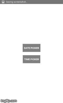
DatePicker
        DateTimePickerModule.openDatePicker({
          textConfirm:"Ok", // text for confirm button deafult is "Confirm"
          textCancel:"No", // text for cancel button deafult is "Cancel"
          btnTextSize:16, // button text size
          colorCancel:"#29436d", // button cancel text color
          colorConfirm:"#29436d", // button confirm text color
          minYear:1970, // minimum year want to show
          maxYear:2018, // maximum year want to show
          selectDate:"2015-06-22" //yyyy-MM-dd formate
      }).then(function(result) {
        alert(result.date)// "result":{"year":2015,"month":03,"day":23,"date":"2015-03-23"} in success after select on confirm button
      });
TimePicker
    DateTimePickerModule.openTimePicker({
      textConfirm:"Ok", // text for confirm button deafult is "Confirm"
      textCancel:"No", // text for cancel button deafult is "Cancel"
      btnTextSize:16, // button text size
      colorCancel:"#29436d", // button cancel text color
      colorConfirm:"#29436d", // button confirm text color
    }).then(function(result) {
      alert(result.time)// "result":{"hour":01,"minute":56,"AM_PM":"AM","time":"01:56 AM"} in success after select on confirm button
    });
Props for DatePicker
| Prop | Type | Default | Description |
|---|---|---|---|
colorConfirm |
String |
#303F9F |
Confirm button text color |
colorCancel |
String |
#999999 |
Cancel button text color |
textConfirm |
String |
Confirm |
Confirm text string |
textCancel |
String |
Cancel |
Cancel text string |
btnTextSize |
int |
16 |
Button text size |
minYear |
int |
1900 |
minimum year to show in calender |
maxYear |
int |
current year |
Maximum year to show in calender |
selectDate |
String |
current date |
selected date to show on top |
Props for TimePicker
| Prop | Type | Default | Description |
|---|---|---|---|
colorConfirm |
String |
#303F9F |
Confirm button text color |
colorCancel |
String |
#999999 |
Cancel button text color |
textConfirm |
String |
Confirm |
Confirm text string |
textCancel |
String |
Cancel |
Cancel text string |
btnTextSize |
int |
16 |
Button text size |