README
react-native-bem
A tiny, fast, BEM-inspired method to styling React Native components.

The BEM methodology and naming convention allows us to reduce the complexity of styling, and develop with speed and predictability. By following a similar approach to naming, modifiers and states (not to be confused with a component's internal state), we can create self-contained, easily styled components in any situation.
Table of Contents
Installation
npm install react-native-bem --save
Features
react-native-bem allows us to style (the Block and Child) elements of a component based on a kebab-cased name, with optional modifier and state attributes.
It exports three functions:
bem(): exported as thedefaultfunction, which is used to apply styling to components.Its signature is
bem (selector: string, props: Object, rules: Object).selectoris the kebab-cased name of the component to style,propsis the component's props andrulesis the style object (from styles.js).renderBemChild(): exported as a named function, this can be used in place of rendering{props.children}to pass a BEM selector to a specific child.Its signature is
renderBemChild (props: Object, style: Array<any>, index: number = 0).propsis the component's props,styleis the result of callingbem()with a BEM Mix selector, andindexis the index of the child element to style.renderBemChildren(): exported as a named function, this can be used in place of rendering{props.children}to pass a BEM selector to all children.Its signature is
renderBemChildren (props: Object, style: Array<any>)and is identical torenderBemChild()but withoutindex.
Note: As of v0.2.0, react-native-bem now utilizes StyleSheets instead of plain JavaScript objects for improved performance.
Modifiers
As with BEM in CSS, a modifier is a flag on a block or element, which is used to change an element's (or multiple elements') appearance.
react-native-bem supports two types of modifiers with the M prefix:
- Boolean: The prop
MalignCenter={true}uses the--align-centerstyle definition. - String: The prop
Malign="right"uses the--align-rightstyle definition.
States
While not a part of BEM per se, states are an elegant addition to signify that the piece of UI in question is currently styled a certain way because of specific condition.
Common stateful namespaces begin with is and has.
react-native-bem state props uses the S prefix, like so SisDisabled={true} which uses the .is-disabled style definition.
Usage
Creating Components
Unless a component requires internal state or life-cycle hooks, a component should use the Stateless Functional Component (SFC) pattern to increase performance. It is trivial to convert an SFC to as class-based component later on where necessary.
Component Architecture
Generally:
- Each Component resides in a PascalCase directory under
componentsthat matches the BlockName. index.js: contains the component.styles.js: contains styles (if necessary).
However, if a Block requires multiple child components:
BlockName.js: contains the outermost block component.BlockName__Element.js: contains a child component.index.js: importsBlockNameand allBlockName__Elements, and exports them as named exports.styles.js: contains styles forBlockNameand allBlockName__Elements.
Styling Components
styles.js
This file exports a default StyleSheet object which contains keys and style properties for each component.
A component with child components, modifiers and states may look like this:
import { StyleSheet } from 'react-native';

export default StyleSheet.create({
    'component-name': {
        KEY: VALUE
    },
    'component-name--modifier': {
        KEY: VALUE_WHEN_MODIFIED
    },
    'component-name.state': {
        KEY: VALUE_WHEN_IN_THIS_STATE
    },
    'component-name__element': {
        KEY: VALUE_OF_ELEMENT
    },
    'component-name--modifier component-name__element': {
        KEY: VALUE_OF_ELEMENT_WHEN_MODIFIED
    },
    'component-name.state component-name__element': {
        KEY: VALUE_OF_ELEMENT_WHEN_IN_THIS_STATE
    }
});
Similar to using BEM in CSS, component styles are encapsulated within a namespace, and developers can clearly see the styles for all components, children and variations.
Common Usage
Component Definition
components/HelloWorld/index.js
import React from 'react';
import PropTypes from 'prop-types';
import { View, Text } from 'react-native';
import bem from 'react-native-bem';
import styles from './styles';

const HelloWorld = (props) => {
    const b = (selector) => bem(selector, props, styles);

    return (
        <View style={b('hello-world')}>
            <Text style={b('hello-world__text')}>
                Hello, world
            </Text>
        </View>
    );
};

HelloWorld.propTypes = {
    MbooleanModifier: PropTypes.bool,
    MstringModifier: PropTypes.string,
    SaStateName: PropTypes.bool
};

export default HelloWorld;
Styles Definition
components/HelloWorld/styles.js
import { StyleSheet } from 'react-native';

export default StyleSheet.create({
    'hello-world': {
        backgroundColor: '#000',
        marginBottom: 5,
        padding: 5
    },
    'hello-world--boolean-modifier': {
        borderColor: '#f00',
        borderWidth: 4
    },
    'hello-world--string-modifier-foo': {
        padding: 20
    },
    'hello-world.a-state-name': {
        opacity: 0.5
    },
    'hello-world__text': {
        color: '#fff',
        fontSize: 20
    },
    'hello-world.a-state-name hello-world__text': {
        color: '#ff0'
    }
});
Usage within a View
View.js
import HelloWorld from './components/HelloWorld';

…

render() {
    return (
        <HelloWorld />
        <HelloWorld MbooleanModifier={true} />
        <HelloWorld MstringModifier="foo" />
        <HelloWorld SaStateName={true} />
        <HelloWorld MbooleanModifier={true} MstringModifier="foo" SaStateName={true} />
    );
}
which results in:
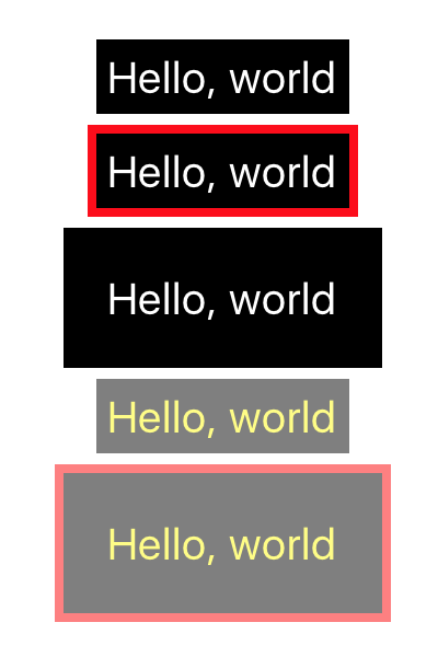
So, you can see that with adding and removing props, either at run-time or by default, you will be able to quickly adapt your components' appearance to reflect the current state of the application.
Advanced Usage
Manipulating Children
There may be times where you wish to pass in child components from within your view, like so:
render() {
    return (
        <HelloWorld>
            <HelloWorld__Text />
        </HelloWorld>
        <HelloWorld MbooleanModifier={true}>
            <HelloWorld__Text />
        </HelloWorld>
        <HelloWorld MstringModifier="foo">
            <HelloWorld__Text />
        </HelloWorld>
        <HelloWorld SaStateName={true}>
            <HelloWorld__Text />
        </HelloWorld>
        <HelloWorld MbooleanModifier={true} MstringModifier="foo" SaStateName={true}>
            <HelloWorld__Text />
        </HelloWorld>
    );
}
Out of the box, the children wouldn't be affected by parent modifier and state props (meaning the text color would always be white in the above example). however, by changing the HelloWorld component to accept children enhanced with BEM like so:
import bem, { renderBemChild } from 'react-native-bem';

const HelloWorld = (props) => {
    const b = (selector) => bem(selector, props, styles);

    return (
        <View style={b('hello-world')}>
            {renderBemChild(props)}
        </View>
    );
};
where HelloWorld__Text is:
import React from 'react';
import { Text } from 'react-native';
import bem from 'react-native-bem';
import styles from './styles';

const HelloWorld__Text = (props) => {
    const b = (selector) => bem(selector, props, styles);

    return (
        <Text style={b('hello-world__text')}>
            Hello, world
        </Text>
    );
};

export default HelloWorld__Text;
we get the exact same output as before, just with the added flexibility of being able to control which child components are rendered from within the view.
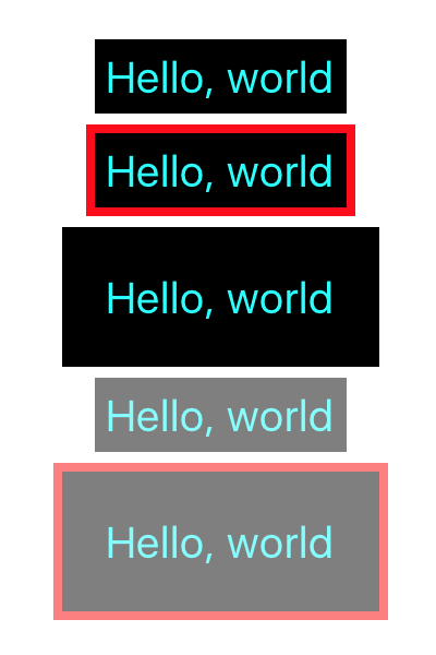
As mentioned earlier, renderBemChild() also accepts a second parameter of a styles object (like those returned from a bem() selector) and an index.
This allows us to render children with additional styles applied, which can be useful when a component is consumed by another (known as a BEM Mix), and its appearance needs to change to reflect that.
If we update our existing files to this:
styles.js
import { StyleSheet } from 'react-native';

export default StyleSheet.create({
    … existing styles
    'bem-mix__text': {
        color: '#0ff'
    }
});
HelloWorld.js
const HelloWorld = (props) => {
    const b = (selector) => bem(selector, props, styles);

    return (
        <View style={b('hello-world')}>
            {renderBemChild(props, b('bem-mix__text'))}
        </View>
    );
};
We can see that the additional styles were applied to the HelloWorld__Text components, turning them cyan.
Using a Component's Internal State
Some components, such as a <TextInput />, need to be styled differently based on an internal state, like when it has focus. Instead of cumbersomely alerting parent components to whether it's focused or not and changing a state prop in the view, we can merge in the component's state to bem() at render() time.
With the following component:
components/TextBox/index.js
import React, { Component } from 'react';
import { TextInput } from 'react-native';
import bem from 'react-native-bem';
import styles from './styles';

class TextBox extends Component {
    constructor () {
        super();

        this.state = {
            SisFocused: false
        };
    }

    _onBlur = () => {
        this.setState({
            SisFocused: false
        });
    }

    _onFocus = () => {
        this.setState({
            SisFocused: true
        });
    }

    b = (selector) => bem(selector, { ...this.props, ...this.state }, styles)

    render () {
        return (
            <TextInput
                {...this.props}
                style={this.b('text-box')}
                onBlur={this._onBlur}
                onFocus={this._onFocus}
            />
        );
    }
}

export default TextBox;
and its related styles.js
import { StyleSheet } from 'react-native';

export default StyleSheet.create({
    'text-box': {
        backgroundColor: '#fff',
        borderColor: '#000',
        borderWidth: 2,
        color: '#333',
        fontSize: 14,
        height: 40,
        paddingHorizontal: 10,
        paddingVertical: 0
    },
    'text-box.is-focused': {
        borderColor: '#00f'
    }
});
Because the TextBox component's b() helper merges the component's props with its internal state (which has a correctly named SisFocused property), it apply styles for when the TextInput is focused!
Copyright (c) 2018 Matt Stow
Licensed under the MIT license (see LICENSE for details)