README
react-native-cross-platform-responsive-dimensions

UPDATE:
Added crossPlatformImg(image) for trimming the extension off of native image file names on Android devices, and keeping them on IOS.
Here's a little magic to make your cross-platform JSS pop...
This package started as a fork of react-native-responsive-dimensions which allows developers to use percentages in their JSS to scale integer values based on the user's device dimensions. This worked great for me and was using it all the time, but when I started working on the tablet version of my app I quickly realized that tablets have a different aspect ratio than phones. And this meant I needed to set a different value for tablets that when scaled would look correctly on all other tablets.
When I finished with my phone and tablet build for IOS, I shifted to Android and was disappointed to see that my app looked like it had been in a terrible car accident.
Android and IOS won't interpret your codebase the same.
Android and IOS will not always process the same style property in the same way, a perfect example is how custom React-Native fonts work. On IOS you need to use the font's display name in the stylesheet while on Android you need to downcase the font, underscore, and add the font style ex. "myriadpro_regular".
In this situation you are forced to list each in it's own distinct way because neither will understand the other. There are a whole host of tiny differences that pop up between platforms and my goal was to create an API with the tools to solve these problems as elegantly as possible.
Workflow.
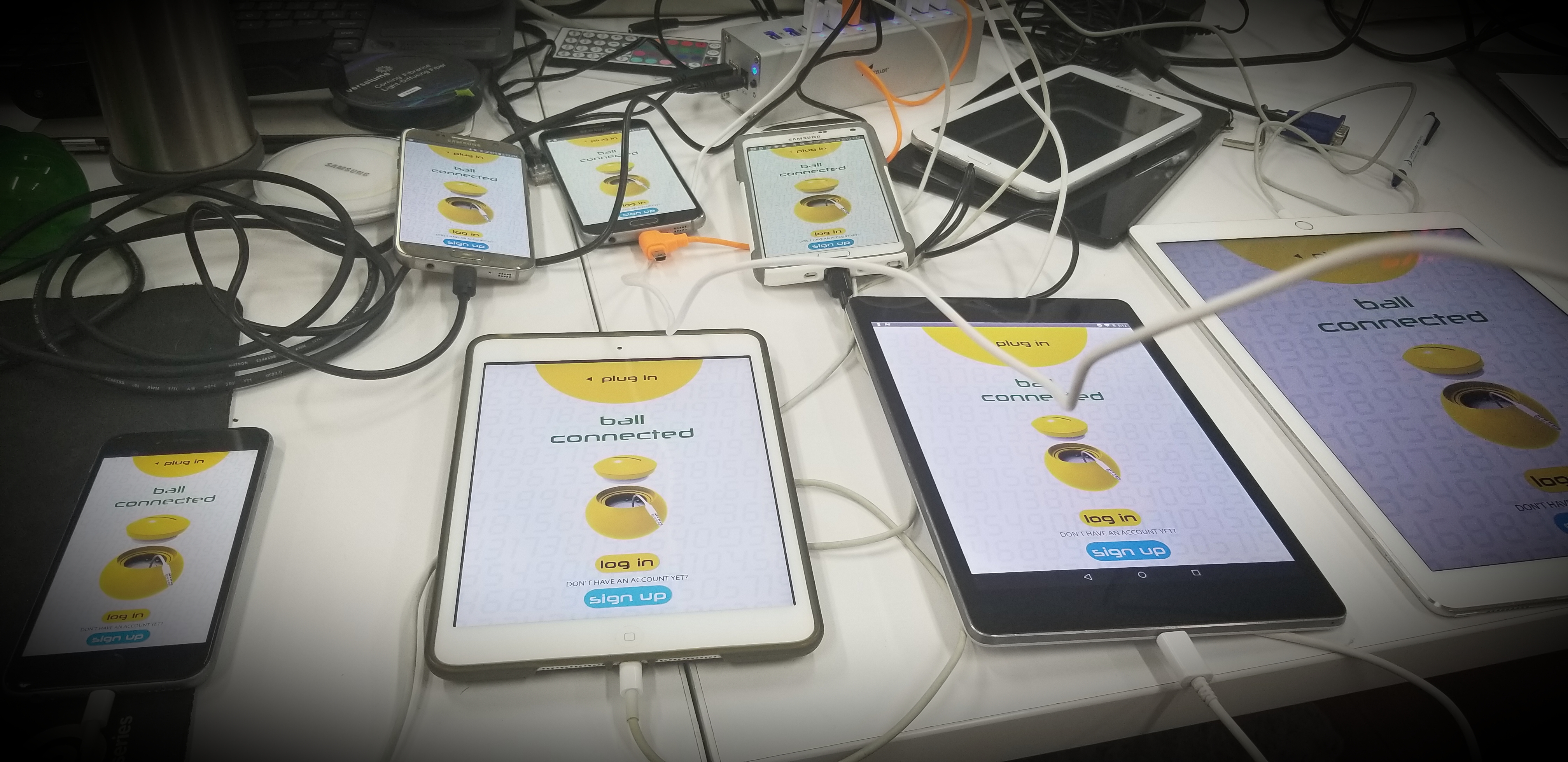
Now that multi-client support has been added for hot module reloading, one of the best ways to use this API is to get a huge USB splitter and connect at minimum an iPhone, IOS tablet, Android Phone, and Android Tablet... also connecting other unique devices such as the iPhone X or Samsung Note 8. When each device has finished booting into the debug version of your app, set each device to hot reload (and only 1 device for debugging if you need it, they will fight each other for it).
It can take a few tries to get everything hot reloading at the same time, but now you'll be able to see any change you make to any of these different device types instantly. This npm makes it really easy to tweak everything at the same time so that you can style for all devices simulataneously.
The Value of React-Native.
As a React-Native developer our greatest value to our clients is the ability to produce products rapidly that work on as many devices as possible, with only one codebase. This is my best shot at it so far. I hope it helps you.
Install
$ npm install react-native-cross-platform-responsive-dimensions --save
$ npm install npm intall react-native-device-info --save //don't forget to link
Available API Methods
Add an import to the top of your file with the methods you need.
import {
    responsiveHeight,
    responsiveWidth,
    responsiveFontSize,
    heightX,
    widthX,
    fontSizeX,
    heightN8,
    widthN8,
    fontSizeN8,
    heightXN8,
    widthXN8,
    fontSizeXN8,
    crossResponsiveHeight,
    crossResponsiveWidth,
    crossResponsiveFontSize,
    crossPlatformOS,
    crossPlatformImg,
    crossPlatformDevice,
    crossWidthX,
    crossHeightX
    crossFontSizeX,
    crossWidthN8,
    crossHeightN8
    crossFontSizeN8,
    crossHeightXN8,
    crossWidthXN8,
    crossFontSizeXN8,
    } from "react-native-cross-platform-responsive-dimensions";
Positioning Methods
Use these positioning methods in your JSS stylesheets:
crossResponsiveHeightcrossResponsiveWidthcrossResponsiveFontSize
These allow you to set individual percentage based properties for tablets and phones on both operating systems.
Inputs
crossResponsiveHeight(IOS_Phone, IOS_Tablet, Android_Phone, Android_Tablet)
You won't always need a different value for each OS or Device type, so make sure to use the method that allows you to only be as specific as you need.
Example JSS StyleSheet
const styles = StyleSheet.create({
    modal: {
        alignSelf: "center",
        backgroundColor: teal,
        borderRadius: responsiveHeight(5),
        display: "flex",
        justifyContent: "space-between",
        marginBottom: crossResponsiveHeight(31, 32, 31, 32),
        marginTop: crossResponsiveHeight(36, 32.5, 36, 32.5),
        width: crossResponsiveWidth(75, 55, 75, 55)
    },
    modalItem: {
        alignContent: "center",
        alignSelf: "center",
        backgroundColor: transparent,
        textAlign: "center",
        width: responsiveWidth(55)
    },
    modalBounceGoalText: {
        fontFamily: crossPlatformOS("Neuropolitical", "neuropolitical_regular"),
        fontSize: responsiveFontSize(3.5),
        marginTop: responsiveHeight(2),
        color: white
    },
    modalBadgeNameText: {
        color: white,
        fontWeight: "400",
        fontFamily: crossPlatformOS("Myriad Pro", "myriadpro_regular"),
        fontSize: responsiveFontSize(2),
        marginTop: responsiveHeight(2)
    },
    badgeImage: {
        display: "flex",
        justifyContent: "center",
        alignSelf: "center",
        height: crossResponsiveWidth(25, 20, 20, 15),
        marginLeft: responsiveWidth(1),
        marginRight: responsiveWidth(1),
        width: crossResponsiveWidth(25, 20, 20, 15)
    },
    xImage: {
        height: responsiveHeight(4.5),
        width: responsiveHeight(4.5)
    },
    xContainer: {
        alignSelf: "flex-end",
        display: "flex",
        top: crossResponsiveHeight(1.8, 1.5, 2, 2),
        marginRight: crossResponsiveWidth(8, 4.5, 12, 12),
        width: responsiveWidth(4)
    }
});
Cross Platform/Device Switch Methods
Use crossPlatformDevice(iosPhone, iosTablet, androidPhone, androidTablet) for the same cross platform ease, but without the responsive scaling.
Put any type of element you need into it and use it like a switch.
<Image
    style={crossPlatformDevice(
        styles.giantBallImage,
        styles.giantBallImageTablet,
        styles.giantBallImage,
        styles.giantBallImageTablet
    )}
    source={require("../../../img/home_ball.png")}
/>
Use crossPlatformOS(ios, android) when you don't need to specify individual values for all devices, but only need to specify either Android or IOS.
This is useful for fonts because each OS requires the font be declared differently.
crossPlatformOS("Neuropolitical", "neuropolitical_regular")
Use crossPlatformImg(image) when you are loading images from Hybrid App Resources, adding them into your IOS project, and adding them into your Android drawable folder. IOS wants to see the file with the file extension and Android wants it without.
Android requires that you also start the file name with a letter and separate each word with an underscore. IOS won't care so might as well format your file names for Android.
This function removes the file extension when the device is running Android ("button" instead of "button.png"), and keeps it for IOS. You must also use .png's for native images. The method trims off the last 4 characters so if you use this with an extension with a different number characters it won't work right.
crossPlatformImg("button.png")
Responsive Dimensions Methods
Use the original react-native-responsive-dimensions methods if you want to use a uniform value for all devices. Try to use this whenever you can and only use the above cross platform methods when it's necessary.
height: responsiveHeight(43),
marginLeft: responsiveWidth(10),
fontSize: responsiveFontSize(4)
You can also use these methods outside of JSS in creative ways anytime you'd like to create a device scaled value.
Here I used it to create a device scaled circle:
<AnimatedCircularProgress
    size={responsiveHeight(38)}
    width={responsiveHeight(2)}
    interval={10}
    prefill={0}
    fill={percentage}
    rotation={0}
    tension={10}
    friction={15}
    tintColor={progressColor}
    backgroundColor={yellow}
    style={styles.animatedProgress}
/>
Here I used it to set positions in my app's animated intro:
Animated.timing(this.state.fade, {
    duration: 1500,
    toValue: 1,
    useNativeDriver: true
    }),
    Animated.timing(this.state.position, {
    duration: 200,
    toValue: responsiveHeight(-50),
    useNativeDriver: true
    }),
    Animated.parallel([
    Animated.timing(this.state.position, {
        duration: 1000,
        easing: Easing.bounce,
        toValue: responsiveHeight(52),
        useNativeDriver: true
    }),
    Animated.spring(this.state.size, {
        bounciness: 0,
        speed: 1,
        toValue: 0.3,
        useNativeDriver: true
    })
])
iPhone X
I've added some new functions to deal with devices that don't quite fit the 16:9 aspect ratio of most phones. If you find you need to move something specifically for the notch on the iPhoneX and it's approximately 9:19.5 aspect ratio, you can use these functions to do so.
Keep your cross-platform styles but set a specific value for iPhoneX.
crossHeightX(iosPhone, iosTablet, androidPhone, androidTablet, iPhoneX)
ResponsiveHeight for all devices except a specific value for iPhoneX.
heightX(height, iPhoneX)
Keep your cross-platform styles but set a specific value for iPhoneX.
crossWidthX(iosPhone, iosTablet, androidPhone, androidTablet, iPhoneX)
ResponsiveWidth for all devices except a specific value for iPhoneX.
widthX(width, iPhoneX)
Keep your cross-platform styles but set a specific value for iPhoneX.
crossFontSizeX(iosPhone, iosTablet, androidPhone, androidTablet, iPhoneX)
ResponsiveFontSize for all devices except a specific value for iPhoneX.
fontSizeX(size, iPhoneX)
iPhone X Example
flexContainer: {
    backgroundColor: white,
    borderColor: grey,
    borderRadius: responsiveHeight(100),
    borderWidth: 1,
    display: "flex",
    left: crossWidthX(72, 68.5, 72, 66.5, 78.5),
    padding: crossHeightX(1, 2.1),
    position: "absolute",
    top: crossResponsiveHeight(41, 39.5, 40, 39.5),
    zIndex: 1
}
Note 8
I personally own a Note 8 as my main phone (and love it), so there was no way I going to let it's elongated 18.5:9 aspect ratio mess up my sweet scaling layouts. I haven't needed to make too many tweaks for my Note since it doesn't have a notch, but decided that it was worth having these methods around because the long form way of writing these out is clutter that shouldn't be in the StyleSheet, not even once.
Keep your cross-platform styles but set a specific value for note8.
crossHeightN8(iosPhone, iosTablet, androidPhone, androidTablet, note8)
ResponsiveHeight for all devices except a specific value for note8.
heightN8(height, note8)
Keep your cross-platform styles but set a specific value for note8.
crossWidthN8(iosPhone, iosTablet, androidPhone, androidTablet, note8)
ResponsiveWidth for all devices except a specific value for the Note8.
widthN8(width, note8)
Keep your cross-platform styles but set a specific value for the Note8.
crossFontSizeN8(iosPhone, iosTablet, androidPhone, androidTablet, note8)
ResponsiveFontSize for all devices except a specific value for the Note8.
fontSizeN8(size, note8)
Note 8 Example
flexContainer: {
    backgroundColor: white,
    borderColor: grey,
    borderRadius: responsiveHeight(100),
    borderWidth: 1,
    display: "flex",
    left: crossWidthN8(72, 68.5, 72, 66.5, 78.5),
    padding: heightN8(1, 2.1),
    position: "absolute",
    top: crossResponsiveHeight(41, 39.5, 40, 39.5),
    zIndex: 1
}
Hybrid iPhoneX + Note 8
ResponsiveHeight for cross device and platform as well as both iPhoneX and Note8.
crossHeightXN8(iPhone, IOSTablet, AndroidPhone, AndroidTablet, iPhoneX, Note8)
ResponsiveHeight for cross device and platform as well as both iPhoneX and Note8.
crossFontSizeXN8(iPhone, IOSTablet, AndroidPhone, AndroidTablet, iPhoneX, Note8)
ResponsiveWidth for cross device and platform as well as both iPhoneX and Note8.
crossWidthXN8(iPhone, IOSTablet, AndroidPhone, AndroidTablet, iPhoneX, Note8)
ResponsiveWidth for all devices as well as specifically the iPhoneX and Note8.
widthXN8(size, iPhoneX, note8)
ResponsiveHeight for all devices as well as specifically the iPhoneX and Note8.
heightXN8(size, iPhoneX, note8)
ResponsiveFontSize for all devices as well as specifically the iPhoneX and Note8.
fontSizeXN8(size, iPhoneX, note8)
Examples
modalSubText: {
    color: black,
    fontFamily: crossPlatformOS("Neuropolitical", "neuropolitical_regular"),
    fontSize: fontSizeXN8(3.5, 3.1, 2.95),
    marginTop: responsiveHeight(2)
}
flexContainer: {
    backgroundColor: white,
    borderColor: grey,
    borderRadius: responsiveHeight(100),
    borderWidth: 1,
    display: "flex",
    justifyContent: "space-between",
    left: crossWidthXN8(72, 68.5, 72, 66.5, 78.5, 75),
    padding: responsiveHeight(1),
    position: "absolute",
    top: crossResponsiveHeight(41, 39.5, 40, 39.5),
    zIndex: 1
},
License
MIT © drumnation