README
react-native-estylo
Installation
Make sure that you are using babel 6 for version 1.2.0 or adove.
npm install react-native-estylo
Getting started
In your index.ios.js file require react-native-estylo component:
var Estylo = require('react-native-estylo');
or, if you use ES2015 syntax:
import Estylo from 'react-native-estylo';
Docs
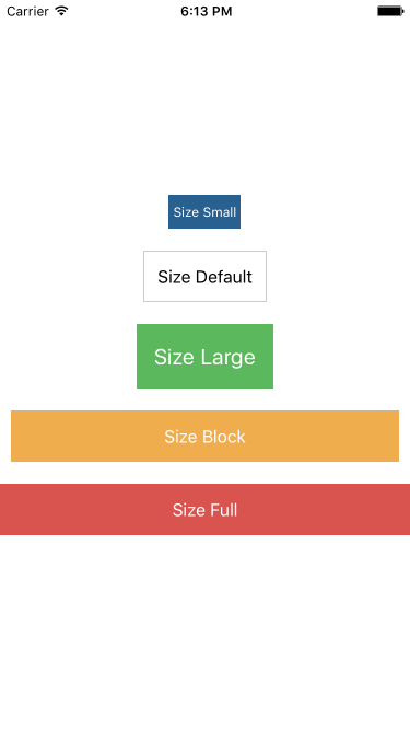
Buttons
To use the Button insert <Estylo.Button>.
Example:
var ExampleApp = React.createClass({
  render: function() {
    return (
        <View style = {[ { alignItems: 'center', flex: 1, justifyContent: 'center',} ]}>
          <Estylo.Button size = 'small' backgroundColor = '#286090' textColor = "#fff" >
            Size Small
          </Estylo.Button>
          <Estylo.Button size = 'default' >
            Size Default
          </Estylo.Button>
          <Estylo.Button size = 'large' backgroundColor = '#5cb85c' textColor = '#fff' >
            Size Large
          </Estylo.Button>
          <Estylo.Button size = 'block' backgroundColor = '#f0ad4e' textColor = '#fff' >
            Size Block
          </Estylo.Button>
          <Estylo.Button size = 'full' backgroundColor = '#d9534f' textColor = '#fff' >
            Size Full
          </Estylo.Button>
        </View>
    );
  }
});
| Props name | Type | Description |
|---|---|---|
| backgroundColor | String | Color Button. |
| size | String | Used to set the size of the button ( small, default, large, block and full ). For an example look at the code and the image shown above. |
| styleButton | Object, Array | Used to customize the button. |
| styleText | Object, Array | Used to customize the text. |
| textColor | String | Color Text. |
| width | String | Is used to set the length of the button, you can set a percentage or a number in pixels. |
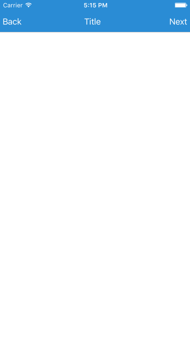
NavBar
To use the NavBar insert <Estylo.NavBar />.
Example:
var ExampleApp = React.createClass({
  render: function() {

    const titleLeftConfig = {
      text: 'Back',
      color: '#fff',
      onPress: () => alert('Press Back'),
    };

    const titleCenterConfig = {
      text: 'Title',
      color: '#fff',
      onPress: () => alert('Press Title'),
    };

    const titleRightConfig = {
      text: 'Next',
      color: '#fff',
      onPress: () => alert('Press Next'),
    };

    return (
        <View style = {[ { flex: 1, alignItems: 'center' } ]}>
          <Estylo.NavBar
            backgroundColor = '#2a8cd5'
            titleLeft = { titleLeftConfig }
            titleCenter = { titleCenterConfig }
            titleRight = { titleRightConfig }
            stausBarHidden = { false } />
        </View>
    );
  }
});
| Props name | Type | Description |
|---|---|---|
| backgroundColor | String | Color NavBar. |
| statusBarHidden | String | If set to true Toggle the StatusBarIOS instead if set to false mosta bar StatusBarIOS. |
titleLeftConfig / TitleCenterConfig / TitleRightConfig
Here are the configurations for titleLeftConfig, titleCenterConfig and titleRightConfig:
| Props name | Type | Description |
|---|---|---|
| color | String | Color Text. |
| onPress | Function | Function that is called onPress. |
| onPressIn | Function | Function that is called onPressIn. |
| onPressOut | Function | Function that is called onPressOut. |
| onLongPress | Function | Function that is called onLongPress. |
| style | Object, Array | Used to customize the text. |
| text | String | Text Title. |
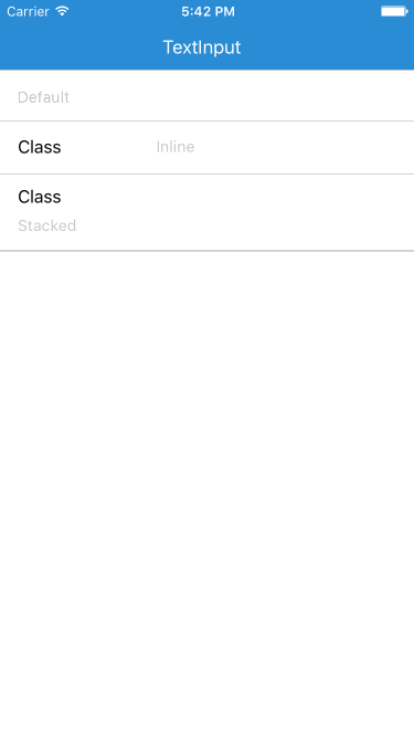
TextInput
To use the TextInput insert <Estylo.TextInput />.
Example:
var ExampleApp = React.createClass({
  render: function() {
    return (
        <View style = {[ { flex: 1 } ]}>
          <Estylo.TextInput
            class = 'default'
            placeholder = 'Default' />
          <Estylo.TextInput
            class = 'inline'
            label = 'Class'
            placeholder = 'Inline'
            value = { this.state.textInline } />
          <Estylo.TextInput
            class = 'stacked'
            label = 'Class'
            onChangeText = { ( value ) => this.setState({ textStacked: value }) }
            placeholder = 'Stacked'
            value = { this.state.textStacked } />
        </View>
    );
  }
});
| Props name | Type | Description |
|---|---|---|
| class | String | Customize TextInput favors class set ( default, inline and stacked ). For an example look at the code and the image shown above. |
| label | String | It needs to add a label to the left of the input element. |
| onChangeText | Function | Callback that is called when the text input's text changes. Changed text is passed as an argument to the callback handler. |
| placeholder | String | The string that will be rendered before text input has been entered. |
| value | String | The value to show for the text input. |