README
React Native: react-native-photo-status


📖 Getting started
$ npm install react-native-photo-status --save
💻 Usage
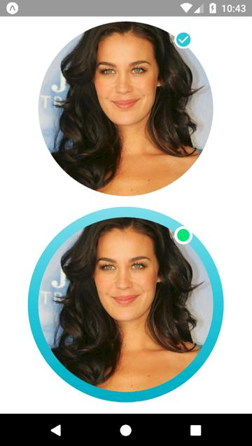
import React, { Component } from 'react';
import { View } from 'react-native';
import PhotoStatus from 'react-native-photo-status';

export default class App extends Component {
  render() {
    return (
      <View style={{ flex: 1, alignItems: 'center', justifyContent: 'center' }}>
        <PhotoStatus
          colors={['#FFFFFF', '#FFFFFF']}
          dim={300}
          image={{
            uri: 'http://www.prettydesigns.com/wp-content/uploads/2013/12/Megan-Gale-Long-Hairstyle-Layered-Hair.jpg',
          }}
          isStatus={true}
          isIcon={true}
          icon={'md-checkmark-circle'}//Use the Ionicons icons.
          iconSize={25}
          iconColor={'#26C6DA'}
        />
        <PhotoStatus
          colors={['#80DEEA', '#26C6DA', '#00ACC1']}
          dim={300}
          image={{
            uri: 'http://www.prettydesigns.com/wp-content/uploads/2013/12/Megan-Gale-Long-Hairstyle-Layered-Hair.jpg',
          }}
          isStatus={true}
          isIcon={false}
          colorStatus={'#00E676'}
        />
      </View>
    );
  }
}
💡 Props
| Prop | Type | Default | Note |
|---|---|---|---|
color |
array |
We need to pass an array of the colors, as in the example. | |
dim |
number |
Circle size. | |
image |
object |
We need to pass an image, as in the example. | |
isStatus |
bool |
Indicates whether to have the status icon. | |
isIcon |
bool |
Indicates whether to have the status icon. | |
icon |
Ionicons |
Indicates what kind of icon to use. | |
iconSize |
number |
Icon size. | |
iconColor |
string |
Icon color. | |
colorStatus |
string |
Indicates the background color of the status. |
📜 License
This library is provided under the Apache License.