README
React Native Scale Alert
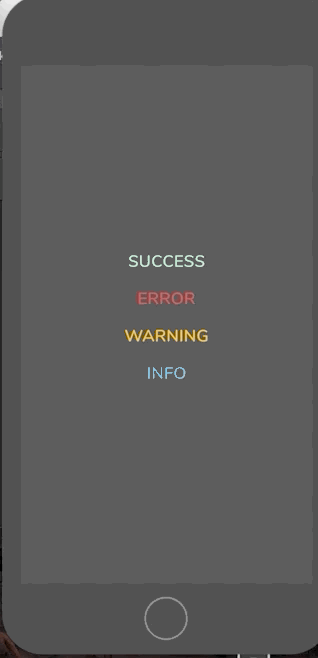
Demo
Getting Started
Installation
$ npm i react-native-scale-alert --save
Basic Usage
import React from 'react';
import { StyleSheet, View, Text, TouchableOpacity } from 'react-native';

import Alert from 'react-native-scale-alert';

export default class App extends React.Component {

  constructor(props) {
    super(props);
    this.state = {
        visible:false
    };
  };

    showAlert = (status) => {
        this.setState({
            visible: status
        })
    }

  render() {
    const {visible} = this.state;

    return (
       <View style={styles.container}>
                <TouchableOpacity
                    onPress={() => this.showAlert('success')}
                    style={styles.buttonStyle}
                >
                    <Text style={styles.textStyle}>
                        CLICK ME
                    </Text>
                </TouchableOpacity>
                <Alert
                    overlay={true}
                    overlayColor='rgba(0,0,0,0.1)'
                    visible={visible}
                    status={visible}
                    title='SUCCESS'
                    message='Lorem ipsum dolor sit amet.'
                    showButton={true}
                />
            </View>
    );
  };
};

const styles = StyleSheet.create({
container: {
        flex: 1,
        alignItems: 'center',
        justifyContent: 'center'
    },
    textStyle: {
        fontSize: 24
    }
});
Props
Basic
| Prop | Type | Description | Default |
|---|---|---|---|
| visible | boolean |
Show / Hide alert | false |
| title | string |
Title text to display | hidden |
| message | string |
Message text to display | hidden |
| showButton | bool |
Show a confirmation button | false |
| buttonText | bool |
Confirmation button text | false |
| overlay | bool |
Show a overlay | false |
| status | string |
Indicates the status of the alert | false |
| propIcon | object |
Icon customization | false |
| onConfirmPressed | func |
Action to perform when Confirm is pressed | - |
Styling
| Prop | Type | Description | Default |
|---|---|---|---|
| containerStyle | object |
Alert popup style | - |
| overlayColor | string |
Overlay color change | - |
| titleStyle | object |
Title style | - |
| messageStyle | object |
Message style | - |
| confirmButtonStyle | object |
Confirm button style | - |
| confirmButtonTextStyle | object |
Confirm button text style | - |
| circleColor | string |
Circle color style | - |
Contribution
- @farukozdemirz Author.
Questions
Feel free to Contact me or Create an issue
License
Released under the Mit License