react-native-simple-stepper


A simple react-native implementation of the UIStepper control from iOS. To note, customization is available, see Props for more info.
Table of contents
Installation
yarn add react-native-simple-steppernpm install react-native-simple-stepper --save
Usage
import React, { Component } from 'react';
import { SimpleStepper } from 'react-native-simple-stepper';

export default class App extends Component {
  constructor(props) {
    super(props);
    this.state = { value: 0 };
  }
  _valueChanged = value => {
    this.setState({ value });
  };
  render() {
    return <SimpleStepper valueChanged={value => this._valueChanged(value)} />;
  }
}
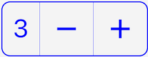
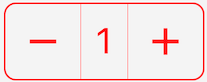
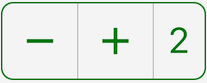
Using Text Position
First, set prop showText to true. Second, set prop textPosition to be left, center or right (default: center). Third, profit. It will render as a <Text/> component by default or you can override it with renderText prop. Example layouts:
Props
Values
| Name |
Type |
Description |
Default |
initialValue |
Number |
initial value |
0 |
minimumValue |
Number |
minimum value |
0 |
maximumValue |
Number |
maximum value |
10 |
stepValue |
Number |
step value (ex. increment by 10) |
1 |
incrementImage |
String or Number |
network or local image |
require('./assets/increment.png') |
decrementImage |
String or Number |
network or local image |
require('./assets/decrement.png') |
activeOpacity |
Number |
touch opacity |
0.4 |
disabledOpacity |
Number |
when step button is disabled |
0.5 |
disabled |
Boolean |
stepper disable state |
false |
wraps |
Boolean |
whether or not it wraps. more info |
false |
showText |
Boolean |
whether or not to show text component |
false |
textPosition |
String |
placement of the text component |
center |
Functions
| Name |
Type |
Description |
Default |
valueChanged |
Function |
invoked when value changes |
() => {} |
onMin |
Function |
invoked when value reaches minimumValue |
() => {} |
onMax |
Function |
invoked when value reaches maximumValue |
() => {} |
onIncrement |
Function |
invoked each time value increments |
() => {} |
onDecrement |
Function |
invoked each time value decrements |
() => {} |
renderDecrementImage |
Function |
used to override decrement image component |
undefined |
renderIncrementImage |
Function |
used to override increment image component |
undefined |
renderDecrementStep |
Function |
used to override decrement step component |
undefined |
renderIncrementStep |
Function |
used to override increment step component |
undefined |
renderText |
Function |
used to override text component when showText is true (defaults to Text/>) |
undefined |
Styles
| Name |
Type |
Description |
Default |
textStyle |
Object |
text component style |
{ padding: 8, fontSize: 20, fontWeight: 'bold', color: 'blue' } |
containerStyle |
Object |
container component style |
{ backgroundColor: 'transparent', flexDirection: 'row', borderWidth: 2, borderRadius: 8, overflow: 'hidden', alignItems: 'center', borderColor: 'blue' } |
separatorStyle |
Object |
separator component style |
{ width: StyleSheet.hairlineWidth, backgroundColor: 'blue', height: '100%' } |
incrementStepStyle |
Object |
increment step component style |
{ padding: 8 } |
decrementStepStyle |
Object |
decrement step component style |
{ padding: 8 } |
incrementImageStyle |
Object |
increment image component styles |
{ height: 36, width: 36 } |
decrementImageStyle |
Object |
decrement image component styles |
{ height: 36, width: 36 } |