README
React Pick Color
Small color picker component for React written in TypeScript.
Install
npm install react-pick-color
# or
yarn add react-pick-color
Usage
import React, { useState } from "react";
import ColorPicker from "react-pick-color";

const App = () => {
  const [color, setColor] = useState("#fff");

  return (
    <ColorPicker color={color} onChange={(color) => setColor(color.hex)} />
  );
};
Options
color
string | { r: number, g: number, b: number, a: number } | { h: number, s: number, l: number, a: number } | optional
The initial color as a hex string or rgba/hsla object.
onChange
(color: { hex: string, rgb: object, hsl: object, alpha: number }) => void | optional
onChange callback with the current color object.
presets
array | optional
combinations
"analogous" | "monochromatic" | "splitcomplement" | "triad" | "tetrad" | "complement" | optional
Provide combinations as a string or an array of combinations.
hideAlpha
boolean | optional | default: false
Hide the alpha range handler.
hideInputs
boolean | optional | default: false
Hide color inputs
theme
{ background: string, inputBackground: string, color: string, borderColor: string, borderRadius: string, boxShadow: string, width: string } | optional | default: themes.light
You can add a custom theme for styling the colorpicker component or choose one from the predefined themes.
Custom Theme
import ColorPicker from "react-pick-color";

const ThemedColorPicker = () => {
  return (
    <ColorPicker
      color="#3573CB"
      theme={{
        background: "lightgrey",
        inputBackground: "grey",
        borderColor: "darkgrey",
        borderRadius: "8px",
        color: "black",
        width: "320px"
      }}
    />
  );
};
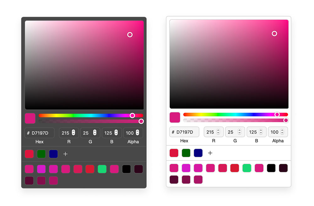
Predefined Theme
react-pick-color exports a dark and a light theme.
import ColorPicker, { themes } from "react-pick-color";

const ThemedColorPicker = () => {
  return <ColorPicker color="#3573CB" theme={themes.dark} />;
};
Hooks
import { useColor } from "react-pick-color";

// A color as a hex string or rgba/hsla object. Will return a color object.
const { hex, rgb, hsl, hsv, alpha } = useColor("#fff");
Roadmap
- Size optimization
- [ ] Build little demo site and codesandboxes
- [ ] Write more tests
- [ ] Remove tinycolor dependency
- Add build pipeline
- [ ] Different CSS solution