README
React Sorcerer


React Sorcerer is a react component and companion hook that helps you use source sets for your img tags.
Source sets work by using a set of image sources to allow the browser to make a calculated decision and display the most optimal image for the current screen size. They increase site performance, and save your users bandwidth. They are like the Goldilocks of image optimization.
Demo
Install
yarn add react-sorcerer
Use as a Component
import Sorcerer from 'react-sorcerer';
<Sorcerer
alt="an image"
coverage={100}
src="https://dummyimage.com/1024x800/f00/fff"
srcSetData={[
{
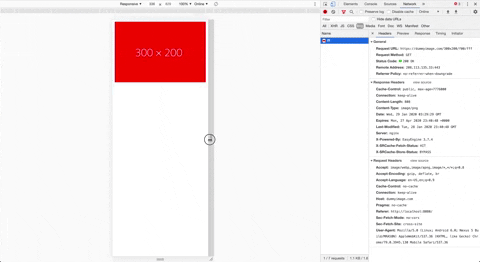
src: 'https://dummyimage.com/300x200/f00/fff',
width: 300
},
{
src: 'https://dummyimage.com/400x300/f00/fff',
width: 400
},
{
src: 'https://dummyimage.com/800x600/f00/fff',
width: 800
},
{
src: 'https://dummyimage.com/1100x800/f00/fff',
width: 1100
}
]}
/>;
Use as a Hook
import { useSorcerer } from 'react-sorcerer';

const imgSrcData = useSorcerer({
  alt: 'an image',
  coverage: 100,
  src: 'https://dummyimage.com/1024x800/f00/fff',
  srcSetData: [
    {
      src: 'https://dummyimage.com/300x200/f00/fff',
      width: 300
    },
    {
      src: 'https://dummyimage.com/400x300/f00/fff',
      width: 400
    },
    {
      src: 'https://dummyimage.com/800x600/f00/fff',
      width: 800
    },
    {
      src: 'https://dummyimage.com/1100x800/f00/fff',
      width: 1100
    }
  ]
});

<img {...imgSrcData} />;
Note: The coverage prop is used to help the browser determine which image to use at each screen size based on the image's width. A full width image would have a coverage of 100. An image in a 4 column grid might have a coverage of 25.
Props
| Name | Type | Required | Description |
|---|---|---|---|
| alt | string |
true |
alt tag for the image |
| className | string |
false |
className for the image |
| coverage | number |
true |
an estimate of the display width of the image in percentage |
| src | string |
true |
the src of the main image |
| srcSetData | { src: string, width: number }[] |
true |
an array of image sources and their width in pixels |
| style | object |
false |
style object for the image |
License
MIT
Copyright (c) 2017 Bryan Brophy.