README
react-styled-flex


Simple, light, unopinionated, CSS standard compliant Flexbox component for react using styled-components
🎏 Changelog
This is react-styled-flex@2 documentation. For version 1, please follow this link. Following changes are introduced in v2:
✂️ Breaking changes
isprop of FlexBox and FlexItem component is longer supported. Instead use native styled-components "as" polymorphic prop to render another react component or html element.- Supports
styled-componentsversion greater than or equal to>=5.1.0. If you want to use older versions ofstyled-components, please installreact-styled-flexv1 by usingnpm install react-styled-flex@latest-1command.
🚀 Enhancements
- Typescript rewrite.
- ~10% lightweight than v1.
- Supports SSR and SSG rendering.
- Introduces Box component.
- Uses
styled-componentsshouldForwardProp mechanism to avoid leaking props to DOM. As a result,isprop from v1 is no longer supported.
🔋 Features
- Lightweight and dependency free, ~2.7 KB minified or ~1.2 KB minified + gzipped.
- Clean underlying HTML DOM. No prop leakage to DOM.
- Supports flex-gap feature. For non supported browsers, it degrades gracefully by applying appropriate margin properties.
- Supports rendering of any react component or html element.
- Supports unitless values wherever required.
- Supports SSR and SSG rendering.
- TypeScript support.
💿 Installation
Yarn
yarn add react-styled-flex
Npm
npm i react-styled-flex
react-styled-flex requires peer dependencies react and styled-components. You need to add them separately.
🔌 API
- react-styled-flex exports three components:
Box,FlexBoxandFlexItem. Boxbehaves as basic CSS box.FlexBoxandFlexItemextendsBox.FlexBoxbehaves as a container withdisplay: flexrule.FlexItemas acts as a child forFlexBox. ThoughFlexBoxcan have other components as child as well.- Only use
FlexItemif you need to provide additional styles to child components. See Props section for more details. FlexItemcan be treated asFlexBoxfor nested children by settingboxprop astrueonFlexItem
🕹 Usage
react-styled-flex exports three components: Box, FlexBox and FlexItem. All renders simple div with styles derived from passed props.
import { Box, FlexBox, FlexItem } from "react-styled-flex";

const Layout = () => {
  return (
    <FlexBox center>
      <Box padding={10}>Child 1</Box>
      <FlexItem>Child 2</FlexItem>
      <FlexItem flex={1}>Child 3</FlexItem>
    </FlexBox>
  )
}
On rendering Layout component,
- One parent div with style
display: flex; justify-content: center; align-items: centerand three nested divs will be rendered.- First child will have padding of
10px. - Second child will be simple div.
- Third child will have style
flex: 1;
- First child will have padding of
For rendering elements other than divs, please refer Change underlying element section.
🎛 Props
Box
- All props are optional.
- Shorthand syntax for margin and padding props are supported.
| Props | Type | Description |
|---|---|---|
| sizing | string | Applies box-sizing |
| position | string | Applies position |
| height | string | number | Applies height |
| maxHeight | string | number | Applies max-height |
| minHeight | string | number | Applies min-height |
| width | string | number | Applies width |
| maxWidth | string | number | Applies max-width |
| minWidth | string | number | Applies min-width |
| m, margin | string | number | Applies margin using CSS margin shorthand specification |
| mt, marginTop | string | number | Applies margin using CSS margin-top specification |
| mr, marginRight | string | number | Applies margin using CSS margin-right specification |
| mb, marginBottom | string | number | Applies margin using CSS margin-bottom specification |
| ml, marginLeft | string | number | Applies margin using CSS margin-left specification |
| p, padding | string | number | Applies padding using CSS padding shorthand specification |
| pt, paddingTop | string | number | Applies padding using CSS padding-top specification |
| pr, paddingRight | string | number | Applies padding using CSS padding-right specification |
| pb, paddingBottom | string | number | Applies padding using CSS padding-bottom specification |
| pl,paddingLeft | string | number | Applies padding using CSS padding-left specification |
| border | string | number | Applies border using CSS border shorthand specification |
| ### FlexBox |
- All props are optional.
- All boolean props defaults to false.
- All Box props are also applicable.
| Props | Type | Description | |||||||||||||||
|---|---|---|---|---|---|---|---|---|---|---|---|---|---|---|---|---|---|
| inline | boolean | If true, applies display: inline-flex rule otherwise applies display: flex |
|||||||||||||||
| column | boolean | If true, flex-direction rule is set as column otherwise set as row |
|||||||||||||||
| reverse | boolean | It works in tandem with column prop to generate flex-direction: {row\|column}-reverse. Following table summaries it,
|
|||||||||||||||
| wrap | boolean | If true, applies flex-wrap as wrap |
|||||||||||||||
| wrapReverse | boolean | If true, applies flex-wrap as wrap-reverse |
|||||||||||||||
| center | boolean | If true, then applies justify-content: center and align-items: center |
|||||||||||||||
| gap | string | number | Applies gap using CSS gap shorthand specification if browser supports it, otherwise fallbacks to using margin property. Read flex gap feature to understand more | |||||||||||||||
| columnGap | string | number | Applies CSS column-gap property if browser supports it, otherwise fallbacks to using margin property. Read flex gap feature to understand more | |||||||||||||||
| rowGap | string | number | Applies CSS row-gap property if browser supports it, otherwise fallbacks to using margin property. Read flex gap feature to understand more | |||||||||||||||
| justifyItems | string | Applies justify-items rule. Depending on the browser, these justify-items values might be supported |
|||||||||||||||
| justifyContent | string | Applies justify-content rule. Depending on the browser, these justify-content values might be supported |
|||||||||||||||
| alignItems | string | Applies align-items rule. Depending on the browser, these align-items values might be supported |
|||||||||||||||
| alignContent | string | Applies align-content rule. Depending on the browser, these align-content values might be supported |
FlexItem
- All props are optional.
- All boolean props defaults to false.
- All Box props are also applicable.
- All FlexBox props are applicable if
boxprop is set to true.
| Props | Type | Description |
|---|---|---|
| flex | string | number | Applies flex using CSS flex shorthand specification |
| grow | string | number | Applies CSS flex-grow property |
| shrink | string | number | Applies CSS flex-shrink property |
| basis | string | number | Applies CSS flex-basis property |
| order | string | number | Applies CSS order property |
| justifySelf | string | Applies justify-self rule. Depending on the browser, these justify-self values might be supported. |
| alignSelf | string | Applies align-self rule. Depending on the browser, these align-self values might be supported |
| box | boolean | If true, then FlexItem also behaves as a FlexBox. In addition to FlexItem props, all the FlexBox props are applicable |
📽 Features explained
Supports unitless values
- react-styled-flex supports unitless values where units are required. In that case value will be auto suffixed with with
pxunit. - Only values where unites are required(eg. height, width, margin) will be suffixed.
- CSS rules which don't have units won't be suffixed (eg. order)
Supports flex gap feature
Browser supports flex gap feature
- If flex gap feature is supported in browser than gap, columnGap and rowGap props will function as per specification.
Browser don't support flex gap feature
- If browser does not supports it, then we intend to provide graceful degradation of flex gap feature by setting margin. This fallback is provided only if, either of gap props is set and wrap prop is not set.
- If wrap is set then gap wont work in non-supported browser.
- Rest all props are supported.
Change underlying element
By default FlexBox and FlexItem renders div in the DOM. We can change it to any HTML element or react component using styled-components as prop.
Example:
import { FlexBox, FlexItem } from "react-styled-flex";

/* other logic */

<FlexBox center>
  <FlexItem as={"button"}>Child 1</FlexItem>
  <FlexItem as={"button"}>Child 2</FlexItem>
</FlexBox>
Renders Child 1 and Child 2 as button. Similarly any react component can be rendered.
❓ FAQ
Where can I find examples ?
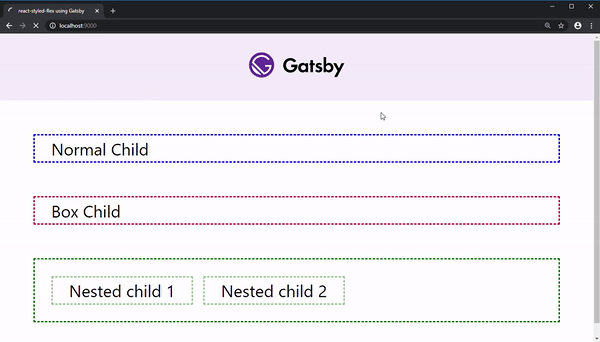
Working example of react-styled-flex with frameworks like create-react-app, gatsby, next.js, parcel can be found in examples directory of this repo. Both javascript and typescript variants are available. If any cool react framework is missing, raise a PR, we will be happy to get added.
Why unstyled content appears during initial page render ?
In SSR or SSG rendering, web pages may flash unstyled content for brief moment of time when page layout is done using react-styled-flex gap prop. Though web page corrects itself as soon as react hydration runs, the shift may be distracting for end users.
In order to fix this issue, we have to provide css class flex-gap-not-supported to body tag.
Below are the fixes available for next.js and gatsby.
next.js
Add custom Document to your application within pages/_document.js. Here is the minimal _document example
// pages/_document.js
import Document, { Html, Head, Main, NextScript } from 'next/document'
import { FlexGapNotSupportedClassName } from 'react-styled-flex';

export default class MyDocument extends Document {
  static async getInitialProps(ctx) {
    const initialProps = await Document.getInitialProps(ctx)
    return { ...initialProps }
  }

  render() {
    return (
      <Html>
        <Head />
        <body className={FlexGapNotSupportedClassName}>
          <Main />
          <NextScript />
        </body>
      </Html>
    )
  }
}
gatsby
Customize gatsby-ssr.js module to implement onRenderBody API. Minimal example is shown below:
// gatsby-ssr.js
const React = require('react');
const { FlexGapNotSupportedClassName } = require('react-styled-flex');

exports.onRenderBody = ({ setBodyAttributes }) => {
    setBodyAttributes({
    className: FlexGapNotSupportedClassName,
    });
};
You may also refer to examples directory for complete working demo.
⚖️ License
MIT © Piyush Lodaya