README
react-tagging-input


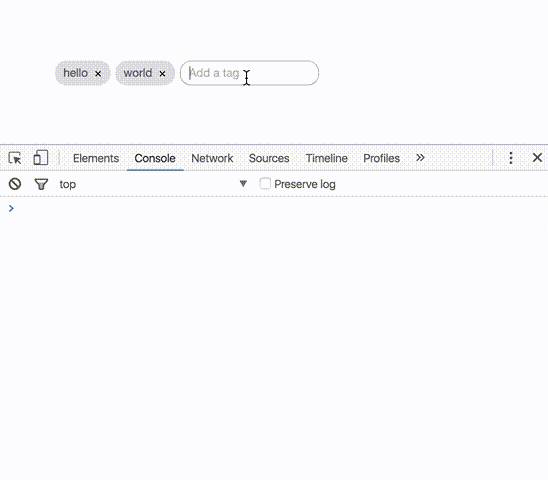
Simple tagging component.
Demo
https://jfusco.github.io/react-tagging-input
Getting Started
Installation
From the root of your project.
npm install react-tagging-input --save
Usage
Simple implementation of tags. See options available below.
import React, { Component } from 'react';
import { render } from 'react-dom';
import Tags from 'react-tagging-input';

class Application extends Component{
  state = {
    tags: ['foo', 'bar']
  };

  constructor(props){
    super(props);
  }

  onTagAdded(tag) {
    this.setState({
      tags: [...this.state.tags, tag]
    });
  }

  onTagRemoved(tag, index) {
    this.setState({
      tags: this.state.tags.filter((tag, i) => i !== index)
    });
  }

  render(){
    return (
      <div>
        <Tags
          tags={this.state.tags}
          placeholder="Add a tag"
          onAdded={this.onTagAdded.bind(this)}
          onRemoved={this.onTagRemoved.bind(this)} />
      </div>
    );
  }
}

render(<Application />, document.getElementById('application'));
Options
tags ~ required
An array of tags to be passed in and rendered right away in the component
state = {
  tags: ['foo', 'bar']
};

<Tags tags={this.state.tags} />
placeholder ~ optional ~ default null
A string used as placeholder text in the tags input field
<Tags placeholder="Add a tag" />
addKeys ~ optional ~ default [13, 9, 32]
An array of keyCodes used to tell the tags component which delimiter to use to add a tag
Here is more info and a list of keyCodes
<Tags addKeys={[13, 9, 32, 188]} />
onAdded ~ optional
A function fired when a new tag is added - returns a string of the new tag
onTagAdded(tag){
  console.log(`new tag: ${tags}`);
}

<Tags onAdded={this.onTagAdded} />
onRemoved ~ optional
A function fired when a new tag is deleted - returns a string of the tag that was deleted
onTagRemoved(tag, index){
  console.log(`deleted tag: ${tag} at index ${index}`);
}

<Tags onRemoved={this.onTagRemoved.bind(this)} />
maxTags ~ optional ~ default -1 (infinite)
An integer representing the maximum number of tags that are allowed to be added
<Tags maxTags={10} />
readOnly ~ optional ~ default false
A boolean that sets the tag component to read only mode. No adding or removing tags and pointer events
<Tags readOnly={true} />
removeTagIcon ~ optional ~ default "x"
The element to be used for the delete icon
const removeIcon = () => {
  return (
    <i class="my-custom-icon"></i>
  );
}

<Tags removeTagsIcon={removeIcon()} />
uniqueTags ~ optional ~ default false
A boolean that allows the same tag to be added more than once
//-- Only allow unique tags to be added
<Tags uniqueTags={true} />
id ~ optional ~ default null
The string to be used for the ID of the component
<Tags id="my-tags-component" />
Styling
Installation
Import the main SCSS file in to your application SCSS files
@import "node_modules/react-tagging-input/src/component/scss/styles.scss";
There are a few variables set to !default that can be overriden. If you need to change it more just override the actual styles.
Any overriden variables needs to go above the @import statement to take effect
//-- Global UI
$tag-base-height
$tag-base-font-size
$tag-base-border-radius
$tag-base-font-color
$tag-base-margin
$tag-base-font-family

//-- Tags
$tag-background-color
$tag-background-hover-color
$tag-remove-color
$tag-remove-font-size
$tag-remove-hover-color

//-- Input
$tag-input-bg-color
$tag-input-border
$tag-input-placeholder-color
If you don't care to override variables and just want to override actual styles you may choose to import the compiled version of the css instead
@import "node_modules/react-tagging-input/dist/styles.css";
Tests
npm test